
Backstage: How we’re building Flows
Product News
Over the years we’ve built out a ton of Zeplin features to help product teams stay synchronized and ship beautiful products together more efficiently. But it wasn’t until early last year that we dabbled into user flows — an essential part of that product development cycle — with our very own Flows feature.
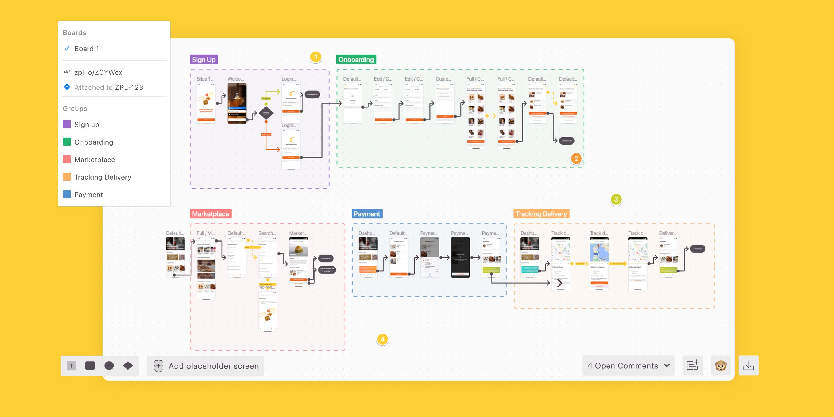
If you’re new to Flows, it’s Zeplin’s take on user journey mapping for flows that have reached a certain level of maturity. It’s for when you’re well beyond initial wireframing, and have fleshed out the details of select screens and flows to more closely represent the UX that’ll go into production (or is already there).
Flows has been live for some time now, and we’re about to enter a second phase of Flows with lots of new functionality! For that reason, now would be a great time to reflect on how Flows has evolved by sharing its origin story, an overview of it’s current functionality, and of course, where we’re taking it next. 🤓
Why we built Flows
Where the idea started
Like any product team, there are countless ways we might come up with a new feature idea. For Flows, it was actually kind of a funny discovery. It originated from a few bug reports from users who noticed some of their screens weren’t responding.
After looking into it, we discovered that they were trying to export massive screens — one as large as 21,000 x 18,000 pixels! 🤯 It turns out that users were trying to publish artboards filled with other artboards to capture their entire user journeys.

From this, we realized that our users were looking for a way to document complete user journeys. The fact that they were trying to do this in Zeplin, despite there being plenty of other tools out there for building flows and prototypes, told us that there was something here worth exploring.
Why it made sense for us to build Flows
Prior to Flows, screens in Zeplin appeared only in grid format with screens lined up horizontally one after the other. This works well for communicating design behavior and instructions screen-by-screen, which is core to the Zeplin workflow. But there was apparently this growing need to view multiple screens together and the relationship between them within Zeplin, too. It would be great if users could arrange screens flexibly on a canvas and add connections as needed, meanwhile preserving the details on each individual screen.
The more we thought about it, the more it made sense. The underlying need from these users was to connect the dots between screens already in Zeplin — so why not help them do that?
And when we thought specifically about users who have very large and complex user flows they’re constantly iterating on — which makes up many of our users — we saw a ton of value in helping those teams organize, document, and scale their user journeys.
The beginning of Flows
What we set out to build
The concept that steered the creation of Flows in its early days was the complete user journey. Our users didn’t need another way to wireframe, but a way to capture and document user flows with more finality and with the intention of scaling them.
So in our initial approach, we sought to create a storyboard-like view in Zeplin as an alternative to the grid view we currently have.
In addition, since designers are already familiar with drawing user flows in other tools, we thought about how we could make the experience of building and viewing user flows smoother and intentionally different in Zeplin.
There are major flaws in doing user journeys in other tools that helped drive what we would build in our own Flows feature:
Building and maintaining complex flows is extremely manual in a design tool
Documenting your complete user journey in a separate tool than where final designs are kept (e.g. Miro, Lucidchart, Google Slides) forces teams to refer to multiple resources that don’t always agree with each other or aren’t up to date
Not documenting user journeys makes it very difficult for developers to gain accurate context on what to build
Our guiding principles for the product
As with any feature we work on, it was important to us that we empathized with where users would be coming from and their frame of reference upon using Flows.
When you look at who uses Zeplin, you’ll find every role in the product development cycle. Designers and developers, of course, but also product managers, executive stakeholders, QA, marketers, copywriters…the list goes on. Each person has a different level of involvement with the product, but they all want to understand and contribute to the user experience.
So ultimately, we realized Flows must provide value in two ways:
1.to give context on complete user flows — with all states, screens, and edge cases — for developers to build with
2.as a centralized reference point for user flows that’s easy for the extended product team to navigate, collaborate on, and grow together over time
How it works and how it’s evolving
Whether you’re familiar with Flows or are just now getting to know it, let’s take a closer look at what’s possible with Flows.
Flows features at launch
At launch, Flows appeared on it’s own dedicated tab when viewing a project in Zeplin and allowed you to:
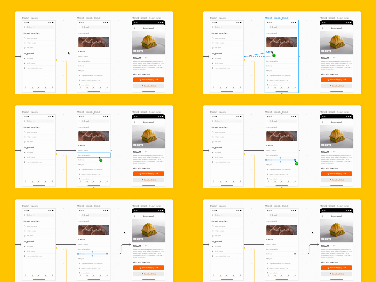
Create and update flows by adding one screen, a group of screens, or an entire section
Place Connectors between screens and components to link them in the user flow
Add Labels throughout to clarify the meaning of certain paths
Also, if you updated a screen in Zeplin, it would automatically update if you’ve used it in a Flow. A simple touch, but one that makes a huge difference for teams otherwise used to having to reconcile their flows and designs manually.
Right from the start there were features to help with scalability, too, such as:
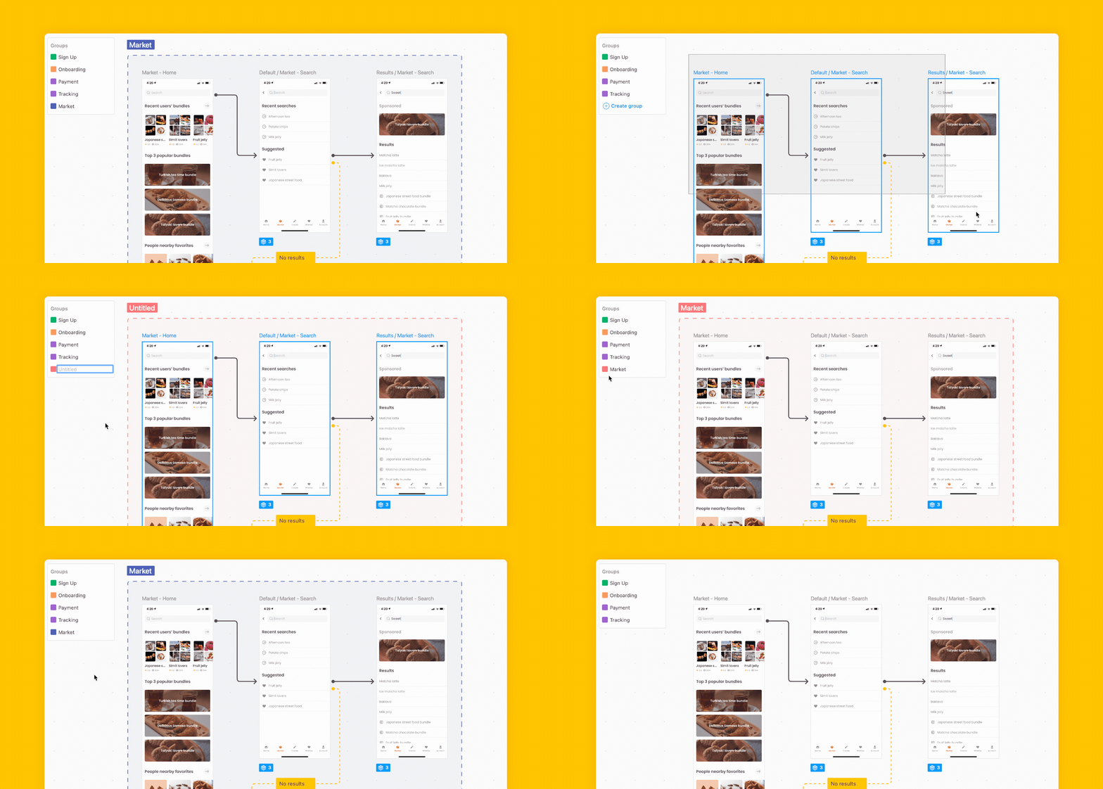
Flow Groups for organizing screens on the canvas
Flow Boards for another layer of separation, for teams with especially large or complex journeys
The next rounds of updates
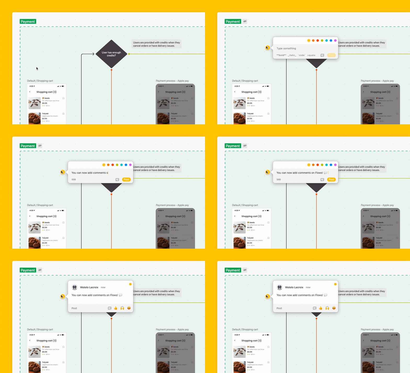
The initial reception for Flows was super positive, which pushed us to release several additional updates shortly after launch. This included the ability to:
Use Shapes (diamond, pill, rectangle) throughout your flows to map all possible use cases — including empty states, decisions, and conditional flows
There were other thoughtful touches that we wrapped in along the way as well, including the ability to:
Distribute & align screens to take care of uneven spacing between screens
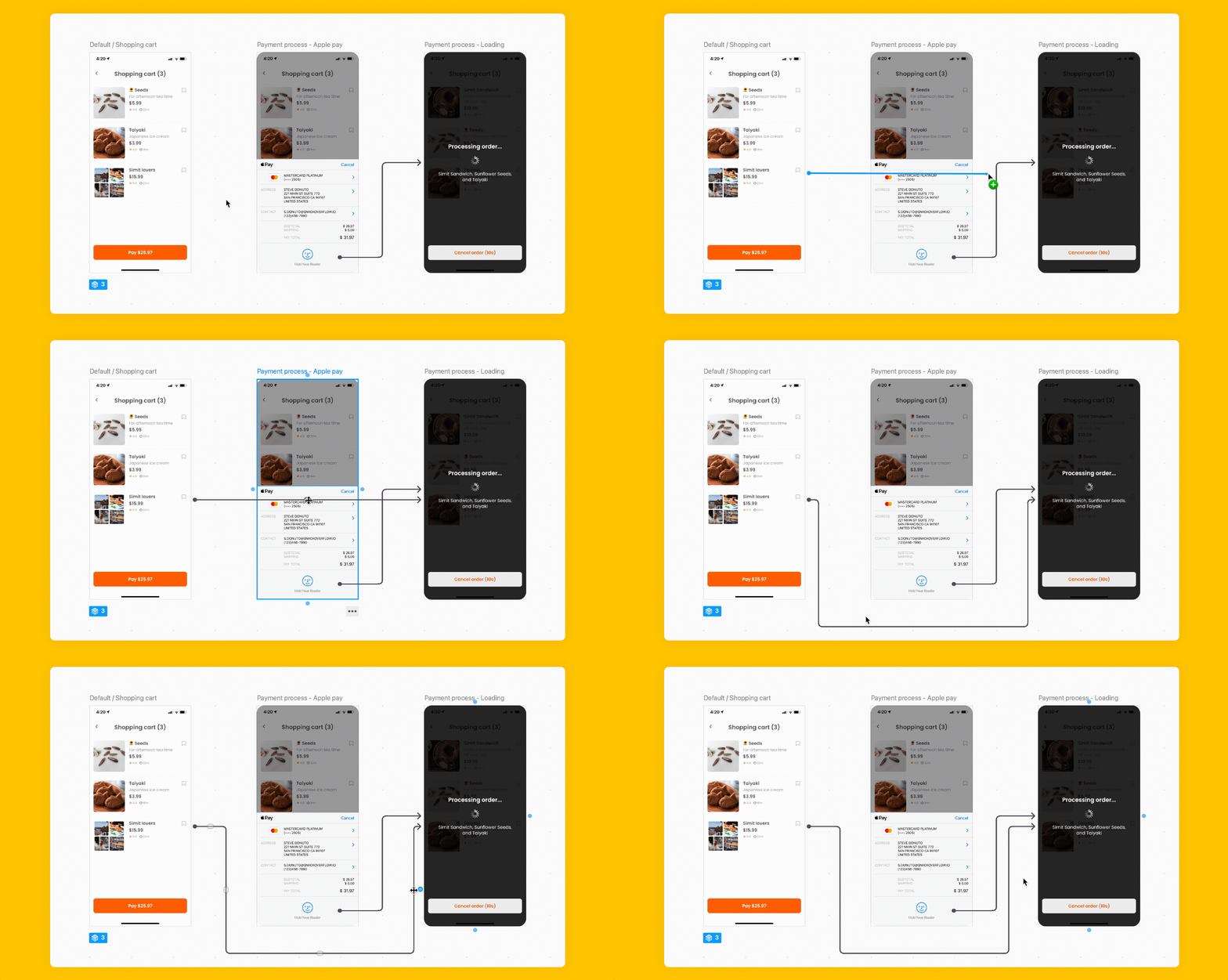
Customize your connector lines while still keeping them neat and tidy
What’s next for Flows
We love Flows here at Zeplin, but we would only continue to grow and expand it if there was proof that our users found value in it. The good news for all of us is that they did.
“Flows allows us to quickly identify missing use cases or predict interaction scenarios that we might not have caught before. This helps us create a product experience that's seamless across touchpoints.”
Mayen Escusa, UX Consultant, Deutsche Bahn
“Prototypes are great, but sometimes I want to see the screens, the states, and see how they’re all connected. Flows provides a complete view of the larger workflow.”
Olyn LeRoy, Head of Product Design, Cloudera
“The ability to visualize exactly where a button takes you goes a long way! Flows makes it so much easier to communicate key interactions and large-scale ideas to my devs.”
Rachel VanAken, UX Designer
Upcoming features…
So as I mentioned at the start, there are a lot of new updates coming to Flows. We’ve got some things in the lineup that’ll be nice enhancements to how you’re already using Flows, but what I’m most excited for is to release a major addition that will transform how Flows can improve your team’s workflows.
We shared that Flows update (plus several other major Zeplin product launches) at our keynote sessions at Harmony 2023 — read about everything we launched at Harmony and check the features out for yourself!
Fin


