

One year ago today we launched Zeplin 2.0, adding components to Styleguides and we’ve heard amazing feedback from teams around the world. Styleguides in Zeplin help your team create consistent experiences by sharing common components, text styles and colors throughout your design system.
As we talked with users in this past year, we learned more about a limitation of Styleguides: each project in Zeplin had to be updated individually when changes occurred. No more! Today, we’re launching Global Styleguides in Zeplin — this is our biggest update yet and we’re excited.
What are Global Styleguides?
You can now build Styleguides that can connect to all your Zeplin projects. Global Styleguides let you organize and update your design system colors, text styles and components all in a centralized location. Combined with a re-designed user interface, maintaining your design system in Zeplin is now even easier.
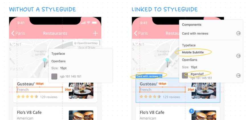
Styleguides give context to your designs
Styleguides ensure your designs are brand-consistent throughout all your apps. Engineers can now clearly see the component names from within a design, promoting reusability. Zeplin also lets you add custom descriptions to each component where you could add a link directly to a code repository or a storybook, making it incredibly easy for developers to find existing code.
Ultimately, Styleguides help you save time by guiding your team to implement designs that have been curated, so nothing off-brand makes it to production.
Global Styleguides is the only system I’ve found that links components to designs in a centralized way.
Getting started
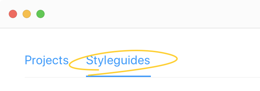
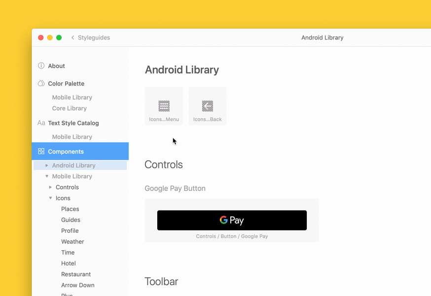
It’s incredibly easy to get started with Global Styleguides. Update to the latest version of Zeplin and you’ll immediately notice the new Styleguides tab.
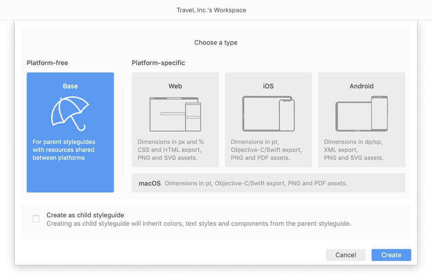
Think of a Styleguide like a Zeplin project that only has colors, text styles, and components. Styleguides are now typed as Platform-free (Base) or Platform-specific (Web, iOS, Android or macOS). Base Styleguides simply link to projects of any platform type, and the other Styleguide types will link to projects of the same platform.
Styleguides have a revamped navigation panel that allows you to easily select colors, text styles, and components. This panel also supports dragging‑and‑dropping components for quick organization. Styleguides also support Markdown in descriptions, feel free to enhance and customize text any way you like!
Global Styleguides streamlines our design and engineering conversations, while allowing the design team to spend less time documenting and more time designing. I love how Global Styleguides was built with input from Zeplin customers to really understand our needs, and the final product delivers.
A system of Styleguides
If you have a more complex design system in place, spanning multiple platforms, you can easily create Styleguide trees with parent‑child relationships. This both helps you organize your Styleguides and allows engineers to only see resources specific to their platform. 🌲
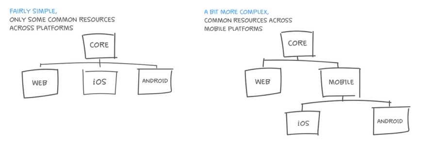
Global Styleguides are completely flexible to meet the needs of your team, big or small. You can build your Styleguides as complex or as simple as needed.
Linking your projects
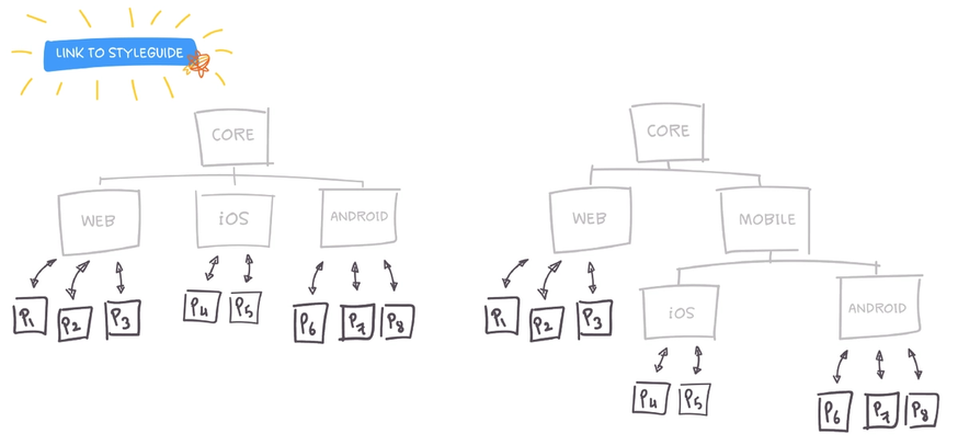
Once you’ve created a Global Styleguide, all that’s left is linking them to your existing and new projects. Linked projects will now reference all the colors, text styles and components from the linked Styleguide and its parent Styleguides.
Global Styleguides help our design teams work much more efficiently, without worrying about how to spec and identify various styles and components. It really streamlines the handoff process, and helps sync between design and development. A great feature that we were happy to provide input to and see great responsiveness from the Zeplin crew.
Components from Figma and Adobe XD
Zeplin integrates with the most popular design tools so your team can enjoy the same features regardless of which one you’re using. So far, it was only possible to export components from Sketch. Today, it’s our pleasure to announce that we’re releasing support for exporting colors, text styles, and components in Figma and Adobe XD!

Build out your Styleguides today
Now is the perfect time to adopt Zeplin Styleguides into your design system. Global Styleguides are available for everyone in Zeplin, including our free plan. Also for teams that have hundreds of components we have great news: we’ve removed all restrictions to the number of components you can have on Starter and Growing Business plans, there’s no limit now!
What’s next?
We’ve already started working on improving Global Styleguides further, where you’ll be able link components in Zeplin to components you have in a repository or a storybook. If you’re interested in learning more about linking components and join the private beta in the following months, ping us at support@zeplin.io.
Global Styleguides has simplified our handoff process — developers can now easily identify components used in our design system, saving us a lot of time.
Update Zeplin and get started today. We hope you’re as excited as we are and can’t wait to hear what you think of Global Styleguides.
Cheers! 👋