
The biggest news from Figma’s Config 2023 event was the introduction of Dev Mode, a developer-focused interface that offers engineers a new experience within Figma for accessing the design specs they need to build products. Since that announcement, lots of people have been asking about whether Dev Mode and Zeplin are the same.
The short answer is no.
Dev Mode and Zeplin overlap in some areas, but they’re functionally different tools. Zeplin is a standalone platform designed to help all members of the product team collaborate during the product development lifecycle. Dev Mode is an interface within Figma's design tool to help developers see some of the specs they need to build a product.
To compare the differences between Zeplin and Dev Mode even further, we’ve put together a point-by-point comparison of how each tool helps your team accomplish critical steps in the design-to-development workflow:
- Defining which designs are ready for development
- Managing and tracking design versions
- Organizing design files for design-to-dev collaboration
- Surfacing specs and the design system
- Documenting the complete user journey
The big difference between Zeplin and Dev Mode
Before we dive into the comparative features, let's get clear about what — and who — Zeplin and Figma’s Dev Mode are designed for.
Figma is a design tool, and Dev Mode is an interface within that design tool. It was made specifically to enhance the design tool so developers can view the technical specs of designs they need to build.
Zeplin, on the other hand, is a collaboration hub. Zeplin is purpose-built to support every team member and stakeholder involved in bringing a product design vision into a final product — which includes product owners, QA, marketing, legal, etc. You can view build-ready designs, grab technical specs, document design intent and behavior with structure and consistency across your team, manage tasks and approvals, and much more.
We should also point out a common misconception that Zeplin is “just a handoff tool.” In today’s complex product development workflows, the traditional concept of handoff and waterfall development processes are outdated. Zeplin is specifically built to improve the continuous design and development process we call design delivery — the ongoing collaboration between the entire product team that's crucial for building excellent products.
Read our Principles of design delivery if you’re interested in learning more about Zeplin’s product philosophy.
Now, onto the comparison…
Defining which designs are ready for development
Currently, most Figma users treat the canvas as both an iterative workspace and a developer blueprint. When it comes time to build, a single, shared file serving two purposes causes confusion as teams have to go back and forth to communicate what designs to build, where to find them, and what changes should and shouldn't be incorporated into the product.
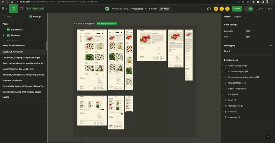
Dev Mode's answer to this problem is a "Ready for dev" button, which allows designers to add a tag to Sections on the canvas that are ready to be built. The idea is that developers can scan through the canvas for this “Ready for dev” tag to find the screens they need.
There are a couple of challenges:
The "Ready for dev" tag in Figma doesn't completely separate in-progress and ready-to-build designs. It places a label on a sub-set of the active, in-progress canvas, and then — if you have a paid seat for Dev Mode — you're able to see a view of these tagged designs that hides other pages in the file that might be outdated.
While this creates some distinction between what's in-progress and what's ready for dev, it does not prevent designers from making edits to the designs after sections have been marked ready for development.
That's a nice clean set of ready-to-build designs you've got there. Would be a shame if someone were to…edit it…
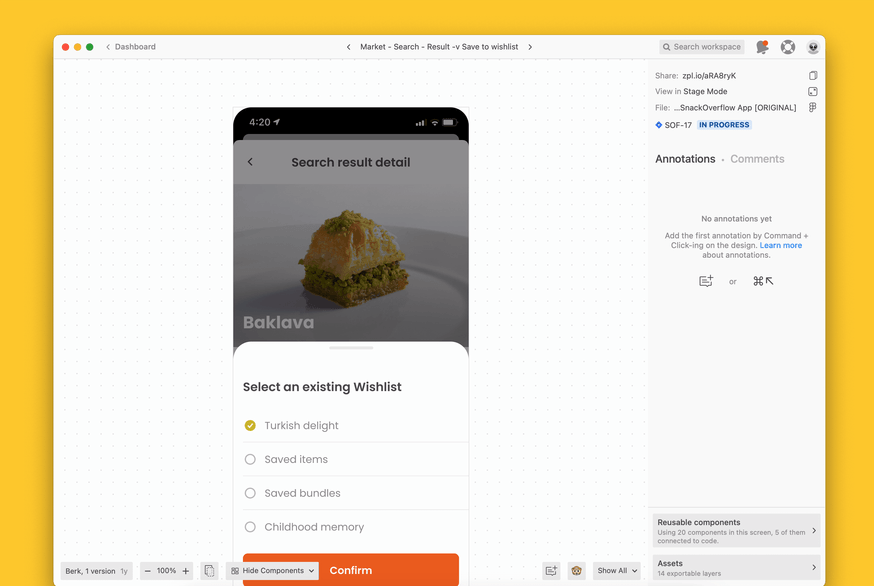
Zeplin's approach acknowledges a fundamental truth: that designers and developers have completely different workflows and needs. Designers need a flexible space to iterate on designs, and developers need a reliable set of locked snapshots of the design for the build.
With Zeplin, designers can define what’s ready for development by publishing screens from Figma to Zeplin, where those designs are then locked and documented in Zeplin. Those designs are separate from in-progress designs, preventing confusion and accidental changes.
Contrast this with Figma’s "Ready for dev" labels, where there’s always the risk that designers will continue to make edits even after sections have been marked ready for development.
So which is better for devs: a label on the canvas or locked designs in a separate space?
Managing and tracking design versions
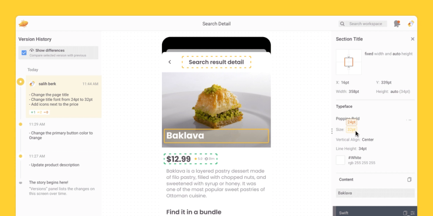
Version management in Dev Mode, and across all of Figma, is centered around the version history — a continuous autosaved log of all changes to the file (see the left side of image below).
Here's how it works: Figma captures every design change made anywhere on the file, and designers can name any of those logs to create a distinct version. These autosaves are great for designers since they won’t lose any design changes, but note that they’re of the entire file, which means there’s no such thing as screen versioning in Figma.
And because file versions are automatically generated by default, rather than intentionally captured — there are irrelevant versions for devs to sort through.
Users can intentionally save explicit versions of designs in Figma, but that process typically means meticulous link tracking and file management whenever there are new changes to a design — including renaming, design duplication, and file re-organization.
Dev Mode also has a compare changes option, which is an exciting concept. However, since it is based on Figma’s automatic version history, it’s hard for devs to know which version they’re actually comparing.
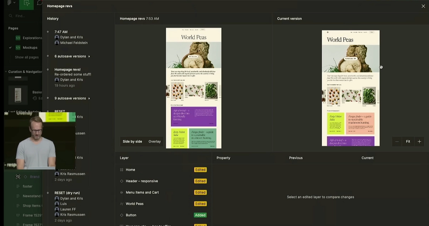
When comparing designs, Figma users have to sort through every single change that's been made to the entire canvas to find what they want to compare.
Design version management in Zeplin takes an entirely different approach. Rather than autosaves at the file-level, Zeplin captures intentional versions at the screen-level.
The feature in Zeplin that Dev Mode’s compare changes might remind you of is Version Diff, which is built around two product features that are unique to Zeplin: locked screens and screen-level versions.
Version Diff documents the differences between locked versions of a screen, not the iterative changes made while the updated screen is being designed. Dev Mode, on the other hand, tracks all manual and autosaved changes to the entire design canvas, and it's up to developers to sort through the change log to find what they're looking for.
So let’s say your designers have made a new screen version. In Dev Mode, developers must be extra careful not to refer to the wrong file versions as they navigate to the right sections or compare changes. Compare this with the experience in Zeplin, where devs can quickly find the previous design screen, the new design screen, and a log of the differences between the two commits clearly highlighted on the screen.
Version Diff only displays the changes that are relevant to the build. Any changes made to in-progress designs are left in the design tool, where they belong.
Which is more helpful to devs for design version control: autosaves of the file or intentional commits of each screen?
Organizing design files for design-to-dev collaboration
Design file organization plays a huge role in any design-to-development workflow, but it’s especially critical when you have more than a handful of developers, a high volume of designs, or a complex product.
In Figma, there is no standardized organization system or file hierarchy, so teams have to develop an organizational system on their own. While designers regularly accept this flexibility (part of Figma’s allure is its flexibility, isn’t it?), the reality is that team collaboration for everyone else will suffer since there’s no consistent organization across projects or teams.
A few things end up happening:
- Files become increasingly difficult to navigate as more and more designs are added to the infinite canvas
- Non-designers must regularly ask for help to find what they're looking for
- When things get busy and designers prioritize other tasks over managing their Figma files, other team members will rely on outdated designs, leading to rework down the line
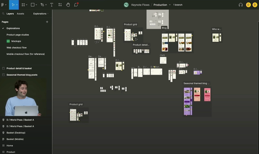
This infinite canvas is pretty well-organized, but without any organizing infrastructure, there are no guarantees that your team will organize as neatly as this one.
Design file organization is one of the design-to-dev challenges that Zeplin solves, and Dev Mode doesn't.
Zeplin has a built-in structure to support standardized organization, where your team can arrange screens into logical groups and tags so that devs — and everyone else who needs access to designs — can sort, filter, and search screens instead of trying to navigate an open canvas.
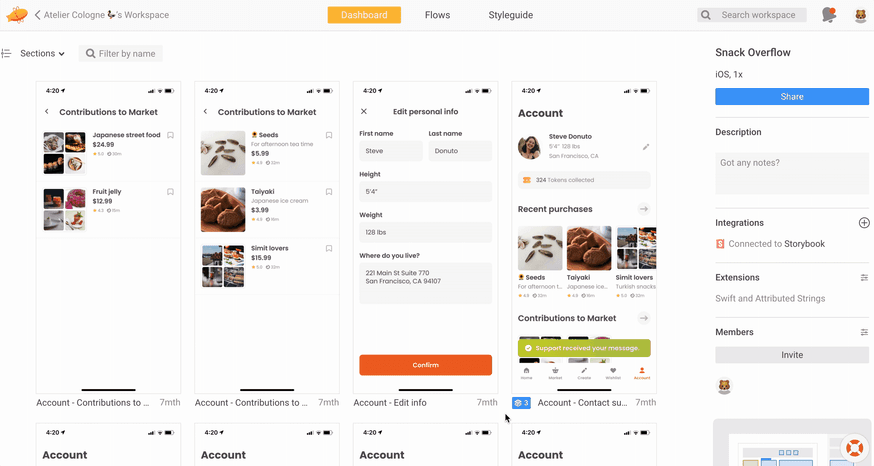
In Zeplin, screens can be logically filed and sorted individually into sections and subsections, which promotes async work
Sections in Zeplin aren't just visual boundary groupings — they're a core part of the design file organization system where you can create categories and sub-categories of related screens.
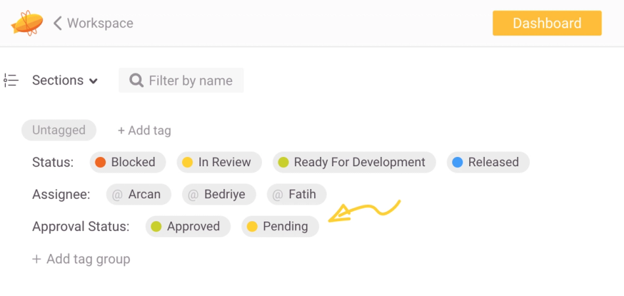
Tags in Zeplin add another powerful layer of organization that supports your design-to-dev workflow that isn’t a native option in Figma. You can create and add custom tags to categorize your screens, or use common ones for Status (e.g., “Blocked”, “Ready for Development”, “Released”), Assignee, and Approval Status (e.g., Pending or Approved)
Zeplin makes it easy to find what you're looking for beyond Sections and Tags, too. With Global Search, you can search your entire workspace and find the exact resource you need, including screens, projects, text styles, components, and even project comments.
So which is a better experience for devs: DIY Figma file organization practices or standardized file organization across all projects and teams?
Surfacing specs and the design system
Zeplin and Dev Mode both provide component values and properties and allow users to copy them directly from the design, so developers can simply click on whatever part of the design they're building and instantly access its specs.
You can also surface custom code for your design system components using codegen plugins. But what makes Zeplin powerful for developers is the ability to connect and centralize all of your UI libraries and documentation in one place: Styleguides, where devs find everything they need at their fingertips.
In Zeplin, clicking on a component shows you its specs and also surfaces tons more information about its usage across your projects, its properties, and its relevance in your team’s Styleguides.
So when a developer clicks on a design element, they'll be able to see the usual component specs like font, sizing, color, and spacing. They'll also be able to click on the arrows next to each of these values to see them and any instructions that accompany them within the context of the style guide.
With the Styleguide integrated directly with the design, devs can see key contextual information like font hierarchies and style variants across platforms. Component states are also clear right within the design.
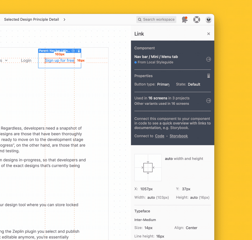
There is no need to navigate away from the screen to find component states — a single hotkey shortcut displays component variants in the design.
Component versions
Zeplin also offers more control over component versioning, which makes a huge difference as you evolve your design system. A design system is a living body of documentation, after all, and Zeplin helps you pass on the appropriate info about how and when it’s being updated across all of your teams so you can work together to achieve your design system adoption goals.
Documenting the complete user journey
Another stumbling block for many product teams is the struggle to fully communicate the design intent of the entire user journey. It's not enough to give a developer access to screens with some documentation and specs — they also need to understand the “big picture” of how users will move through the product.
In Figma, your primary option for creating user flows is to draw them on the design canvas or skip straight to prototyping. On the canvas, designers can either create a separate flow map using manually drawn shapes to represent screens, or they build out a prototype to represent the happy path as best they can. For any product that has more than a few conditional paths, that quickly gets difficult to manage.
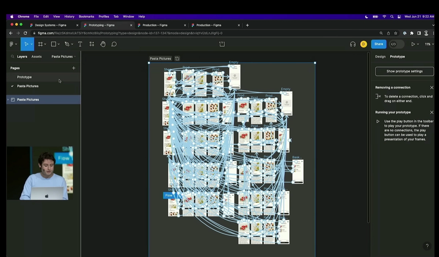
Figma introduced a new way to create prototype flows, but when it comes to user journeys, anything but the simplest flows will quickly turn into spaghetti.
Zeplin's Flows feature enables designers to map complete user flows using the actual design screens, giving developers a comprehensive picture of the user experience and more than just the happy path to reference. You can also click into a screen directly from any flow in Zeplin, which means all of the relevant information — properties, values, and behaviors — appear in the context of the individual screen and within the more extensive user flow map.
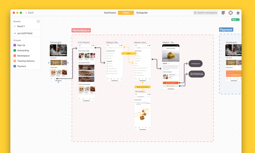
Zeplin's Flows feature lets designers build clear and comprehensive user journeys that devs can easily navigate.
With everything connected and in the right context, developers are far less likely to misinterpret the intended user journey in Zeplin. And if they do have questions, they can use comments to ask them right on the screen or the user flow.
TL;DR: Zeplin matches Dev Mode, and offers additional out-of-the-box capabilities for dev and product
Is it possible to use Figma for design collaboration? Sure. And if you're working with small projects and soft deadlines, you'll probably be able to get by just fine with doing everything in Figma’s Dev Mode. Both Dev Mode and Zeplin provide design specs and both give design system information (though Zeplin integrates it more closely into the dev workflow).
But when the stakes are high for your product experience, and precision and efficiency are priorities for your organization, having too many cooks in the kitchen — or on the canvas — is a recipe for confusion, headaches, and delays. Dev Mode certainly does give developers more breathing room than they used to have in Figma, but it's still a mode within a designer’s space.
Zeplin, on the other hand, is purpose-built for the complex journey your team takes when turning product design vision into excellent products at scale.
In a side-by-side comparison, Zeplin provides more than Dev Mode when it comes to:
- Clarity on what to build, with ready-to-build screens separate from in-progress designs
- Design version control - with screen-level version tracking and commits like Git
- Standardization and consistency for design file organization
- Documenting and centralizing design behavior, user flows, and product requirements
Want to learn more? Talk to a member of the crew about how Zeplin might work for your team, or do a free 30-day trial of Zeplin to try it out yourself.