
Not long ago, Zeplin was just a small group of designers and developers who wanted to create a better workflow for shipping beautiful products together. And at this moment, we have over 140 Zeplin crewmates and millions of users across more than 200 countries worldwide. 🌎
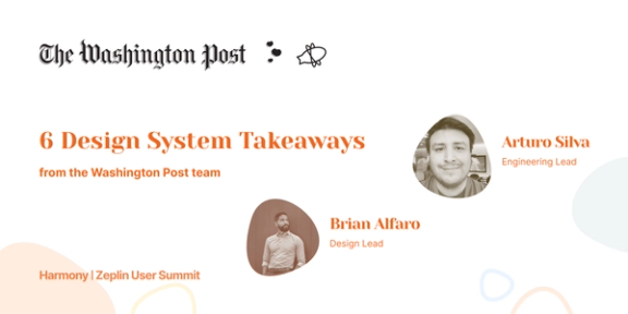
That said, the numbers aren’t the main thing that has kept us inspired along the way. It’s the real stories we’ve heard from PMs, designers, and developers at amazing product teams at Apple, NBC, Starbucks, and The Washington Post who rely on Zeplin to:
- organize thousands of design screens and coinciding product requirements
- bring their design and development teams in sync with each other
- maximize design system usage and component adoption
- simplify and automate routine design handoff tasks, saving them more than a day a week
Stories like these are what gave us the drive and direction to expand Zeplin’s features by a lot this year in particular — with more than a dozen noteworthy product releases! 🚀
So whether you’re a longtime user or new to Zeplin, here’s a list of 2022 product features that tap into those new use cases and that specifically address three common workflow challenges for product teams:
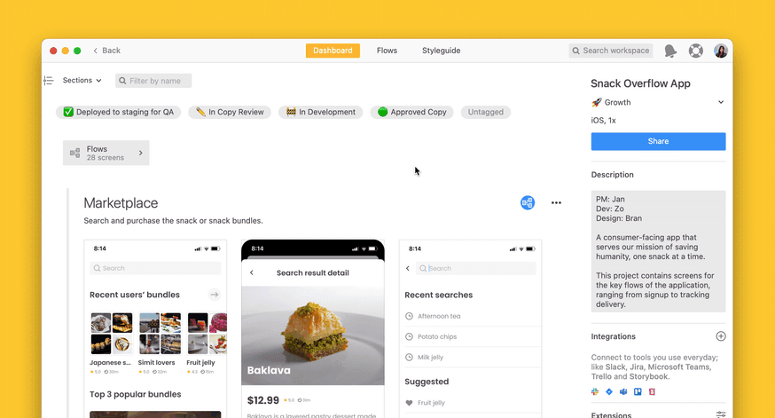
Workspace organization & flexibility
Our most recently launched feature — and a major one for creating order in your workspace — is Nested Sections: a new layer of organization for those deep projects that need more visual hierarchy.
Each section can now nest up to two additional subsections, which you can sort by owner, flow, large batches of variants, JIRA sprints, or any other property really, if it makes sense in your workflow. This helps you store more designs in one structured place, despite your projects growing more complex over time.
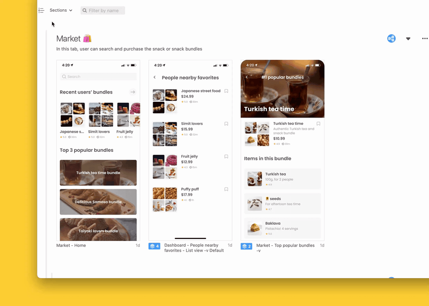
“Features like Nested Sections add better information architecture when sorting and categorizing screens in projects. With Screen Variants, these are powerful features to organize our more complex projects.”
We launched domain capture this year too, to help large teams quickly implement Zeplin across their organization. And for all teams that manage numerous or complex projects, we made it much easier to tame your workspace with drag-and-drop and drag-to-reorder.
There are a ton of ways to speed up your workflow with our new Global Search, which covers a number of feature requests we’d been hearing from you. This powerful new search experience helps you find exactly what you need from anywhere in Zeplin whether it’s a screen, component, text style, comment, etc. It’s so convenient that some of you have told us it’s your new favorite way to navigate around your workspace! ⚡️
More ways to document & align on design decisions
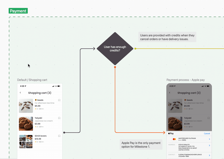
A core part of the product development workflow is user journey mapping, an exercise where designers and developers visualize their intended user flows and align around a common understanding of them.
In the past, the typical process for this was manual and high-maintenance. Many teams would use their design tool by default, drawing arrows and boxes on a canvas and adding text layers to explain what was going on in each flow. This is super manual to create and difficult to maintain going forward. Some teams would also use separate tools to create the flows, and in that case you end up with multiple sources of truth that eventually get outdated.
We wanted to tackle this struggle head on, so in January, we launched our own user journey mapping feature called Flows, giving developers (and your entire team) much needed clarity on how individual screens should fit together in the final build — something teams often have to piece together in various other tools with a lot of effort.
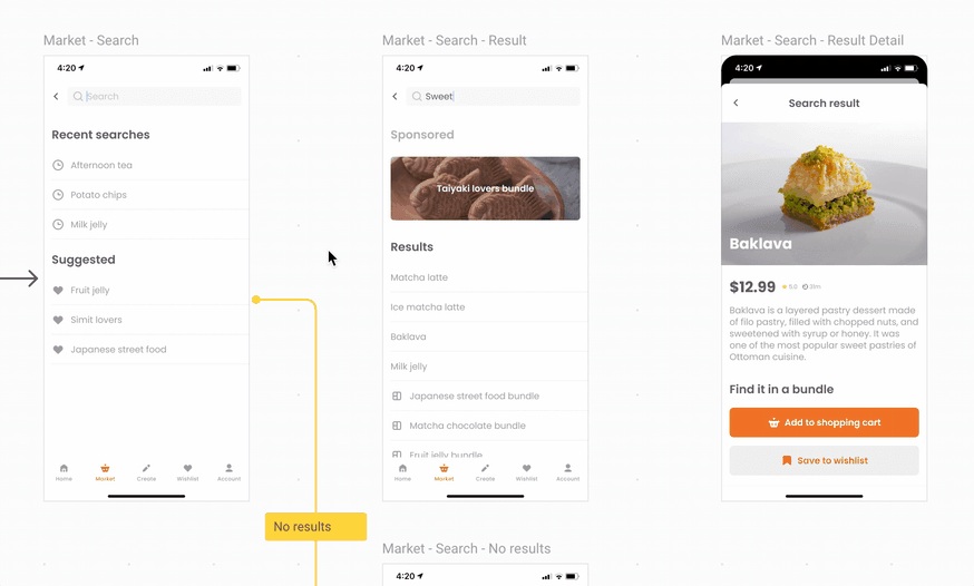
Since then, we’ve been heads down working on making Flows even better. Some of those improvements include Shapes, customizable connectors, and comment functionality, to:
- Allow you to build error/edge cases by adding decisions, actions, or placeholder screens
- Keep connectors neatly organized even as your flows grow
- Invite feedback on user journeys from your various stakeholders for stronger collaboration
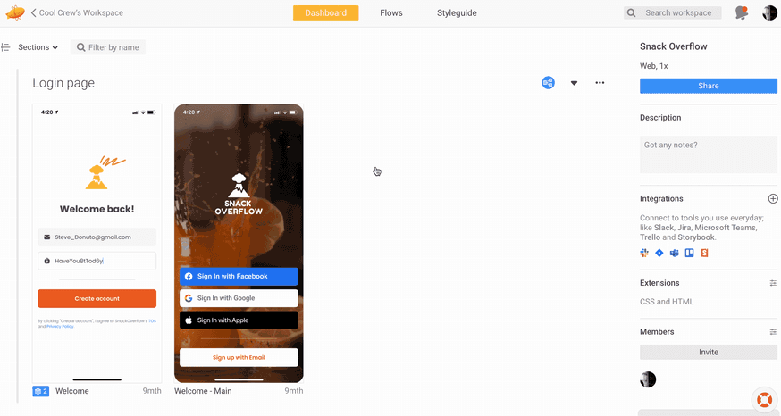
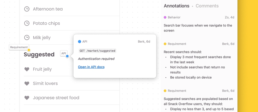
Around the same time we launched Flows, we also launched Annotations, a way for designers to document how designs should behave and pin that information directly to the screen or component. Unlike comments that are more conversational than instructional, Annotations are always visible and can show descriptive GIFs/videos, reference product requirements, and even API endpoints to ensure there’s no ambiguity on what to build.
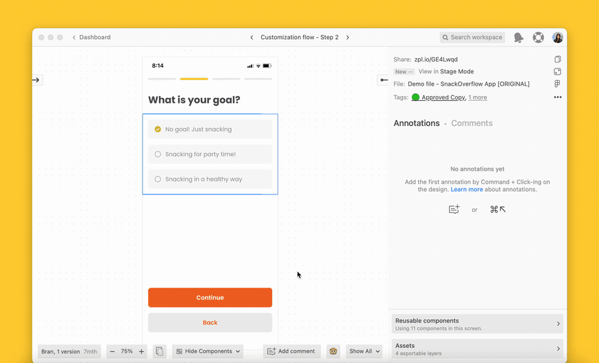
While Annotations are static, we knew that teams also frequently need to exchange feedback across multiple screens or flows — but without the clutter of a working design file.
This use case inspired the creation and launch of Stage Mode: a focused, presentation-friendly view where you can present, review, and give feedback on designs in Zeplin. Within a month of its launch, we also added the ability to click through prototyping hotspots and flow connectors in Stage Mode for an even smoother experience.
Component visibility & adoption for the development workflow
Every team approaches their design-to-development workflow differently, but the ability to discover and reuse design system components is an increasingly important priority across product teams. We saw a clear way we could help that fit naturally into the developer workflow in Zeplin.
Without knowing what’s reusable, it’s common for developers to spend time rebuilding things from scratch. With Highlighted Components, you can easily discover reusable elements on the screen, and also access custom snippets if connected to your code library.
There’s also the ability to see which other screens highlighted component is used in, which makes it so much easier for developers to estimate and scope out the build.
And that’s a wrap! Thanks for being part of our journey in 2022.
If this year taught us anything, it’s that market conditions and business needs can change in the blink of an eye and that means products teams need to be wary of tools and processes that add clutter or waste time. Our goal at Zeplin is to create the best and most adaptable product development workflow so product teams can operate with extreme efficiency while continuing to ship beautiful, high-quality products their users love — come along with us if you want that for your team in 2023! 🙋♂️