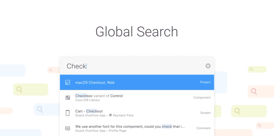
Global Search is one of those features where you think — of course, it makes total sense for us to build this! That’s definitely what crossed my mind. Almost every app you use offers some sort of search functionality and since Zeplin organizes thousands of files and pieces of design information, having a strong search feature in Zeplin sounded like a very important and natural addition for our users. But how would it work? What would it look like?
Global Search is by no means a small feature so it took some time to get it right. And now that it’s live, we wanted to share an inside look into the unique journey of building it. We’ll show you the first concepts, how we honed in on our vision, and what’s to come as we continue to grow and refine it.
Where it all started
The first steps we took towards a truly “global” search happened more than a year before we launched this feature. At the time, our crew recognized from product feedback and user requests that there was a desire for a more powerful search functionality within Zeplin.
That kicked off a phase of understanding how users find things within Zeplin and pain points they encounter in their journey. During that formative research, we worked to gain a complete understanding of the behavior first, before piecing together a solution.
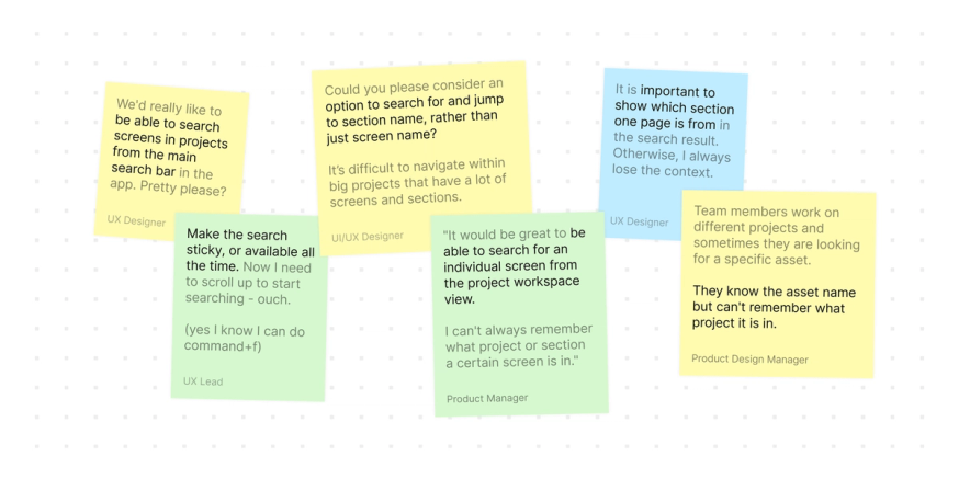
Our main goal with Global Search was to make it easier to find things in Zeplin. It could be your product’s entire onboarding flow, or a one-off text style in a styleguide. If it’s in Zeplin, it should be easier to find it and get to it.
In general, users had a tough time quickly finding the resources they needed and it was a problem that grew as their Zeplin workspace grew. For example, at this moment the Zeplin crew has 450 projects, 239 members, and tens of thousands of screens in our Zeplin workspace. Before Global Search, the only “search” option you had appeared after entering one of those projects. If you couldn’t recall exactly which project had that screen, that meant a lot of clicking around and bouncing between projects.
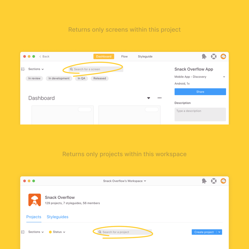
And when users wanted to discover files that they hadn’t seen or worked on before, they would often have to rely on others’ input — whether it was a conversation, email, or Slack message.
At this point, we didn’t doubt that there was a need for Global Search. But rather, what’s the right way to approach it?
Carrying the concept forward
Once we finished our discovery, research, and initial brainstorming for Global Search, we didn’t actually build it right away. Maybe some product teams out there can relate, but several months went by where we would ship other features and grow our product, design, and development crews by a few new faces (including mine 👋). Eventually, our collective focus did come back around to Global Search, and this time with renewed enthusiasm and fresh eyes.
In picking up where we left off, we reviewed our findings from research and aligned on what the key requirements were for this new search experience.
As a feature, it should:
- create a faster workflow where users can quickly search for results and jump between different projects
- search within different projects from the workspace level
- allow users to search beyond just projects and screens, i.e components, text styles, comments, etc…
Honing in on the vision
There’s an infinite number of ways to implement search functionality in an app and while we didn’t know for sure what it would look like in Zeplin, we knew what we didn’t want: anything visually complex or complicated that would slow users down. This was the most important design implication we learned from our initial research.
What we really wanted was for Global Search to feel snappy and simple. A quick search across the workspace anytime you need it. And to be honest, if we hadn’t taken a break between user research and building, we might not have landed on our current vision and could have come out with an entirely different solution. Just check out the difference between the first wireframes compared to the newer ones.
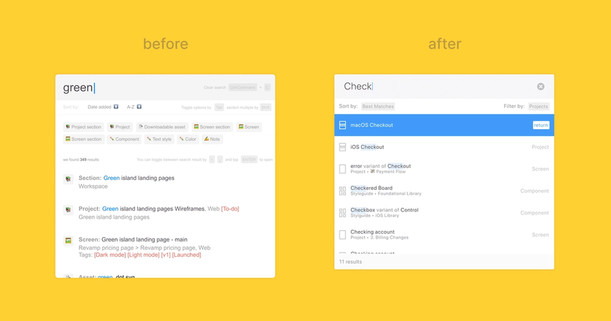
As we refined our new vision for Global Search, we also thought about the most natural way to fit this new search experience into our users’ current workflow within Zeplin. There was an existing feature in Zeplin called ‘Jump to’ that accomplished a bit of what we wanted to build, so we used it as the foundation to build the new experience on. While this did mean we weren’t working with a completely blank slate, we made sure to push ourselves to design the best search experience regardless of what might already exist.
Getting the experience right
What’s unique about Global Search compared to other brand new features we’ve launched for Zeplin is that it’s very backend-heavy. Core to the Global Search experience — and central to its benefit to users — is the snappy, logical grouping and ordering of search results that covers many types and edge cases. Backend developers are the heroes who make this possible.
That meant our design and development crews had to be very meticulously aligned, and very early on in the design process at that. We needed to collaborate even more than we already do to ensure the feature works smoothly from the frontend and backend, and so that every search scenario played out exactly as expected for the user.
In all, there were 19 distinct search result cases that we needed to view and define from both a technical and a design lens.
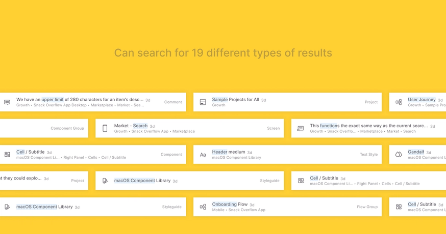
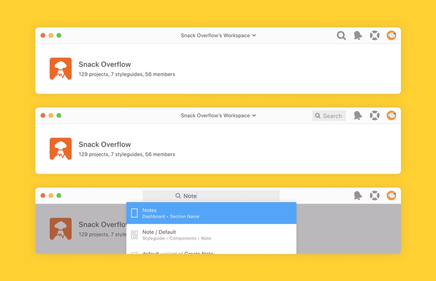
The access point for Global Search was also an area where we were especially considerate of multiple scenarios in the user experience. For one, it was important to us that Global Search was accessible from anywhere in the app because our users have so many different workflows within Zeplin that can benefit from a fast search. Second, because there was already a local search in Zeplin, we needed to prevent confusion between the new search and the local search.
Through several iterations of the access point, we landed on a substantial button (rather than an icon) that lives in the menu bar, is present all the time, and can be called with a shortcut.
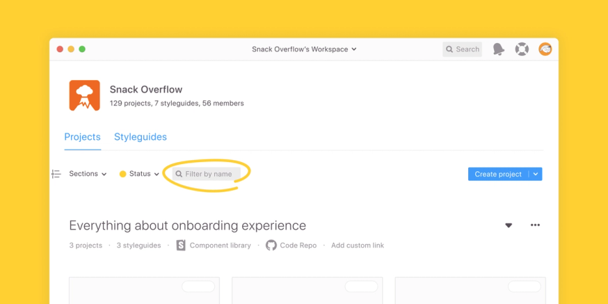
And to make sure this new search and the local search were easier to distinguish from each other, we moved the local search closer to other filters and changed its copy to ‘Filter by name’.
How to use Global Search
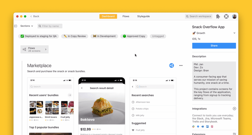
You can use Global Search from anywhere in Zeplin. Start by clicking “Search” in the top right menu, or with ⌘K on macOS or Ctrl+K on Windows, and enter a word or phrase to describe what you’re looking for. Global Search supports fuzzy search, so it’ll surface relevant results even if you don’t know the exact name of the resource you’re looking for.
For example, let’s say you plan to work on multiple different screens on a given day. With Global Search, you can search for the screens you need from anywhere in Zeplin and navigate quickly between them, savings you tons of clicks in just that one work session. Or maybe you’re working on something new and want to circle back to a past screen for reference, but don’t remember which project it was in. A quick query with Global Search from your workspace helps you search within all of the different projects your team is working on. This is a super helpful trick if you’ve got hundreds of projects going like we do.
And finally, remember that Zeplin organizes way more than just projects and screens, but also components, text styles, comments, and so much more. Global Search helps you access and discover those resource types across your workspace more easily as well.
What we learned and what’s next?
The steps we took to build Global Search weren't all that atypical from other features, but there were definitely moments and details about this journey that we’ll learn from.
For one, this process is a nice representation of how we strive to approach decisions here at Zeplin, in the sense that we’d rather take the time to do things right vs. make shortcuts to speed things up. We took the time to not only make sure that we were building the right thing and tackling the right pain points, but also that we built the thing right and offered an experience that seamlessly integrates with the rest of your workflow. Whether you’re a designer or not, I’d say that’s a big takeaway for understanding how we’re building Zeplin and what drives our thinking.
And secondly, making something complex look simple is the one of the most rewarding things to do when designing digital products, and it’s so much easier for teams to do this when designers and developers are in sync with each other. How we built Global Search really underlines the need for designer-developer collaboration before and after design handoff and that’s something product teams should be thinking more about.
What’s next with Global Search
We’re excited to make Global Search even more powerful and we have a couple of additions already lined up to go live within the first couple of months after launch. One is the ability to filter search results by type (e.g. projects, comments, components), and the second is results sorting options so you can view results by Date created or Last modified. There’s a bunch more after that, too — any guess on what they’ll be?
Go ahead and try Global Search for yourself in Zeplin and let us know what you think! And if you have any product questions or suggestions, just drop us a line. 📩

