
Everyone can remember a moment when they first heard a word and learned they’d been pronouncing it completely wrong in their head. For me, it was “segue,” which I’d been pronouncing like “segg” every time I read it. I was well into my twenties and had written more than one English thesis when I found out that Segway, the company, was just a clever misspelling of the same word.
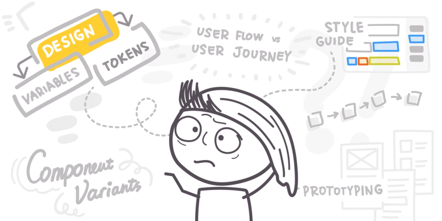
We all like to think that, once we’re advanced enough in a skill or industry, we’re immune to little errors like that. Not so! Really smart, qualified people make silly mistakes all the time — designers and developers included.
Here, we’ve gathered up the five terms that we hear used incorrectly by even the most advanced product pros. For each term, you’ll find the real definition — followed by an explanation of why, exactly, the term is so commonly misused.
1. User journey
A user journey is the path a user takes to accomplish any goal related to the product they’re using. When you open your mobile banking app to deposit a check, you’re beginning a user journey that ends when the deposit is completed. When you encounter a bug on that app’s login page, you’re beginning a user journey that will end when you successfully troubleshoot the issue (and may include a few error states along the way).
User journeys include everything the user does and experiences on their way to accomplishing their goal. That can include:
- In-app actions
- Web searches
- Online chats
- Phone support
- Physical trips to repair or exchange equipment
This entire journey is visualized using a timeline or “journey map” that details each of these actions as well as the thoughts and feelings the user has along the way. Product teams then use these journey maps to find and eliminate pain points, improve experiences, and generally strengthen the user’s relationship with the brand.
What’s confusing: user journeys vs. user flows
In the product development world, user journeys often start and end entirely within the product itself. As a result, product teams frequently confuse user journeys with user flows, but they’re two separate things with very different purposes.
A user flow is a navigation sequence made up of actions a user takes to move through a digital product. It can be visualized using the product designs themselves, or it can be conveyed using a flowchart or user flow diagram.
User journeys and user flows differ in a few key ways:
- User flows are limited to in-product actions, while user journeys happen across channels
- User flows focus on the user’s actions only, while user journeys include the user’s thoughts, feelings, and experiences
- User flows are used to optimize product experiences, while user journeys are used to strengthen and improve the user’s relationship with the product company
Think back to our mobile banking example. The user flow for a successful mobile deposit would be something like:
entry ➡️ login ➡️ select account ➡️ select task ➡️ photo capture ➡️ input deposit values ➡️ submit ➡️ confirmation ➡️ close
In a full flow diagram, we would also include paths for successes and failures, so if the app’s photo capture feature stopped working, the flow might include a path leading the user to an error page with options to chat with or call support.
The user journey for this same experience would include much more information, beginning with contextualizing details about the user, like their goals, behaviors, and constraints. The steps the user takes along their journey would also include more information, like this:
Step: Deposits check via mobile banking app
- Pain point: App won’t accept check photos
- Channel: Mobile app
- Experience: Annoyance
Step: Contacts chat support
- Pain point: Chat bot has insufficient answers/can’t solve problem
- Channel: Mobile or web chat
- Experience: Frustration
Step: Calls customer support
- Pain point: long hold times
- Channel: Phone
- Experience: Increasing frustration/anger
On the full journey map document, this series of steps would be displayed as a visual sequence with space for designers to add insights and highlight opportunities to improve the user experience.
The user flow helps product designers improve in-app functions and details, like where buttons should go, how menus should look, and which screens should appear at different steps. The user journey is much more detailed, giving designers key information necessary to identify user experience problems and design effective solutions.
2. Design token
Design tokens are the building blocks of the design system, and are a large part of what makes the design system a product team’s “single source of truth.” Each design token holds a particular style attribute (color, typeface, font, bolding, shadows, spacing, etc.) that will be used continuously throughout a product. Design tokens can then be applied across products, teams, tools, and coding languages, keeping all design decisions consistent across the board.
When a designer decides on a style attribute for a particular aspect of the design — let’s say the background color for all the buttons across a product will be cornflower blue — they’ll create a background-color: token with the value #438FE1. When the developer builds the product, they’ll use the background-color: token instead of hard-coding the specific hex value each time.
There are two major benefits to using design tokens:
- Update the token, not the code. If the style value for a design token is changed, every product element that uses that token will update immediately. The developer doesn’t need to go in and change each hard-coded attribute individually.
- Multiple platforms, consistent style. Design tokens are typically saved as JSON or YAML files, which are platform agnostic. The developer can code for web, Android, and iOS products with the same token instead of manually converting each style value between platform-compatible formats.
What’s confusing: design tokens vs. variables
A variable is an attribute whose visual properties can change. Variables make it easier to write code without having to remember the specific values for each style attribute.
When writing CSS code, for example, you would normally style each element using actual attribute values, like this:
button {
	background-color: #419bf9;
	color: #fbfbfb;
	border-radius: 12px;
}
Variables allow you to define variables with these values at the top of your code, and then use the variables to style each element.
:root {
	--cornflower-blue: #419bf9;
	--text-white: #fbfbfb;
	--rounded: 12px;
}

button {
	background-color: var(--cornflower-blue);
	color: var(--text-white);
	border-radius: var(--rounded);
}
Because design tokens also allow teams to label different style elements, it’s easy to get them confused with variables. However, there are a few key differences between tokens and variables:
- Variables exist inside a product’s code and can’t be applied across products. Design tokens are stored in the design system, so changing the value of a token will update that value in all products that use that design system.
- Design tokens are language agnostic, so one token can define an attribute for multiple products. Variables are specific to the language they’re written in, so if you define variables using px and want to reuse them on products that use pts, you’ll need to convert them first.
- Designers define design tokens with semantic names that explain the style attribute’s function, to provide clarity and eliminate confusion for designers and developers alike. Developers create variables after designers provide product specs in their original value format, and their primary function is to simplify the developers’ coding process. Designers don’t normally interact with code variables at all.
3. Component
A component is a product element that will be reused throughout the product to create a standardized user experience. Components can be any size, and components can exist inside other components as well. For example:
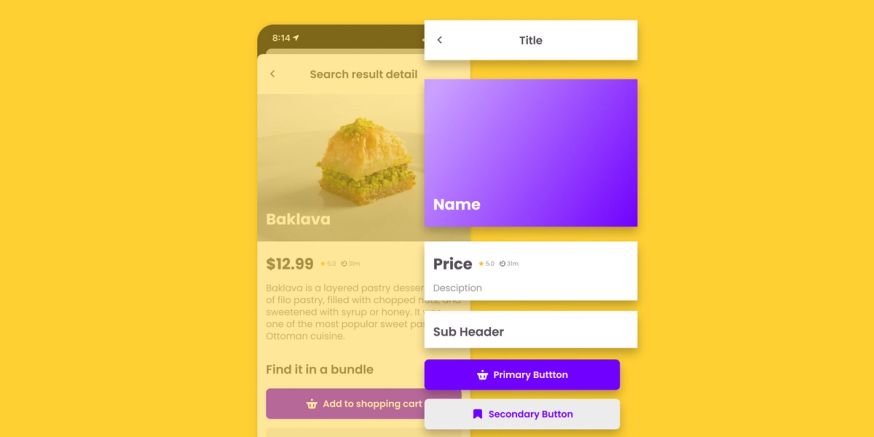
This app screen is broken out into pieces, and each piece is its own component. Some components contain additional components as well. The bookmark icon and basket icon are each components that are part of a larger button component. All of these components can be found repeatedly throughout the app platform.
Components are stored in the design system, and each time a component appears in a product, the developer can grab that component’s reusable code directly from the design system.
What’s confusing: components vs. elements
Components are often incorrectly defined as anything that’s used repeatedly throughout a product. But elements are also designed to be reused, and they’re not the same as components.
Whereas components have a specific definition, “element” can be used pretty flexibly. Referring to an element is a lot like referring to a “part” — the word itself just means a smaller section of a larger whole, so it will mean different things in different contexts. A design element is simply a part of a design, a product element is a part of a product, and so on.
The key difference between components and elements is that components are distinct pieces of a product, and elements can include things that aren’t components. For example, a particular style value, like a typeface or color, can’t be a component, because it’s not actually a part of the product design — it’s a stylistic decision that will be applied to parts of a product design.
The relationship between components and elements is a lot like the relationship between rectangles and squares. A square is a type of rectangle, but a rectangle isn’t a square unless it has certain characteristics (i.e., all sides being equal). In the same way, components can be elements, but elements are only components if they’re actual pieces of the product itself.
4. Style guide
A style guide is a set of rules and standards that govern the way product styles, elements, and components are used. It’s stored within the design system, and contains essential information about things like colors, typefaces and fonts, layouts and spacing, and how to use different components.
Style guides include written instructions and visual examples. If you write your style guide yourself, you’ll need to grab screenshots and image files to add to your document. If you use a tool that stores and organizes your style guides for you, you can tie your instructions directly to the appropriate elements and components in the design system.
What’s confusing: style guides vs. design systems, component libraries, and pattern libraries
Style guides are used to standardize the look and feel of a product. Design systems, pattern libraries, and component libraries also contribute to that standardization effort, so it’s easy to get the four things mixed up. It can be especially confusing because pattern libraries, component libraries, and style guides are all parts of the larger design system. Although there’s a good amount of overlap, all four are separate and distinct.
- A design system is a comprehensive resource that contains all of the components, style guides, patterns, and design tokens for a particular project or set of projects.
- A style guide is a set of instructions that dictates how designers and developers should use the components and elements contained within the design system.
- A component library is a collection of components, or reusable product elements, that are used repeatedly throughout a product.
- A pattern library is a collection of UI patterns, which are component groups that are used throughout the product to perform specific user functions. For example, individual buttons are components, but a menu made up of a specific set of buttons that has been agreed upon as the main navigation tool for the product is a pattern.
5. Prototyping
Prototyping is the step in the design process when designers turn a concept into an early model of a product or feature that can be tested internally. Prototypes are created on the design side of the product team, and don’t incorporate any code. Instead, designers use prototyping tools to add interactivity and dynamic functions to their designs so that the prototype “behaves” like a final product.
What’s confusing: prototypes vs. wireframes, mockups, and beta versions
There are a lot of different types of early product models, all of which have different characteristics and serve different functions. It’s easy to confuse prototypes with other pre-release models like wireframes, mockups, and beta products.
Wireframes
A wireframe is basically a product blueprint. It’s a two-dimensional sketch that outlines the basic structure of a product or feature. Wireframes use placeholders and annotations to indicate how the product is laid out, how it functions, and what the user flow for the product will look like. Wireframing is part of the concept creation process.
Prototyping is a separate step in the design process that comes after the concept has been finalized. A prototype is made up of actual product screens, not sketches. Whereas a wireframe will have annotations explaining what each button and feature will do, a prototype is clickable and should actually behave the way the final product will function.
Mockups
Mockups are fully designed product screens that have no clickable functions. They exist as a sort of hybrid that bridges the gap between wireframes (which have no designs at all) and prototypes (which use designs and have clickable functions). The purpose of a mockup is to let the team better visualize the product outlined in the wireframe and make any adjustments before moving forward to build a working prototype.
Beta versions
Though prototypes are considered “working” models, they only look and feel like a real product. Prototypes don’t actually perform product functions. For example, if you were designing a food delivery app, the prototype would look like a real app and would allow you to click buttons, change screens, and navigate through menus, but it wouldn’t have any of the functions required to show you local restaurants, contact drivers, or actually get you food.
A beta version is a legitimately functional version of the product that’s ready to be tested by a small group of real customers, but isn’t yet ready for a full release. The beta version of a food delivery app would actually allow users to order food, but it would probably still have plenty of undiscovered bugs and errors that required fixing before bringing the app to market.
As you can see, there are a lot of little nuances within the product development lexicon that make it common for even the most experienced designers and developers to misuse these trickier terms. When you’re also working on a highly detail-oriented project and trying to coordinate with an array of coworkers and teams, you want to do everything you can to simplify processes and eliminate opportunities for confusion. These little details might not seem like much, but going into a project well-prepared and thoroughly organized makes a world of difference.