Product design teams come in all shapes and sizes, and not all teams use the same design artifacts throughout their process. So while wireframes, mockups, and prototypes are all fundamental product design tools, it's not unusual for a designer to be less familiar with one or two of the three design types. If you've worked with larger teams on very complex products and UIs, you're more likely to be familiar with things like high- and low-fidelity prototypes than someone who's worked at smaller companies with leaner teams and processes.
Whether you're a new designer or an experienced one, there are lots of reasons that you might get mixed up between prototypes, wireframes, and mockups. Fear not — we’ve laid out everything you need to know.
The basics
Before we get into the details of each product design, here's a quick rundown of the basic elements of all three:
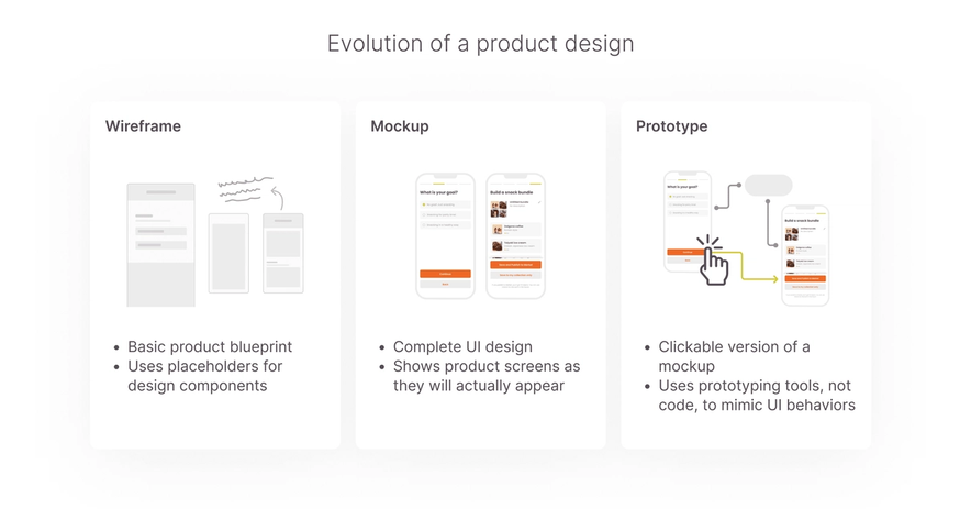
- Wireframe: a basic, bare-bones sketch of a product's layout, with shapes and placeholders that represent visual elements
- Mockup: a high fidelity representation of a product's user interface, featuring the actual design components that will later be used to build the product
- Prototype: an interactive, clickable version of a design that uses transitions and animations to illustrate how a user interacts with a product's UI

What's a wireframe?
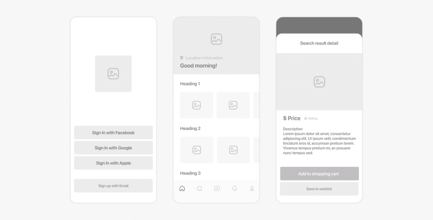
A wireframe is a low-fidelity sketch of the basic structure of a product and its features. It uses placeholder shapes to denote where things like buttons, menus, images, copy, and other components will go in the design.
Wireframes are usually the earliest drafts of a product's UI, used to make broad UX design decisions and to hammer out how the product will perform its main functions. They're primarily used to illustrate the UI's spatial layout rather than its visual style.

Pen-and-paper wireframes
In the earliest stages of the design process, designers use pen-and-paper wireframes to quickly sketch multiple different design ideas and solutions. Pen-and-paper wireframes are faster than digital wireframes, but they're also simpler and messier, so they're perfect for first drafts but not for long-term UX and UI work.
Digital wireframes
Once a design concept is approved, designers turn the paper sketch into a digital wireframe — a detailed grayscale blueprint of a product's UI. Whereas paper wireframes illustrate a design concept in broad strokes, digital wireframes use detailed placeholders for images, buttons, and copy and map out the actual sizes, shapes, and locations of different product components.
Digital wireframes are more time-consuming than paper drafts, but they’re also a key resource for most of the stakeholders on a product team. The extra time it takes to create them is a necessary investment to ensure a smooth product design process. Before designers start working on designing the actual user interface, UX teams use the detailed wireframe to make decisions about the product's user experience design. UX writers can use wireframes to start drafting product copy, and engineers can look at wireframe user flows to understand the scope and technical feasibility of the project that lies ahead.
What's a mockup?
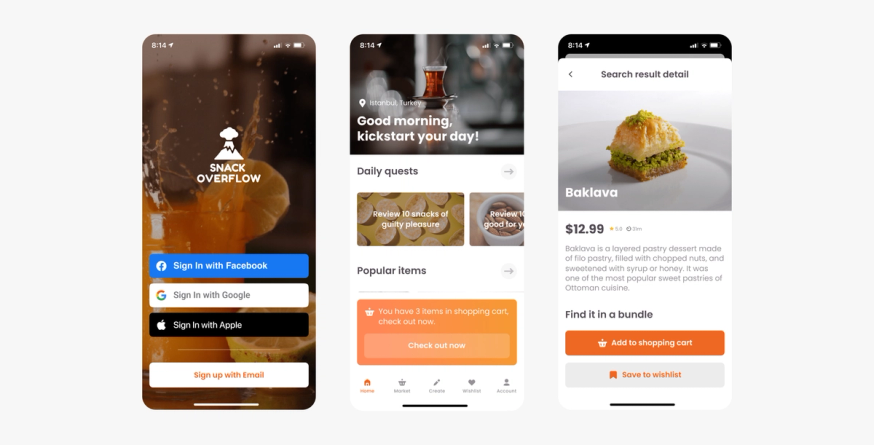
A mockup is a complete design of a product's UI. It's the natural next step in the wireframing process when placeholders are replaced with the actual components they represent. Some teams even refer to mockups as "high-fidelity wireframes."

Mockups fill in all of the stylistic details of a UI's visual design, like colors, fonts, typography, icons, and images. They also illustrate the information architecture of each screen — how copy is organized, formatted, and presented in a way that guides the user intuitively toward their goals.
Depending on the team and the product, designers may hand off the mockup and associated documentation to the developer to build. When a design is more complex, or if the product is brand new, the designers may opt to turn the mockup into a prototype.
What's a prototype?
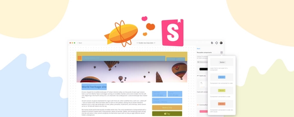
A prototype is a mockup with clickable functions that illustrate how the user will move between mockup screens. Prototypes don't use any code — prototyping tools like Figma, Adobe XD, or Axure allow designers to add basic functions like hover states, clickable buttons and menus, and animations that replicate how the UI will respond to the user's actions.
Interactive prototypes allow designers to run usability tests on a product's UI by previewing basic functions like screen transitions and component states. Product managers may also bring in small groups to perform early-stage user testing and gather feedback on their experience navigating the product interface.
Low-fi vs. high-fi prototypes
In general, when someone refers to a prototype, they're referring to a high-fidelity prototype. High-fidelity prototypes are created from finalized UI mockups.
However, there are some situations where it makes sense to test the product's usability before starting on the UI's visual design. If a product's layout is particularly unique or complex, UX designers may want to preview its basic architecture and navigation and make changes that could impact UI design decisions.
In these cases, designers may create a low-fidelity prototype, which is a clickable version of a digital wireframe. Just like in a wireframe, placeholders represent UI components like buttons and menus. But in a low-fi prototype, those placeholders will also behave like the components they represent — button placeholders will be clickable, menu placeholders will trigger screen transitions, etc. Prototypes may also include actual product copy (as opposed to placeholder text, which is more common in wireframes) so that testers can give feedback on the product's information architecture as well as the overall user experience.
The key to ensuring a smooth product design process is creating rock-solid, high-quality design artifacts that the whole team can use throughout the whole product cycle. It's tricky to strike a balance between creating all of the resources your team needs and managing a project's time and resource constraints. Understanding the differences between wireframes, mockups, and prototypes — and between the high-fi and low-fi iterations of each — can help you find the most efficient, productive way to equip your team, create high-quality products, and hit all of your deadlines.


