For many designers using Figma, the process of handing off designs to developers can be painful. Even with Figma’s live collaboration capabilities, the infamous friction between design and development is still a reality for many teams. Why is that? Can’t developers just dive into the Figma file and use the Inspect Panel to get everything they need to convert design to code? Well, not exactly.
Over the years the Zeplin crew has talked to thousands of our designer and developer users. Based on what we’ve heard, the three main issues affecting cross-functional collaboration in a design tool like Figma are:
• The need for clarity on exactly what to build
• A lack of organization and structure
• A disorienting workspace for non-designers
Let’s look at each of these challenges — and how we see a way forward to a better design delivery process.
Figma Handoff Challenge #1 - Lack of Clarity on What to Build
When designers hand off screens to developers, the first hurdle is establishing mutual clarity on what needs to be built. When designers and developers work together, one of the most common questions is, “Are these designs ready for development?” It’s a phrase that sends chills through the halls of both design and development teams whenever someone utters it through Slack, through email, or in person.
Why are developers asking this question over and over? We’ve realized that while developers can always access the latest design in Figma, what they actually want is a finalized design. What’s the difference? A finalized design is “locked” and no more changes are being made. It is ready for development.
Today, many teams will duplicate Figma pages for handing off to development and use branches to iterate. While these approaches are workable, managing duplicate design files is time-consuming — and inevitably involves copying over edits and feedback between files. This process is the definition of a workaround. It isn’t the best use of a designer’s time (especially as the comments keep streaming in the main file and working files).
Some teams also rely on unwritten rules or verbal agreements that “no one will make changes to the Figma file” once it’s shared with stakeholders. This may work for some smaller teams, but approaches like this simply aren’t scalable as projects increase in volume and complexity. Imagine: All it takes is one person with edit access unintentionally moving a button or changing a color to throw the team into chaos! This is one of the dangers of using the same tool for design and handoff.
How Zeplin Can Help
Zeplin helps solve this challenge by providing the ability to publish designs for developers and any other stakeholders on your team. Using the Zeplin plugin for Figma, designers can publish screens to the Zeplin workspace, signaling to the team that those screens are ready for development. Once screens are published to Zeplin, they cannot be edited — they’re locked. This gives developers the clarity and the answer they need: “Yes, these designs are finalized and ready to build.”
Designers also win with this approach. By separating the latest file from the finalized one, designers also gain the flexibility they need. We’ve even seen designers continuously work on future releases in Figma while developers work on the published versions from Zeplin. This is a more agile way to work for a lot of teams and frees up designers to focus on design while providing developers the clarity they need to quickly start development.
Figma Handoff Challenge #2 - Lack of Organization and Structure
Another point in the handoff process that often trips up the handoff process is setting up screens in Figma so that developers can actually understand how the different screens fit together. Because the Figma canvas is a boundless workspace for designers, it can be a confusing “wall of screens” for developers. While the limitless flexibility of the tool works great for the design creation process, this lack of structure can actually make handoff disorienting for developers. Designers also tend to set up their screens differently — some use a vertical layout, some a horizontal layout, and some might cluster the screens. In the end, this ever-changing context makes it challenging for a developer to understand some of the big ideas behind the designs.
A common workaround in this situation is for a designer to create tons of text layers just to help the team make sense of the design layout or to communicate how various screens relate to each other (like identifying states and breakpoints).
This approach is tedious. Figma designers often spend additional time in design review meetings and answering Slack messages and emails trying to clarify design layout to stakeholders. Take the Autodesk team, for example. Before they found Zeplin, Autodesk’s design team would spend one day per week prepping their design file for developers. Imagine how much more your design team could accomplish with an extra day per week! 🤯
How Zeplin Can Help

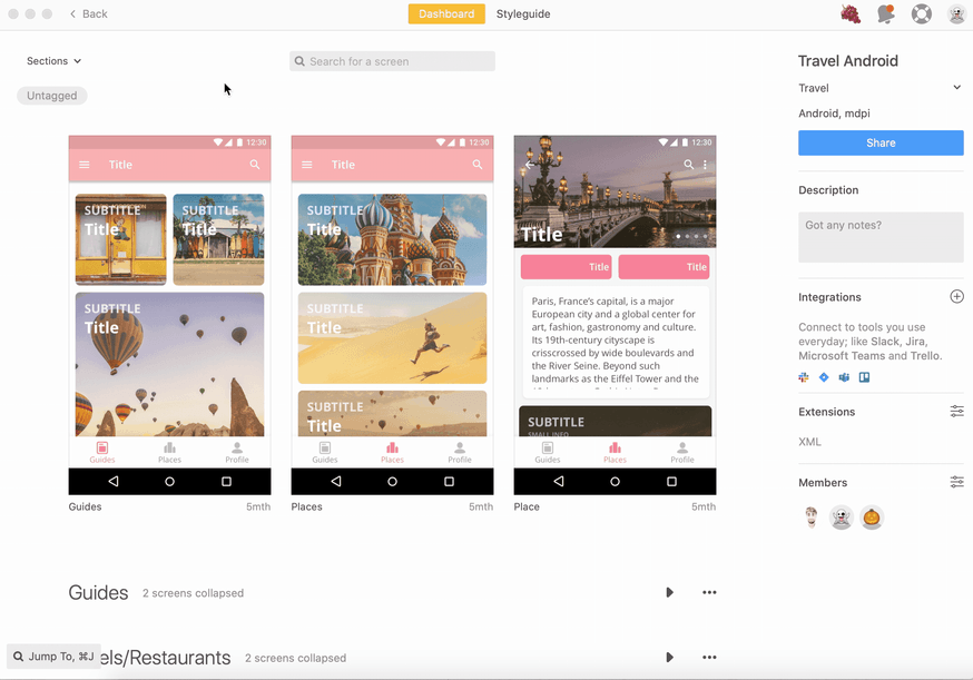
The Zeplin workspace provides much-needed structure to Figma design files. First, designers can publish screens into defined Sections, which work like nested folders. Let’s say you’re designing UI for a banking app. You can define a Section in Zeplin called “New Account Registration” and publish all the screens solely related to that workflow. Sections also allow you to include links to supporting resources like a PRD, research, timelines or any other reference content that your team might find helpful.
Second, you can use Tags in Zeplin to define and filter screens. For example, a designer might tag several screens as “For Review by Zo” so that Zo the developer can immediately access the screens assigned to her. It’s an easy way for stakeholders like Zo to quickly navigate the design file and access the screens relevant to their work at that moment.
Finally, Zeplin provides native support for Figma Variants. Any variations of screens or components defined in Figma are automatically transferred into Zeplin and sorted with defined Sections and Tags.
With the Zeplin integration, designers can still enjoy all the freedom of the Figma canvas without worrying about confusion among stakeholders. Bárbara Fontenelle, a Production Designer at digital agency ArcTouch, explained how Zeplin’s organizational capabilities help keep her team’s flow of work moving.“ Translating the wall of screens in Figma to an organized hierarchy in Zeplin connects the designers’ creative work to the developers’ production work, it’s a critical step in our workflow.”
Figma Handoff Challenge #3 - Disorienting Workspace for Non-Designers
Although non-designers can use Figma, that requires a baseline level of familiarity with design tools. For a non-designer, like a marketing executive who just needs to pop in to review UX copy, it can be a disorienting experience. If you spend your day in spreadsheets, slide decks, or code repositories, clicking a link to a Figma file can feel like landing on another planet. (And designers are all about empathy for the user, right? 😉)
We’ve seen designers hold training sessions with non-designers like developers, testers, product managers, copywriters, and marketers to familiarize them with the Figma canvas. While helping your teammates learn something new is hardly a bad thing, this might not be what your design team signed up for. That’s time they could have spent on design, not tool training.
How Zeplin Can Help
We built Zeplin to be a platform for bringing the team together in a more inclusive workspace — friendly and intuitive like the tools you use for work every day. Once designs are published to Zeplin, users can easily navigate the screens using that familiar nested folder structure. When users click on a Zeplin link, they go directly to those specific screens instead of a large and potentially disorienting design canvas. Zeplin also summarizes Comments at the screen level, a more intuitive way of tracking numerous comments. Instead of attaching a comment to a point on a canvas, Comments in Zeplin are always tied to the specific screens the user is referring to.
Katherine Lee, a UX Design Manager at Autodesk, explained the importance of inclusive collaboration and how Zeplin helped her team achieve just that. With Zeplin, she says, “team members from varying disciplines like product managers, UX writers and more can come together to deliver on designs.”
Deliver on the Promise of Design
Just because friction between design and development has been the norm, it doesn’t mean it’s the future.
Teams like Autodesk and digital agency Superformula look beyond the inspect panel to deliver on the promise of design. Instead of workarounds, they embrace Zeplin’s unique design delivery capabilities to clarify what to build, to establish organization and structure, and to create a welcoming place for non-designers. The results: time saved from needless documentation and trainings, better collaboration, fewer errors, and a higher quality product.
Learn more about how Zeplin can improve your team’s experience with Figma, or try out Zeplin for free.


