Highlights:
- Challenge: When you build critical operational software impacting millions of end users, how can you minimize risks in QA for each release? How do you proactively align all product stakeholders — product, design, development, QA, and more?
- Solution: Unify everyone with Zeplin: a connected space for product requirements, flows, designs, style guides, and design decisions. Zeplin is the source of product truth — ideal structure for devs and QA, intuitive for non-technical teammates, too.
- Result: Cargas Energy’s UX team can now stress less and work better together. No more confusion around design files, increased confidence that critical UX changes are always centrally documented, and significantly reduced QA “slog” — that final bunch of un-releasable bugs before each launch.
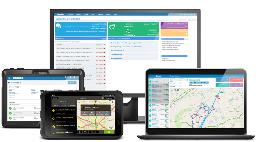
Cargas is an employee-owned software company based in Lancaster, Pennsylvania. While the organization thrives in its partnerships with Microsoft, HubSpot, Salesforce, and Sage, it also offers proprietary software and mobile applications for fuel delivery, called Cargas Energy.
Categorically an ERP, Cargas Energy covers everything from customer account management, fuel delivery, HVAC service, point of sale, cylinder exchange, and more.
The main thing you need to know is that Cargas is an intensely customer-focused software company, solving user needs at a level and speed that most product organizations only aspire to.
Here’s a tangible example of what they build: you know those big trucks on the highway with a rounded tank on the back? Cargas’ technology helps the businesses who operate those trucks forecast, route, and fulfill fuel deliveries to their customers.
Just like if you would pull up your car to gas station and that pump itself has to be inspected and registered to make sure that when you get a gallon of gas, you're really getting a gallon of gas. The same thing happens on these trucks. Our software and mobile application sits in that truck, and connects to those certified meters as they physically move the fuel around.
Customers are at the heart of their product story and organization
When talking to the two designers at the center of Cargas’ UX process, Ethan Diehm, UX Design Team Lead, and Amanda Mooney, UX Designer, it was immediately clear that their product team’s close collaboration and transparency are a reflection of the company values and how the company began — with a steady focus on teamwork, customer care, and shared success. What makes their team’s success even more sweet is that the company is majority employee-owned.

Today, Cargas serves hundreds of customers and millions of end users all across the United States and Puerto Rico. Let’s talk more about what — and how — their team is building for these valued customers.
Building critical software with real-life impact
Ethan and Amanda’s product team consists of 4 product managers, 8 dedicated developers, 5 QA team members, and a number of others in leadership and technical deployment who all closely collaborate throughout every release cycle.
When working together on any feature, product discovery, planning, and early UI iterations happen across Productboard, Figma, Confluence, and Jira (and previously Balsamiq and Adobe XD), but they bring it all together in Zeplin. Zeplin has been the most effective connector across their product team, and it’s the tool they’ve found to be best suited to help them solve their organization’s unique challenges.
Those unique challenges include three realities about their technology and customers:
- They have a large product suite of multiple regulated and integrated software and hardware, so they need to carefully manage a high volume of UX designs and information
- Every release has a significant impact on their customers’ day-to-day operations
- Any product disruptions or bugs can result in serious real-life impact on end users
Here’s what Ethan shared about each of these challenges.
High volume of UX designs and information
“Hundreds of thousands of physical devices we support sit on tanks, and they virtually ping information over cell networks — like the amount of fuel that's sitting in a tank — back to our system. That all gets swept into automatic delivery processing. So imagine the impact this could have to a hospital in the middle of nowhere. The emergency generators may kick on, but it absolutely cannot run out of fuel. This is an example of the hardware that floats out there that we integrate with, and the information we need to manage."
Customer impact of every release
“We have some mammoth companies using us as core operational software. So when we release changes, they have to go through hours of training with hundreds of employees. We can't just be like ‘okay, a new version is up, here you go!’ There are specific processes for testing, and training environments specifically to ensure product changes aren’t disruptive.”
Consequences of product quality issues to the end user
“The worst thing in our industry is called a fuel tank run out. Like, what if you’re in Michigan, the temperature is -20, and you have a newborn. All of a sudden your furnace shuts off. From one angle, someone might discount that as just a bug in the software. But it means much more. You really do not want to mess up your features and how things work for those reasons.”
Iterating on their ideal UX workflow
So how do they build products against these challenges? Well, it’s all in their workflow, which they’ve been continuously improving for some time.
Confluence and Jira are two workflow mainstays for designer-developer and broader product team collaboration — Confluence for written requirements, and Jira for development tasks. And prior to finding Zeplin, their approach to design delivery went through a few different approaches.
Adobe XD was their primary design tool a few years ago, and that meant there was some redlining and other manual steps involved in their design-to-dev workflow. Then in 2022, when the now-cancelled Adobe-Figma merger was announced, they migrated from XD to Figma.
While they did their best to “do-it-all” in Figma, like many teams try to do, over time they began to discover a pattern of workflow problems:
- Developers were asking to see products requirements and designs more closely together.
- Various team members involved in their UX process were getting confused and overwhelmed trying to understand large Figma files.
- Amanda, as their main designer, noticed that everyone was jumping into Figma with hopes to collaborate, but “all-in-one” was actually causing stress and friction for herself and the team.
That's how we got to Zeplin. It came from a struggle and realizing that, frankly, Figma didn’t work as a sharing tool for us. It's a design tool, and we were getting lost trying to force it to be that.
A Zeplin workflow for driving UX quality and transparency
Using Zeplin as the main connector across their team’s UX process helped Ethan and Amanda solve their workflow problems almost instantly.
And as a bonus, Zeplin also elevated UX design within their organization and drastically reduced the number of critical bugs that made it into QA — two unintended but hugely positive benefits that made an impact across the business.
Here’s more on how Zeplin helped Ethan, Amanda, and all their product collaborators achieve a smoother UX workflow so they can better serve their customers:
1. Zeplin gives developers a clearer visual connection between designs and requirements
An easy way to keep documentation in context with designs
For Ethan and Amanda, it was important to listen to their devs and give them the experience they were asking for: being able to see product requirements and designs in a more connected view.
Using Zeplin made so much sense for this, since it displays requirements and designs in a way that’s tailored to how developers can more easily consume them. For example, here’s how their Annotations are structured on a design screen.
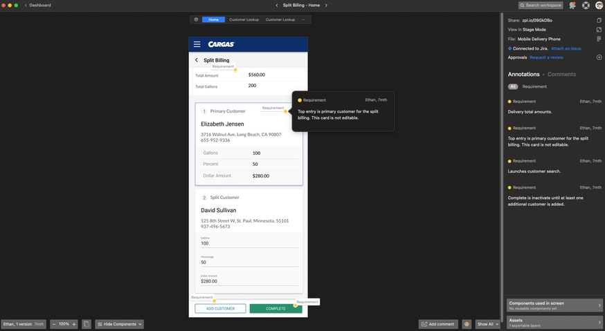
Our developers were looking for product requirements and prototypes to be more married together. That was where Zeplin came in. Zeplin comes in between design to development, and even into QA, as a way to clearly and visually tie together those requirements with our archive of designs.
Quickly communicate the full UX journey devs need, with Flows
Their developers’ request for a more “married” view of requirements and prototypes was also about the full UX journey. Ideally, they could see the entire user flow in one view so they’d have a stronger reference for what to build.
You can make flows in other tools, but Ethan and Amanda saw Flows in Zeplin as a more fitting solution, since you can map and annotate Flows with actual screens. This created a better experience for devs and was also simpler to maintain.
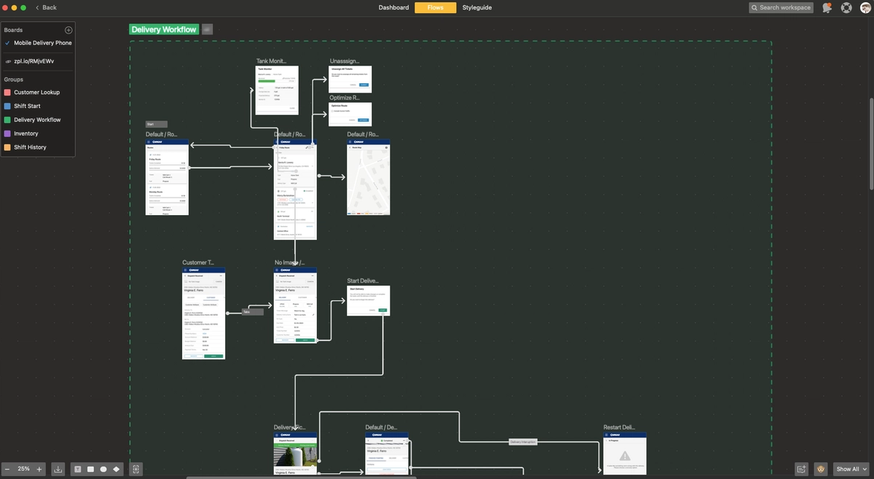
I swear we could have gotten a hug from our development team when we started using Flows in Zeplin. We’ve been re-doing our main app, which is a massive project with lots of screens and variants. Having that documented in a Flow makes it so clear and, as a designer, I love that when I re-push it or update individual screens, the Flow updates automatically.
Over time, Flows has become a core piece of design documentation for their team that helps them increase alignment and quality across all of their many complex projects.
Flows in Zeplin has been like an insurance policy for our entire UX team that everyone is communicating and talking on the same page and understands the full picture of things.
2. Zeplin is their single source of product truth, fitting how collaboration happens across the org
Centrally capture design decisions so they don’t get lost in chats, meetings, and tools
As a feature works its way through the UX process, there are almost always side conversations about it up until its release. It could be about something as small as a single button that needs adjusting, or some unapproved copy on a screen that needs to be revised.
This type of thing regularly happened in Ethan and Amanda’s team. And rather than hoping that anything critical to the build didn’t get lost in a siloed conversation, Zeplin has become the perfect central place for their team to document all final product decisions.
When we're working on a feature, Ethan and I will talk about it. I might talk about it with the PM. We might also have a group message and separate meetings. I might have notes in Figma, but then there are also notes in Confluence. Then for Figma, not everyone has the same access — certain people can comment in Figma and certain people can't. But with Zeplin, it’s great to be able to just say, here's the link, this is everything you need to see.
Curate and showcase your UX vision, separately from messy design work
Figma is extremely flexible, and that’s both a blessing and a curse. When you have a lot of design projects at different stages of readiness (and messiness) sometimes you just want to keep in-progress work separate from the designs that others huddle around.
This need for separation is something Amanda experienced a lot when they were using only Figma, and it’s why she’s now grateful to have Zeplin as their UX team’s dedicated gathering space.
With Zeplin, I'm in control of what gets pushed over. I don't have people poking into things that are not ready to be poked yet, but I can say “this is exactly what’s ready for you, at this link” and it's the same link all the time. Zeplin compiles everything into one place and separates that from all of the messy stuff that's happening.
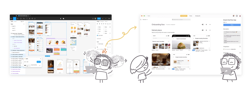
This has also benefited other team members across the company who also need to review, understand, and even approve designs, but are less technical than designers or developers — such as executive leadership, operations, and product owners. Amanda regularly heard feedback that Figma was not digestible for the average person.
When we were sharing Figma files across our team, there was a lot of feedback that it’s not digestible for the average person. When looking in Figma, one of our PMs would say “I don't even know how to look at this.” So Zeplin definitely breaks it down so if you're not a designer, you're just seeing what you actually need to see — versus all of the crazy layers and stuff that would get stressful.
3. Zeplin minimizes bugs that make it to QA, simply by creating more design-to-dev structure
We all know that during development, there’ll often be last minute design adjustments (that come after “handoff”) to get things to the finish line. The changes themselves may seem small, but because it isn’t always clear who made what change, on what screen, and when, they’ll accumulate and re-emerge in QA as inconsistencies to correct or bugs to fix.
This was definitely the case for Ethan and Amanda’s team. There wasn’t an easy way to communicate these “last mile” design changes without manual coordination in Figma and across other tools — a lot of the time they just hoped their devs got things close enough.
Zeplin’s structured approach to version control solved this for them right away — saving them and their devs tons of time in second guessing, QA, and rework.
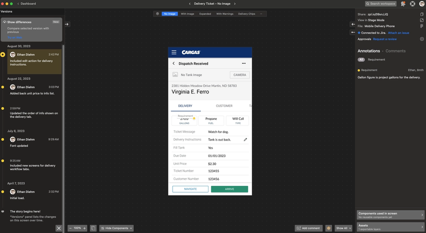
Before, when a last minute design change happened we’d have to ask ourselves…did I update the design for that yet? Did I mention that everywhere? Is it attached to the right Jira item? I don't know. With Zeplin’s versioning, you could see an exact record and annotation of what’s changing which is really nice. It wasn't like we were coming from a better way of versioning — we had no versioning.
Using Zeplin to unite everyone around the same product vision
For teams building digital products, there's always time pressure to release things, right? And while there’s always the instinct to just push through and go faster, what’s far more effective is looking at your entire UX process and thinking of basic principles — things like teamwork, customer care, and shared successes.
For Ethan, Amanda, and the Cargas product organization, adding Zeplin has fit perfectly into their core values and their team’s focus on continuous improvement. As a result, everyone across product, design, development, QA can all work better together to drive value for customers.
Our shared success purpose underpins everything we do. As a product company, achieving our revenue goals hinges on collective effort. If I throw the developers under the bus with convoluted design documentation, that doesn't help anyone. We have to be cognizant of how our outputs are consumed by all the other members of our team. Transparent and clear communication about our designs not only improves the product but also contributes to our team’s shared success.
Has your team been through similar challenges as Ethan and Amanda's team? If you have, and are looking for a better way to document, organize, and collaborate on your UX designs — try Zeplin for free or join an upcoming Zeplin group demo.
Cargas is an employee-owned software company with more than 180 employees. Cargas is the creator and provider of Cargas Energy, leading software for fuel delivery and HVAC service companies. With tools for fuel delivery, customer service, HVAC service, and cylinder exchange operations, Cargas Energy helps fuel dealers do more with the resources they already have so they can grow their businesses.
Through its unique employee-owned culture, Cargas fosters a commitment to excellence, a dedication to teamwork, and a high level of customer care. Established in 1988, Cargas has continuously been recognized as a Best Place to Work. The Cargas team is proud to be recognized for these additional achievements:
- Best Places to Work in PA
- Inc. Best Workplaces
- Inc. 5000 Fastest-Growing Private Companies
- Samaritan Counseling Center Ethics in Business Award winner
- NCEO Innovations in Employee Ownership Award winner
- Central Penn Business Journal Business of the Year
For more information, please visit cargasenergy.com.

