Zeplin acts like a workflow connector between designers and developers. And since this transition looks different for every team, we’re always thinking about how we can help our users customize their Zeplin workflow to their needs and add efficiency wherever possible.
And so, one of the more exciting aspects of my role is answering our users’ questions about customization and helping them explore how to extend their Zeplin workflow with our SDK.
In this blog, I’ll show you a practical example of how your developers can use our SDK to automatically download icons from a Styleguide in Zeplin. This way, in addition to having Styleguides as a central reference for reusable UI elements, developers can also grab elements they need from it quickly.
About Zeplin Styleguides
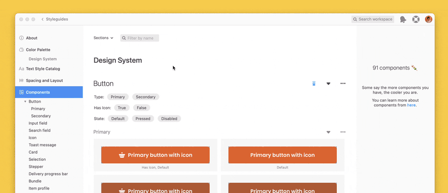
Using Styleguides in Zeplin means you can reference one resource for all reusable elements and design system components during development — vs. multiple links to different design libraries which might be in different states of readiness and organization.
As your unified reference, your team’s Styleguide will typically contain all of your assets, like icons and other images used throughout your projects. These assets will also be organized alongside other reusable components, such as input elements like selectors, radio buttons, and text fields.

When it comes to say, icons, most teams will have dozens or more in their Styleguides. So you might be wondering — do I have to download them all individually? Ideally, there’d be an option to bulk download all of your icons locally so that you can manage them in your app.
Along with common naming practices of our icons in our Styleguide and the Zeplin Javascript SDK, we can make this happen!
Getting Started with the Javascript SDK
To get started with using the Javascript SDK, check out our tutorial. Once you are set up with your Personal Access Token set up in your .env file, you’ll be able to continue with the rest of the steps below.
Installing Dependencies
You’ll need Axios for our HTTP request handler. Zeplin’s Javascript SDK actually uses Axios already behind the scenes, but we’re going to supply the SDK with a custom handler that uses axios-rate-limit to help make sure we throttle the requests a bit. The Rate Limit for requests to the Zeplin API is 200 requests per minute per user, so if you’re working on a big project with a lot of screens and assets adding this custom HTTP request handler with rate-limiting built-in will ensure you don’t get blocked by the rate limits.
Downloading and writing so many files at a time can be taxing on your system, so, similar to rate limiting, we'll be using the p-limit library to manage the number of concurrent downloads. And you may not want all of the assets, so if you just want to download SVG’s or just the PNG assets, we can give our app some extra options like that using Commander. And since we could be downloading a lot of assets at a time, it would be nice to see the progress in the command line so we’ll be using the Progress library to build that.
Finally, we’ll use dotenv to help safely store our personal access token and any other environment variables you might need. If you want to install all of those in one line, here you go!
$ npm install @zeplin/sdk axios axios-rate-limit p-limit commander progress dotenvIf you haven’t already, let’s create our file download-styleguide-icons.js and start importing our dependencies.
import { ZeplinApi, Configuration } from '@zeplin/sdk';
import axios from 'axios';
import rateLimit from 'axios-rate-limit';
import fs from 'fs/promises';
import { config } from 'dotenv';
import { Command } from 'commander';
import Progress from 'progress';
import pLimit from 'p-limit';
Configuring Environment
config({ path: '../../.env' });

const { PERSONAL_ACCESS_TOKEN } = process.env;
Here, we configure the environment using dotenv to load environment variables from a .env file located in the root directory. Your directory path may vary — the example above is from the repo of other SDK scripts that contains an environment file for other variables needed in those scripts. You can reference .env.example in the repo above for setting up your environment file. The only variable we’ll need for this is PERSONAL_ACCESS_TOKEN.
Initializing a Zeplin Client
const http = rateLimit(axios.create(), { maxRequests: 200, perMilliseconds: 60000 });

const zeplin = new ZeplinApi(
  new Configuration({ accessToken: PERSONAL_ACCESS_TOKEN }),
  undefined,
  http,
);
This section initializes the Zeplin API client using the personal access token obtained from the environment variables and sets up Axios with rate limiting to prevent exceeding the Zeplin API rate limits, setting a maximum of 200 requests every minute(60000 ms).
Fetching Styleguide Components
Now we’re ready to retrieve the components from the styleguide using the Zeplin SDK’s method components.getStyleguideComponents().
Calling that method will return all components in the styleguide, which isn’t what we want, so we want to filter these results to only include icons. It’s a common naming convention to name icons with a prefix like ic-, icon-, ico-, etc.
Let’s create a simple filter for the results first to only include components that start with a given prefix.
const filterComponentsByIdentifier = (components, identifier) => (
  components.filter((item) => item.name.startsWith(identifier)));
Once we have our filtered list of component objects, we’ll parse through them to get the URL’s for image files to download and then also update the name of the image file for easier referencing once they are stored locally. In the code below, I replaced any slash characters with dashes. Using a slash is common in naming conventions for design system components, but the fs module will interpret these slashes as a nested directory so in order to keep our files in the place we intend, we’ll replace them with a hyphen.
const parseComponents = (filteredComponents, formats, density) => filteredComponents.reduce((acc, item) => {
  const latestVersion = item.latestVersion || {};
  const assets = latestVersion.assets || [];
  // density array returns string types when command is run. Convert to numbers.
  const parsedDensities = density.map((str) => Number(str));
  assets.forEach((asset) => {
    const { layerName } = asset;
    const contents = asset.contents || [];
    contents.forEach((content) => {
      if (formats.includes(content.format)) {
        if (parsedDensities.includes(content.density)) {
          acc.push({ name: layerName, url: content.url, filename: `${layerName.replaceAll('/', '-')}-${content.density}x.${content.format}` });
        }
      }
    });
  });
  return acc;
}, []);
The Zeplin API docs can be referenced here for understanding the Component schema, which includes a latestVersion property if we pass in the option when calling the endpoint. The latestVersion property will include data for the image file download URL from the CDN.
With our functions to help us parse the data, it is time to handle actually calling the Zeplin API to retrieve the components from the styleguide. There may be a lot of components and the endpoint takes offset and limit parameters, so we’ll call the function in a while loop until 0 results are returned and use the offset and limit parameters to handle pagination.
We’ll create the async function getStyleguideComponents and pass in our Styleguide ID, followed by an object of our options. Be sure to include the includeLatestVersion = true option to make sure we have access to the latest component version for the image file download URL.
const getStyleguideComponents = async (
  styleguideId,
  {
    offset = 0, limit = 30, includeLatestVersion = true, formats, identifier, density,
  },
) => {
  // initialize array to save all components for paginated results
  let components = [];
  let hasMoreData = true;
  // Handle pagination
  while (hasMoreData) {
    const { data } = await zeplin.components.getStyleguideComponents(
      styleguideId,
      { offset, limit, includeLatestVersion },
    );
    if (data.length === 0) {
      hasMoreData = false; // No more data, exit loop
    } else {
      components = components.concat(data);
      offset += limit; // Update offset for next page
    }
  }
  const filteredComponents = filterComponentsByIdentifier(components, identifier);
  const parsedComponents = parseComponents(filteredComponents, formats, density);
  return parsedComponents;
};
Downloading Assets
Almost there. At this point we have a filtered list of the icons with the relevant data we want from them like the density and file format. Next we’ll create a function to download a single icon and then iterate through the list of icons to run that function.
We can name this function downloadAsset that takes in the parameters of the name, url, and filename from the component object we created when we were filtering and reducing our components in the previous step. We’ll also passing in our progress bar that we’ll create later, and progress.tick() at the end of our function will move the progress bar forward in our command line.
const downloadAsset = async ({ name, url, filename }, dir, progress) => {
  try {
    const { data } = await axios.get(url, { responseType: 'stream' });
    // Create a new directory called "Icons" and a new nested directory for each icon.
    // This keeps icons with different densities organized together in the same folder.
    await fs.mkdir(`${dir}/${name}`, { recursive: true });
    // Remove the "dir" and "name" folders if you want all of your icons in a single folder
    await fs.writeFile(`${dir}/${name}/${filename}`, data);
  } catch (err) {
    console.log(`Error downloading ${name}`);
    console.log(err.config.url);
  }
  progress.tick();
};
When we call fs.writeFile() we pass in the directory name, icon name, and the formatted filename of the icon. You can change this formatting to suit your needs on how you would like your icons organized locally.
Programming the Command Line Interface
It’s time to start our command line function with Commander. We’ll call it program.
const program = new Command();
Then we’ll set up the command-line interface calling program, so we can add options such as styleguide ID, icon formats, identifier, and density with Commander’s methods .requiredOption() and option(). These methods take in 3 arguments and we’ll use the first required option for Styleguide ID as an example:The first argument is the shorthand that we’ve called-s, and then longhand which is--styleguideId followed by the variable name you’ll used to reference the argument later. Lastly, if someone were to add the flag--help they would see what’s in the third argument, which is a description of how to use the option. When using--help the user would see a list of all possible options that can be used with the command line interface for this program. Read more about how to use Commander here.
program
  .requiredOption('-s, --styleguideId <styleguideId>', 'Styleguide ID')
  .option('-i, --identifier <identifier>', 'Identifier for filtering icon naming convention', '')
  .option('-f, --formats <formats...>', 'Formats to download', ['png', 'jpg', 'webp', 'svg', 'pdf'])
  .option('-d, --density <density...>', 'Asset density to download', [1, 2, 3])
  });
The remaining options are for setting the identifier(the common string that icon components share so we can parse through all components and pick out just icons), which formats you would like downloaded, and which densities to download. After we define all the options, we’ll use the action() method to put together all the functions we worked on before. So we can just chain on:
.action(async ({
    styleguideId, formats, identifier, density,
  }) => {
    const components = await getStyleguideComponents(
      styleguideId,
      { formats, identifier, density },
    );
    return components;
  });
So far we’re just returning the components, filtering out the formats and density supplied by the user and also matching with the identifier provided in the options too.
And now that we know how many components we’ll process, we can take note of the progress with a progress bar in the command line using the Progress library. It will be drawn with an = equals sign as the progress moves over a blank space, taking up to 20 spaces as the width we define.
const assetsBar = new Progress('  Downloading styleguide icons [:bar] :rate/bps :percent :etas', {
      complete: '=',
      incomplete: ' ',
      width: 20,
      total: components.length,
    });
For the handling of the files with Node’s built-in fs module, we’ll save all the icons in the same folder as this script nested in its own folder called icons and remove any existing before the script starts with fs.rm(), followed by creating the directory with fs.mkdir()
 await fs.rm('icons', { recursive: true, force: true });
 await fs.mkdir('icons');
We’re using p-limit to also limit our promises to only 20 concurrently, in addition to managing our ratelimiting with the HTTP provider we created earlier. Then as we map through the component list, we’ll wrap the function for downloading each asset inside the limit instance:
  const limit = pLimit(20);

  const downloadComponents = components.map((asset) => (
    limit(() => downloadAsset(asset, 'icons', assetsBar))));

  await Promise.all(downloadComponents);
  console.log(components);
return components;
Note that we’ve also passed in our assetsBar for keeping track of the progress which will run the method tick() after every iteration.
Here’s the program in its entirety:
program
  .requiredOption('-s, --styleguideId <styleguideId>', 'Styleguide ID')
  .option('-i, --identifier <identifier>', 'Identifier for filtering icon naming convention', '')
  .option('-f, --formats <formats...>', 'Formats to download', ['png', 'jpg', 'webp', 'svg', 'pdf'])
  .option('-d, --density <density...>', 'Asset density to download', [1, 2, 3])
  .action(async ({
    styleguideId, formats, identifier, density,
  }) => {
    const components = await getStyleguideComponents(
      styleguideId,
      { formats, identifier, density },
    );
    const assetsBar = new Progress('  Downloading styleguide icons [:bar] :rate/bps :percent :etas', {
      complete: '=',
      incomplete: ' ',
      width: 20,
      total: components.length,
    });
    // Remove existing icons folder and create new one at start of script
    await fs.rm('icons', { recursive: true, force: true });
    await fs.mkdir('icons');
    const limit = pLimit(20);
    const downloadComponents = components.map((asset) => (
      limit(() => downloadAsset(asset, 'icons', assetsBar))));
    await Promise.all(downloadComponents);
    console.log(components);
    return components;
  });

// call the program
program.parse(process.argv);
Putting It All Together
At the end of our code, we’ll call on the program’s parse method to parse the command-line arguments and executes the defined actions based on the provided options. Let’s try out our program in the command line.
$ node download-styleguide-icons -s 12345678 -i ico -f png svg -d 1 2
This would download png and svg images in 1x and 2x density for components in the styleguide with ID "12345678" that start with the letters "ico" in their name.

Was this helpful? If it was — and/or if your curious about other ways to extend Zeplin for more power and efficiency — check out these additional resources:
- Downloading screen images with Zeplin Javascript SDK
- Downloading all assets from a project with Zeplin Javascript SDK
- Zeplin Integrations and add-ons (Storybook, Jira, Azure DevOps, Slack, and more)
You can also check out the source code and more helpful scripts that use Zeplin’s Javascript SDK from the Zeplin Community GitHub Repo.
And if you have any questions or want to share what you're building, come join the developer community on our Discord server — see you there!


