
Design systems are still relatively new, but within the past five to ten years there have been a lot of changes in growth and development. If you are in design, development or product management, you know that product teams try to iterate faster now. That’s why design systems are super valuable and why they are a critical piece for all of these teams to work collaboratively together.
Since you’re reading this, I’m sure you know about the importance of needing a design system that’s dynamic and future-proof. As a developer myself (now leading product) I definitely understand the value. However, most design systems are still operating with a lot of disconnect and inefficiencies . So how can we solve these issues? What will design systems look like in 10 years? Before we get to that though, let’s first take a look at the history of design systems.
How design systems came to be
Let’s take a trip down memory lane to 2011. Blackberry was still popular, and Adobe Photoshop was the standard design tool. Photoshop offered no reusability features for most design components. This wasted a lot of time for designers who had to redesign components that had already been created before.
In addition to Photoshop, I’m sure most of you will remember Adobe Fireworks. It was slightly less popular but still commonly used among UI designers. Fireworks had one key feature, symbols, that shaped the future of UI design. Hard to imagine a world without symbols, right? Symbols combined graphic elements to represent a UI element and could be stored for reuse later for future projects, significantly reducing the time needed to create a design. Unfortunately though, Adobe discontinued Fireworks in 2012 since they thought there was a lot of overlap between their different tools. (Hint: They later introduced Adobe XD.)
Now let’s fast forward to 2014 — a big year for designer and developer tools. Sketch v3 was introduced and popularized Sketch as a leading design tool. It had a major focus on reusability and re-introduced symbols to the design process.
Reusability is nothing new for developers, but in 2014 something important happened: React was announced. React was designed to be a component-based library, and helped developers think in a more component-driven way. This encouraged developers to think more and more about reusability and how this could save them time and improve efficiency in writing code.
Reusing together
Although designers and developers started prioritizing reusability around the same time, initially they were both doing this separately. Designers were reusing symbols in their design file and developers were reusing components in their codebase. So a big question rose to the surface: why not reuse together?
This marked the birth of design systems — the shared understanding, the contract between designers and developers.
What is a design system?
Design systems were formed with a focus on tools that encourage reusability — a way to work and share things more efficiently. A design system is usually made up of three parts:
- Design files - hosted on design tools such as Figma or Sketch, with symbols and components designed and maintained by designers.
- Source code - built and maintained by developers on a codebase optionally through tools such as Storybook.
- Documentation - a collection of all design system elements, together with rules and how-tos, which are hosted on custom websites or tools like zeroheight.
The collaboration between designers and developers and each of the tools they use is what turns this into a design system — a completely new way of working collaboratively.
But there’s still something missing here that creates a lot of challenges within modern design systems: the link or connection between the design file and the source code.
Challenges with the source of truth
Among teams that use design systems, there’s one very important question that’s often asked: “What is the source of truth?”
The answer? Some developers believe it's the source code — that’s what users see at the end of the day, right? Some designers believe it's the design file, or the documentation they spent so much time on. There’s nothing keeping these in sync, making it a pretty fragile system. The design file and the source code technically represent the same thing, but there is no real connection between them. The designer and developer both work in their own separate tools.
There have been lots of tools created to try to solve this problem but there isn’t a perfect solution just yet. With three sources of truth that need to be maintained manually, you can imagine the time spent trying to keep each source up-to-date!
Here’s an example: there is a primary button in the design file and a primary button in the source code. Let’s say the designer makes a change to the button. So now the designer has to update the documentation and update the developer about this change. Doing this manually makes things time-consuming and way more prone to error. Now there is more back and forth, more steps to be taken, and more files to update. So how can we solve this problem?
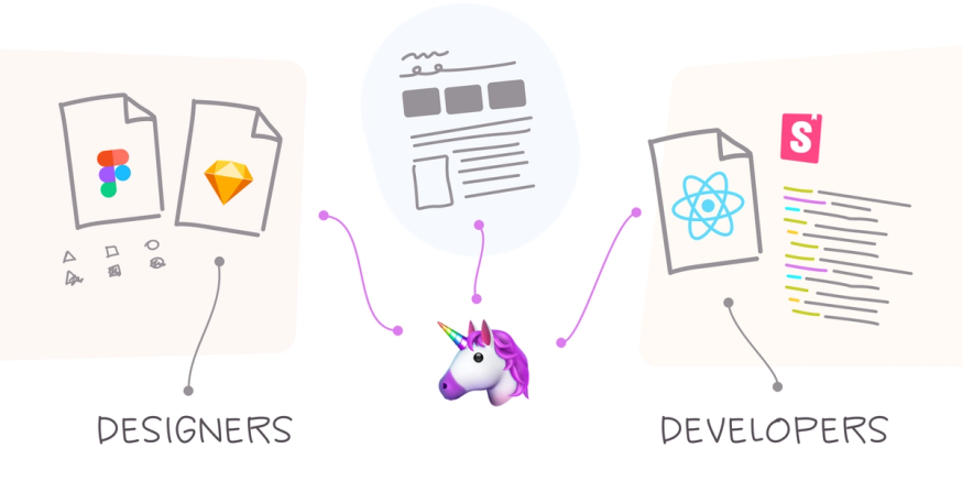
A glimpse into the future with connected tools
Let’s say there’s a future where we have an integrated design system that's shared across all three sources. Let’s call this “the unicorn” for now. Designer and developer tools now communicate with one another through the unicorn, so that they're kept in sync automatically. 🦄
This is ideal because designers and developers can continue to work within the tools that they feel the most comfortable with. There are actually some design tools that have tried to solve this before, but it meant sending a developer into a design tool they weren’t familiar with, or vice versa, which only slows down the process.
So how do we get to this stage? Where can we find the unicorn? What do we do in the meantime?
Design tokens are the stepping stone to the future of design systems
If I had to guess, probably five to ten years from now all components will be in sync across the entire software development process. But for now, how do we keep at least some part of it in sync? Design tokens are a great starting point. Design tokens are standards that tools can rely on to share pieces of a design system. Today, they are able to represent simpler design system elements like colors and text styles, and they kind of fall short when it comes to more complex elements like UI components.
To get to the solution we’re looking for, “the unicorn”, we need our tooling to work together and share the same underlying data. This way whenever a designer updates a component, the same update is reflected on the codebase. Design tokens are simply the infrastructure that this future will be built upon: 10 years from now, ideally we won’t even be thinking about design tokens, our tools will be seamlessly synced.
All right, back to today! Even though design tokens are currently solving only one piece of the puzzle, it’s still a good idea to start using them. Where do you start?
Design tokens in Zeplin
Many current tools don’t fully support design tokens, but this is possible with the help of a Design Delivery tool like Zeplin. Zeplin stores text styles and colors and designers can define additional tokens in Zeplin as well, such as spacing. Then developers can either download the tokens as JSON files or use Zeplin’s API and webhooks feature. This always keeps tokens up-to-date and maintains the important connection between components in design and components in code.
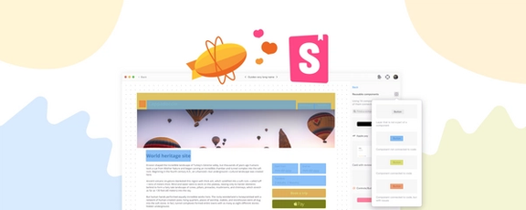
Storybook integration in Zeplin
A common tool among developers is Storybook. That’s why Zeplin created Storybook integration, so that developers can build and maintain components and automate the difficult tasks of mapping components. With the design and the code connected, developers have access to both tools and can easily jump between them to get all the information they need while maintaining the source of truth.
Final thoughts
Moral of the story is, design systems have come a long way in terms of connectivity, but there’s a lot of improvement to come in the next five to ten years. In the meantime, with Design Delivery tools like Zeplin, there are ways to ease these challenges until we see that “unicorn” come trotting around the corner to help us all work more efficiently together.
To learn more about the future of design systems, watch my session from the 2022 DesignOps Global Conference below, or get started with Zeplin today.