Figma is an incredibly versatile design tool that makes creating and prototyping UI layouts super fast and easy. And out of all of the features that make it enjoyable for designers, Auto Layout is definitely one that sits high on the list. Some designers are such big fans that they use it almost all the time — even when it introduces unnecessary complexity to their layouts.
We believe in using the right tool for the right job, so below, we’re going to talk about the ideal scenarios when you definitely should take advantage of Auto Layout, as well as some specific cases when you probably shouldn’t.
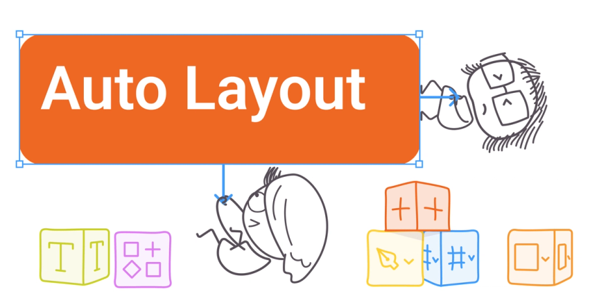
What is Auto Layout?
Auto Layout is a property you can add to a frame or a group of items (which would then turn into a frame) to automate its sizing and spacing behavior. To try it out, either use the keyboard shortcut Shift + A, the Auto Layout button in the right sidebar, or right-click to create a new Auto Layout.
This feature is all about control and flexibility. So instead of having to manually resize and reshuffle objects around your artboard to maintain a consistent layout, Auto Layout allows your frames to expand and shrink flexibly with their contents based on whatever constraints you’ve applied in your Auto Layout properties.
How design teams use Figma Auto Layout
Auto Layout is an optional feature with tons of different applications, and every designer may use it differently depending on what they’re working on. That said, Auto Layout is especially handy when designing user interfaces and page-level layouts because those include elements and interactive components that need more uniform spacing and padding to support an organized — and therefore more enjoyable — user experience.
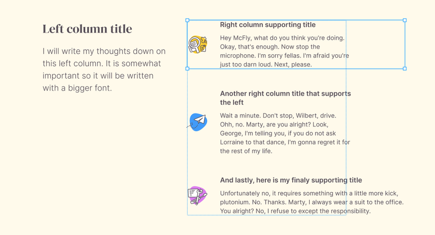
Let’s talk about some basic functions of Auto Layout and why a design team might apply them, using a website homepage as an example.
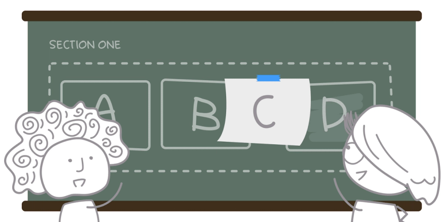
Alignment
As a designer, you know that the way you apply alignment in your layouts is core to how your users will interpret what’s important, and how different objects relate to each other. You can use alignments settings in Auto Layout to automatically align objects vertically or horizontally.
On a homepage, for example, this is a huge help because most conform to a common layout such as single column, multi-column, or grid. Alignment settings in Auto Layout helps you quickly achieve the layout you’re aiming for by applying an alignment setting universally to the frames on your homepage mockup.
Padding
The white (and empty) spaces in your design layouts give your user some visual breathing room, and it’s your padding parameters that define that spacing. With Auto Layout, you can set finite padding values between the boundary of a frame and that frame’s child objects and apply them either the same all around, vertically and horizontally, or different for top, right, bottom, and left.
On a website homepage, universal padding could work for things like buttons and icons, applying padding vertically and horizontally could make sense for arranging a gallery of images, and using different values for top, right, bottom, and left padding might make sense for the header or footer.
Resizing
Beyond alignment and padding, Auto Layout also gives you better control over the dimensions and distribution of the objects inside a frame. There are three ways to apply it: with fixed width or height, hug contents, or fill container.
The first is great if you want your parent frame to remain the same despite what’s happening inside, which you might want to do with a fixed width column on a homepage. The second is helpful if you want the outside frame to wrap closely around its contents, and the last works in those situations when you have a larger frame and you want the objects inside to be distributed nicely and fill up the empty spaces. Both of those might make sense for different content blocks you might use on your homepage to display a mix of text, buttons, or logos.
Direction
You know how Auto Layout is meant to help your frames grow flexibility according to the constraints you set? The direction setting in Auto Layout determines whether your component will grow vertically or horizontally once it has more or less content.
When to use Auto layout
Using Auto Layout is ultimately a preference that every designer will have their own opinion on based how they like to work and what they’re working on. That said, considering what Auto Layout is and how it actually functions in your layouts, there are a few best case scenarios when you should definitely use Auto Layout to make your life easier, and designing more fun.
- Designing buttons that grow or shrink as their text labels change
- Building lists that adapt as you add, remove, or hide different items from them
- Creating new basic templates and applying your design system
- Prototyping new user interfaces
3 Benefits of Figma Auto Layout for designers
There’s a lot of love out there for the Auto Layout feature and it’s not just because it saves time. It’s also because when you add Auto Layout, new possibilities open up in your UX design workflow that you wouldn’t otherwise benefit from. Here are three of the biggest benefits of using Figma’s Auto Layout.
1. Gain space for creativity
When you’re not stuck double-checking and adjusting the padding and alignment between all of the elements, groups, and components on your canvas, you’re free to focus on the broader design vision that’s in front of you. And since you can make realistic prototypes faster and more often, you can try more ideas and gain more mental space for creativity in your design process.
2. Reinforce your design system
If your team has a design system that includes guidelines for alignment, padding, and direction, Auto Layout makes it easier to reinforce them by help you apply those rules in a bulk action.
3. Reduce errors
As the number of elements and components on your canvas increase, the higher the likelihood that some alignment or padding values end up straying from what you may have intended or envisioned. But if your team is aligned on how to use and implement Auto Layout, it would ideally reduce overall human error while prototyping and when aligning your designs with a design system.
The downsides of Figma Auto Layout
There’s a time and place for Auto Layout and when you stick to those cases we mentioned above then you’re golden. But there are also some situations where you’re actually better off not using Auto Layout as it would actually make things harder for you and your team. We’ll highlight those situations by sharing the biggest downsides of Auto Layout.
Downside #1: Nested layers
A big downside of Auto Layout is that it makes it easier to create nested layers within nested layers within nested layers. And actually, auto-layout's own constraints require you to generate more frames than you normally would generate. What could’ve simply been one grouped layer, can easily turn into an Auto Layout that holds multiple Auto Layouts.
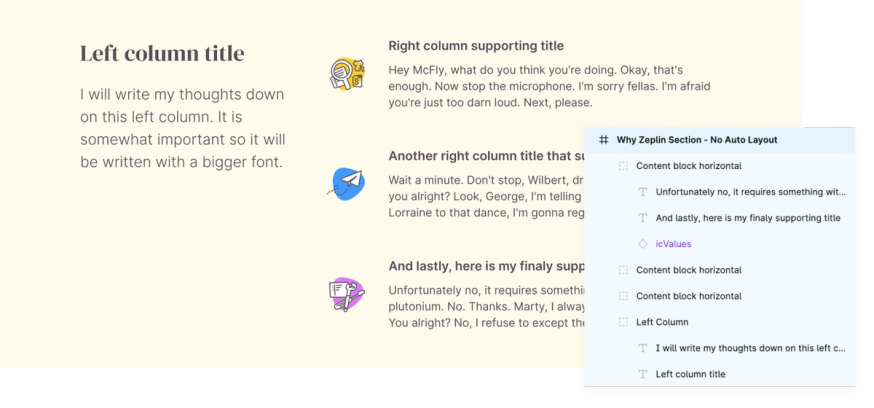
Due to all the nested Auto Layout frames and layers, it’s hard to do quick changes as it takes a lot of clicking around to find the layer you want to adjust.
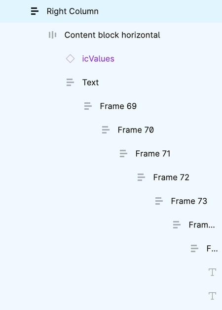
Everything you would like to put in a frame that has Auto Layout applied to it, automatically goes into Auto Layout as well. In that sense, it requires extra attention to be sure that the object you are placing is located to where you would like to be.
Downside # 2: It’s hard to undo
Auto layout is great in some situations, but we all know every design project is different — even if you’re working on a new iteration of the same thing. A downside to Auto Layout that applies in this case is how hard it is to undo it.
If one part of a component has Auto Layout and you want to add something to that component, such as a text layer with a fixed width, you are forced to adopt the existing Auto Layout and edit it completely for your new need. You can’t ignore Auto Layout even though it might not be relevant for the addition you are making: your only option is to remove Auto Layout altogether, or manually drill into and edit the layout logic so that you can make a clean addition.
Oftentimes you end up having to re-define the vertical and horizontal sizing (fixed size / hug content / fill container) of your layer after you make edits. Depending on how nested your layers are, this can end up being a lot of clicking and investigating to find the offending layer(s) that’s messing with your design.
Downside #3: Every designer uses it differently
If the Auto Layout is set up by one designer, the layout could possibly feel unintuitive for another designer. So another downside is that there may be initial friction in understanding someone else’s use of Auto Layout, much like how hard it would be to interpret someone else’s code without documentation. For design teams that collaborate on a high volume of projects, these moments of friction can really add up.
Downside #4: New updates have added more complexity
In 2022, Figma made a number of updates to how Auto Layout works, essentially broadening its capabilities and control options for canvas resizing, absolute positioning, negative spacing, and text baseline alignment, just to name a few. While these updates are still pretty new, there are already signs that they’re not as helpful as Figma wants them to be.
One example of that is Canvas controls. While it makes sense that designers may want to use their mouse to adjust padding instead of entering exact padding values, it’s easy to confuse this option with moving or resizing a parent frame. To even use this feature successfully, designers have to play an icon game to make sure they’re hovering over the right area and this poor user experience is another noticeable downside.
And in general, Auto Layout is inherently a complex feature so with every new addition or update there's a high chance you'll need to relearn or adjust your design process to make it play nicely — a small but potentially annoying downside.
Share your Auto Layout properties all the way through the design process
There’s no doubt that Figma Auto Layout is a slick and dynamic feature that’s both fun to use and extremely helpful for reinforcing element alignment and distribution. This exploration of when and when not to use it should give you plenty to think about as you design your next layout.
When you do opt to use Auto Layout, a final thing to remember is to clearly communicate all of your Auto Layout properties to your developers so none of that important work you’ve done with Auto Layout gets lost.
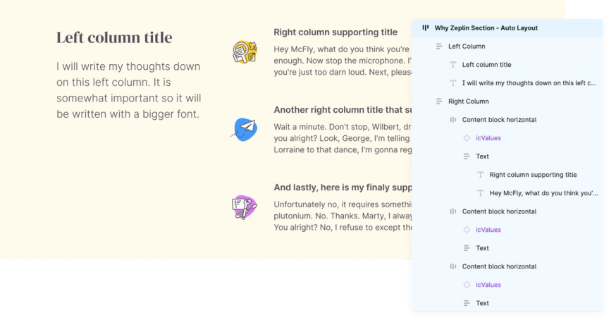
If you’re using Figma for design handoff, your developers are likely just clicking around to different layers on your design file to get whatever information they can get. But when you use Zeplin as a complement to Figma for your design handoff process, Layout Specs in Zeplin helps you pass on your Auto Layout settings to developers easily and at the right moment in their workflow, so their experience with Auto Layout is positive too.
Learn more about the difference between doing design handoff with Figma vs. Zeplin, or try Zeplin for free.
Figma Auto Layout FAQs
What is an Auto Layout?
Auto Layout is a property in Figma that helps you build flexible frames and components that adapt to your UI designs as you add more to them.
What’s new in Figma Auto Layouts?
Some new features Figma recently introduced to Auto Layout include canvas controls, text baseline alignment, canvas stacking order, negative spacing, and more.
What is Auto Layout used for?
Auto Layout is used to gain more control over the padding and alignment across your layouts as your designs evolve, and to ultimately create a better responsive design workflow when using Figma.
Why should you not use Auto Layout?
You should not use Auto Layout if you’re innovating on layouts that many other designers will need to collaborate on, because it tends to add unnecessary frames and complexity to your layouts, is hard to undo and adjust, and can cause confusion between designers who use Auto Layout differently.
What is Layout Specs in Zeplin?
Layout Specs in Zeplin allow you to see Auto Layout and Constraints in your designs published from Figma, Sketch, or Adobe XD. Zeplin shows this information in the canvas, the right panel, and the code snippets so you can easily understand how a layer should behave according to its parent or children.