Rich, context-aware responsive design has come a long way. Design tools like Figma, Sketch and Adobe XD have changed the game with features like “Auto Layout” and “Constraints” to specify element direction, alignment and distribution, spacing, and gap values across layers.
But, for many product teams, the game hasn’t changed when it comes to bringing these dynamic designs to life. There is still lots of back-and-forth communication and excessive documentation to define settings and to clarify how different layers are intended to respond to each other.
Today, many designers spend their time on workarounds to inform developers how Auto Layout and Constraints settings should behave in the end product. These can include additional design reviews, long email or Slack threads or even sharing links to the working design file with tons of added notes.
For developers, having to click around a design file to figure out how responsive settings should behave can be painful, especially for those unfamiliar with the latest design tool. We knew there had to be a better way.
Capture design intent with Layout Specs
Today, we’re excited to introduce Layout Specs in Zeplin. Now, designers can automate the process of sharing Auto Layout and Constraints settings and behavior with developers.
Layout settings
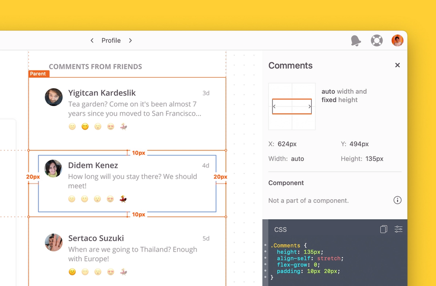
With Layout Specs, developers gain visibility to the settings within the layout. They're now able to see spacing and gap values between child and parent layers (often called “items” and “containers” in the coding world) as well as the direction, alignment, and distribution of child layers. Hovering over spacing and gap values in the right panel highlights their corresponding values as well.

Layout behavior
In addition to gaining visibility to layout settings, developers can also understand how the child layer should respond to changes in the parent layer, or container, and vice versa in Zeplin. When a child layer is selected, Zeplin contextually highlights its parent layer on the screen. When a developer inspects a layer with constraints applied, Zeplin will now display information about how it should behave if changes are made to its parent layer. It’s that simple. And we’ve also added animations to make it crystal clear. 🪞
Extract Android snippets
In addition to CSS snippets, developers can grab Android snippets for Auto Layout settings using Zeplin extensions.
We’re also working on launching Swift and Objective C Code snippets, so stay tuned!
Demystify design intention
Our goal for building Layout Specs is to help developers get visibility on Auto Layout and Constraints settings and gain clarity on design intention. It’s part of our broader goal of helping product teams establish strong capabilities in Design Delivery.
Designers already using Auto Layout and Constraints in their design tools can now use Zeplin to ensure those settings are implemented in the shipped product. Designers can ditch the extra work of writing explanations for developers and skip the back-and-forth with Slack pings and essays in design notes.
For developers, this means no more switching between tools to get custom settings and no more confusion on exactly what to build. Developers tell us they love using Zeplin because they get exactly what they need without extra steps — and with Layout Specs, we’re taking this further. With layout settings, hover highlights and animations, we’re demystifying design intention.
We hope that Layout Specs will help close the gap between design and development and optimize design delivery. When designers spend time on design and not workarounds and developers aren't hunting for information, end-users are the ones that win.
Get started
Layout Specs are available today when you publish designs to Zeplin — no additional work or setup needed.
Learn more about Layout Specs in this explainer video. 👇
As always, you can share your feedback and experiences with us at support@zeplin.io. Let us know what you think!


