"It sounds like a cliché but it’s true. Zeplin changed my life!
"
LM Group’s Mobile Design Team lead, Marco Silva, recently sat down with our Customer Success Advocate, Andy Wingrave, to discuss how they have implemented Atomic Design principles in Zeplin as part of their Design System.
LM Group is a publicly traded multinational Group, among the worldwide leaders in the online travel industry, that operates a portfolio of well-known brands such as lastminute.com, Volagratis, Rumbo, weg.de, Bravofly, Jetcost and Hotelscan.
LM Group has more than 1200 employees, working on several main products, from accommodation (hotels and vacation rentals), to transportation (flights and trains), to vacation packages (dynamic packages and traditional tour operators and cruises).
Can you describe how your team is set up?
We work in cross functional teams. Each team, we call them pods, is composed of a product designer, a product manager, tech lead, backend engineer, and one iOS and Android developer. Each pod has their own set of rituals (e.g. like daily stand ups, weekly syncs, etc.) and, on a biweekly basis, we have a bigger sync where each pod + design + business share updates.
Both Pau and Shao joined 6 months ago as product designers. In our team, we have 2 pods that are working on the features we’re launching. Each one of them is responsible for their own set of features.
I’m the team lead of the application group, our responsibilities include exploring and developing the vision for our product. I also provide guidance and support to both Pau and Shao, and the 3 of us are in sync on a daily basis to guarantee consistency and quality in the work we deliver.
What does the overall design workflow look like?
We have 2 parallel tracks; the vision and the re-design. We also have from a macro level a visual design workflow process together with the tools that we use:
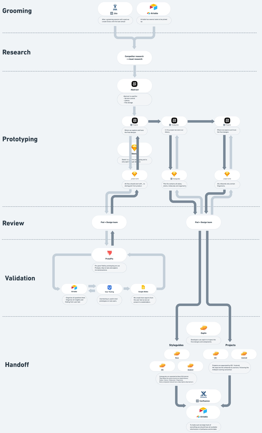
The Vision: On one side, we have the vision which, at the moment, tends to be more exploratory from both a design point of view and from a feature perspective. The vision evolves constantly especially now that we need to be so reactive to the current market. We look at data, run surveys, and create new features or even just tweaks to fulfill the needs of the users. Davide and I usually groom a feature together, develop a couple of proposals, there’s then a cycle of feedback sessions and iterations and we run some user tests to validate the UX and UI of the feature.
This doesn’t guarantee the development of the feature though and this is when the other track comes along.
Re-Design: On the second track, we’re redesigning the app from scratch. We look at what the current app has, in terms of features and content, and we update it from both UX and UI point of view. At the same time, we’re applying what has been learned in building the vision.
The workflow is similar to the vision but goes a lot more in depth. After the grooming, there’s a more careful competitor analysis created. If the vision doesn’t satisfy the new learnings, it is tweaked and improved. Also, we investigate and identify as many case scenarios as possible and address them accordingly. Once this is complete, and both the tech lead and product manager are satisfied, the designers prepare all assets and documentation for the developers to work on the feature.
For those not familiar with Atomic Design, please can you explain this for us?
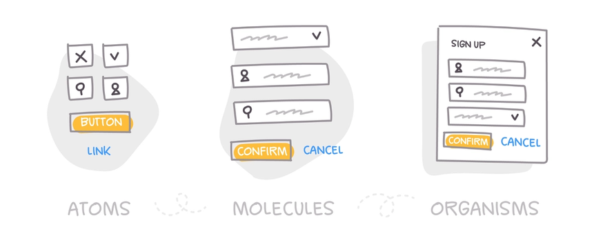
Atomic design is the development technique for design systems, and comprises three core features:
- Atoms are the basic constituents that make up a design system and can be comprised of buttons, or inputs.
- Molecules are clusters of atoms bonded together, which are the compound’s smallest base components. Such molecules assume their own characteristics and are the foundation of our design systems.
- Organisms are groups of molecules that are bound together to form a distinct piece of the interface.
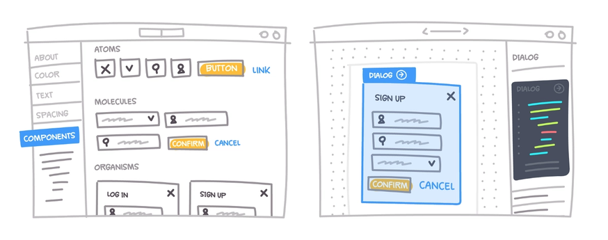
- Templates consist of groups of organisms which are stitched together to shape pages. This is here where the concepts come together and we can see the layout come to life.
- Pages remove the placeholder content and replace it with representative content to provide an accurate picture of what a user actually would see.
How did Atomic Design philosophy help your design team?
The biggest advantage I have experienced from Atomic Design was not so much the principles behind it and its usage, but the actual process of converting to it.
The amount of in depth learning and effort that goes into creating every single element has ensured a super solid and consistent design system. Since we’re building the app from a blank slate and every member contributes to it, this empowers every member of the team to embody the design system.
Then, by using Zeplin to export all assets, it becomes super easy to organize everything.
Why did you choose Atomic Design?
Funnily enough, it came from the very same essence of what my job is, to solve a problem, and I discovered it when trying to solve other problems.
The problem that I was trying to solve was that every time I was developing a feature I would have to create way too many artboards to visualize every case scenario and export all of those artboards to Zeplin. This resulted in a massive clutter in Zeplin which would lead to confusion, and difficulty in maintaining updates, and eventually frustration
At that time, we were already using a very good naming convention for the artboards (which was brought to the team by a colleague, Mattia). That gave an idea to separate artboards from components where components could then have their own naming convention and their own case scenarios. This led me to Atomic Design which further breaks down each component.
What are your favorite features?
Not so sure if this is considered a feature, but it’s more of an outcome of its power and how we’re using it.
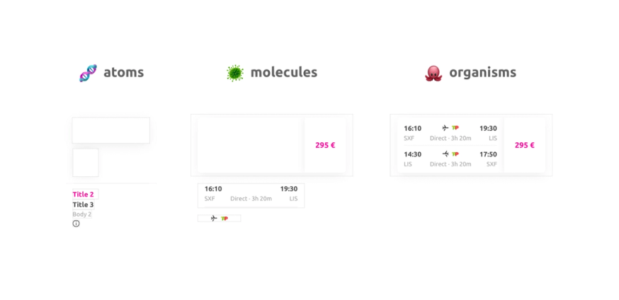
So, I take pixel perfection very seriously. 😄 And one of the most satisfying things I get out of Atomic Design is that when I’m creating the final artboards for Zeplin, it’s composed only of organisms and there are no loose pixels flying around between them. It’s a very clean file! It’s a bit of a paradox, even though it’s very minimalist, this is only achieved through a very carefully thought and well developed complex system.
What do you think is unique about your processes?
I would say that if I could choose something, which is probably not unique but the most valuable, is that it can evolve. We’re very open minded to change. If something is not working properly and can be improved we will try it out and see how it works.
How do you collaborate with other teams?
On the app level I’ve already shared some insights, but what could be interesting to share is how does web and app collaborate.
We also have a shared weekly sync for starters that ensures that everyone has at least a fair idea of what everyone is working on. But the most valuable collaboration comes when our teams or theirs, reach out to each other to share knowledge on a specific feature that one or the other might have already worked on. In the beginning, this came a lot from our side with us reaching out to them. This would save us a lot of time since a lot of knowledge has been harvested there already. Now it’s slowly coming from them as well since we already released a few features and start to see what impact it has.
Were there any challenges for this collaboration?
Between us, the app team, and the Web we are exploring different paths when it comes to the design system and the look and feel of the product.
We might have a few common points, and the ultimate goal is to converge into a bigger design system in the future, but for the moment the app is taking a more bold, exploratory and cutting edge direction. For that reason it makes it a lot easier to move fast and have less constraints.
What kind of tips or advice do you have for collaborating with other teams?
From what we’ve been experiencing this is what I think works best:
- The naming convention we’re using for the artboards and components: The way everything is organized and it’s very easy to navigate. But, to ensure that everything is easily maintained, we need to jump to tips 2 and 3.
- Avoid using artboards for different case scenarios. There might be a situation or two where it’s important for the devs to understand where something will be located or how it behaves and so on. But most of the time it’s a component that is present in that artboard that changes. By keeping those different case scenarios on a component basis we have less artboards to look at and process.
- We only export screens that are going to be developed at that moment and that will look exactly like what will be implemented. Vision, explorations, “Nice to haves’’, future.. all this lives in Sketch files, and in Abstract previews where other stakeholders can have access.
- Too many people managing the styleguides tab might become a problem. So far, we’re only 3, so we haven’t faced that problem yet but, for a bigger team, I’m guessing that a centralized team for the design system might be the right way to go.
"I think I started using Zeplin late 2016. Before that, I saw it as the dark ages.
"
What was your team’s process prior to using Zeplin?
I think I started using Zeplin late 2016. Before that, I saw it as the dark ages.
I was using Sketch at that time, which was already a big improvement vs Adobe Photoshop, and luckily Zeplin was only compatible with it at the time!
Creating documentation for developers was just a pain! The amount of time spent there, the back and forth with the devs about pixels, distances, sizes, colors, etc.. + one of the amazing features at the time, the assets delivery! It sounds like a cliché but it’s true. Zeplin changed my life! 😅
I get to spend more time on exploration and validation with user testing.
How did you decide on using Zeplin?
At the time I was in an agency and I started working on a new client that was using Zeplin. It was love at first sight.
Where does Zeplin fit in your workflow?
Mostly on the handoff. Zeplin is the main bridge between designers and devs. We use it only for the final designs and components ready to be developed.
We’re using 2 projects. One for iOS, one for Android. They have very similar screens, just minor changes, mostly from a native perspective like status bars, some icons, etc.
Inside of each project, we use sections to organize the artboards and apply a specific naming convention; this naming convention was created around the main entry points of the app:
- Home
- Search
- My bookings
- My profile
Having said that, we do have more sections than 4, but they’re organized accordingly.
The same goes for the styleguides. We have the base, with 95% of all elements, and then 2 branches for iOS and Android with their unique components.
Inside of styleguides we break down the components in 3 sections: Atoms, Molecules & Organisms.
Inside of each one of them we have multiple groups also reflecting its own naming convention which is the same one we use in our Sketch library.
"The amount of time saved in creating redlines for every single component and in depth documentation on its behavior is insane.
"
What is your favorite feature of Zeplin and why?
I would say the information section on the right hand side of a screen. I know that it’s a massive feature, but if I would have to go into more detail, the measurements! This is such a life saver. The amount of time saved in creating redlines for every single component and in depth documentation on its behavior is insane. Not saying that this is still not important to do, the documentation, but it’s on a totally different level.
But Zeplin is way much more than this obviously.
To learn more about the topics we covered in this blog post, here are some links:


