Zeplin was born out of a simple, but important realization: in order to build great digital experiences, there needs to be an airtight handoff between design and development teams. We call this moment in the product development process Design Delivery. It is when infinite design possibilities meet the constraints of reality. It is critical, and all too often underestimated.
Earlier this year at our first user summit Harmony, a number of innovative teams talked about how they use Zeplin to improve their Design Delivery process, and connect design to code. Among the speakers was our very own product designer Aditya Kundu. Here are three ways the Zeplin crew uses Zeplin to build Zeplin.(Try saying that three times fast!)
Connect design components to codebase
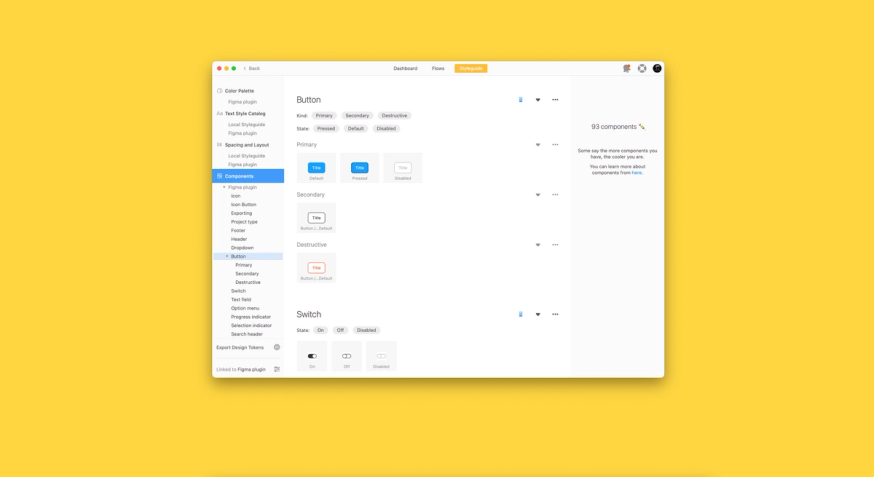
Design language can vary widely. It can change between apps, projects, and even features, and can make life difficult for design teams. When Kundu was designing the Figma plugin for Zeplin, he found himself having to grapple with lots of plugin-only components, as well as differences with respect to text and color styles.
Given so many components, and so much potential confusion and miscommunication, Kundu decided to use variants in Figma to define the different states a component can have. This is where the innate compatibility between Figma and Zeplin really paid off.“The exact properties and values of components that we defined in Figma for[the Zeplin] plugin, are translated 1:1 into Zeplin automatically when you export,” Kundu said.“Now, I can speak the same language as our developers. They can stay in Zeplin and get everything that they need to start coding right away.”
For example, take a look at the component variant window in the screenshot below. At the screen level, the Export button can have multiple states: pressed, disabled, etc. Since Kundu has already defined these component variants in Figma, Zeplin brings all the properties over automatically, so it’s easy for a developer to see all the different values and states of a button.
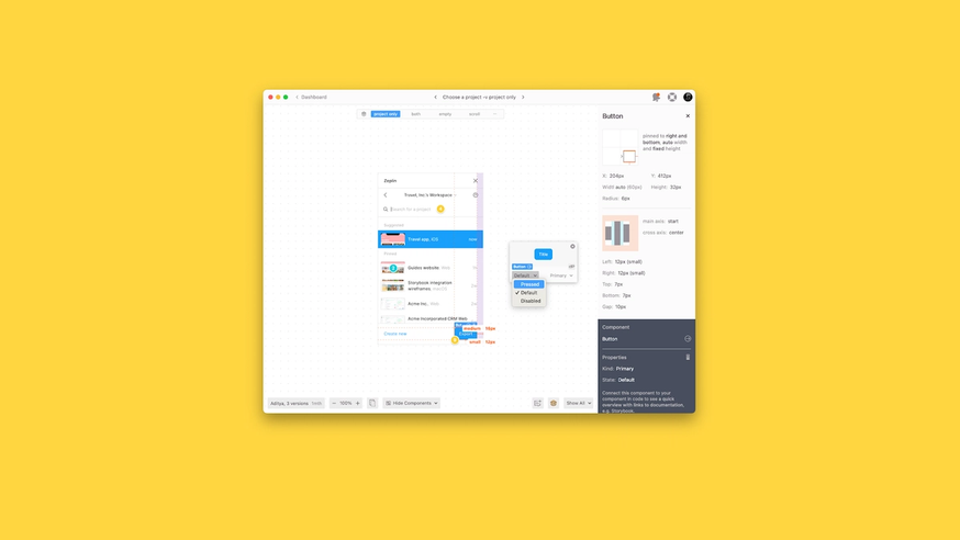
In addition,“Component Variants allow developers to quickly and visually see the various properties of components, including the specs and updated code snippets for each variant. With this feature, there’s no need to consult the separate documentation to figure out what a given variant might be. Instead, developers can view any given variant, plus a component state, directly in Zeplin.” Kundu shared.
Comments and Annotations
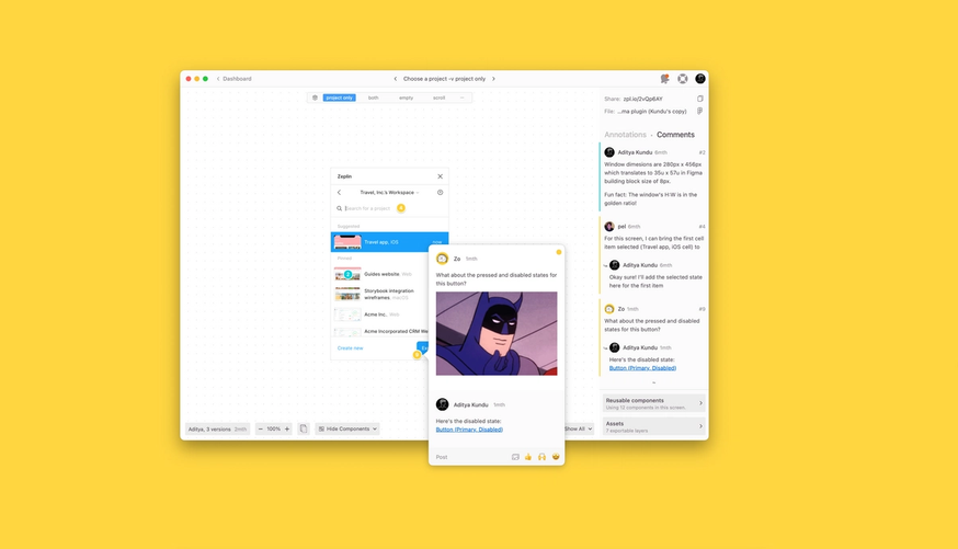
When it comes to design collaboration, the centralization of information is priceless. That’s why Kundu loves Zeplin’s Comments feature. It’s a great way to centralize communication between team members and focus attention on specific screens and assets. From here, it’s easy for different stakeholders to be dropped or tagged into a specific screen where they can create new Comments or join existing threads to discuss designs. In addition to Comments, designers can also add Annotations to designs in order to communicate the design intent more effectively.
And because Zeplin integrates with tools like Jira, Dropbox paper, Notion, it’s simple to centralize those designs conversations happening elsewhere in Zeplin.
Comments and Annotations allow us to be cross-functional across all departments, which is fundamental to our design philosophy. We believe that products reach their best when marketing, product professionals, and developers all get involved in the design process.
“Comments make it inviting for cross-functional stakeholders to participate in the design review, making the entire design experience more collaborative.”
Sections
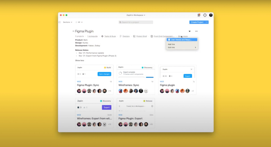
Design is naturally a highly iterative process. Scopes, expectations and the product itself are constantly evolving. But that constant evolution can make it difficult for everyone to see a project’s direction and history.
Kundu recalled a story from when he first arrived at Zeplin. For his first assignment, he was asked to help create a new onboarding and exporting experience for Figma designers connecting to Zeplin for the first time. No mean feat, even if you’re starting at the beginning of the project. The problem was that some of the foundational work for this project had already begun.“A lot of the conversations and design decisions for that plugin had been made months before,” Kundu recalls.“Just to know why the plugin looks like it does today, what needs it was intended to serve — I have to know ‘Why are we doing this?’ before I can add or change anything.”
Zeplin consolidates key design information held over a variety of different tools into one place. We can see designs from Jira. You can review user stories and old product requirements stored in Dropbox Paper. You can review the product roadmap and vital user base information.“Because everything is centralized in Sections,” Kundu said,“I could get up to speed quickly. It quickly surfaced info that was important but that I would not have known about otherwise.”
Taking flight
The ability of different members of a team to speak the same language(figuratively speaking) is a priceless benefit, no matter what kind of company you’re running. Zeplin enables us to do just that — get everyone speaking the same design language, looking at the same designs, and collaborating with ease. Now we know that we’re harnessing the full potential of our entire cross-functional team. From designers to developers, product managers to copywriters and marketing managers, our design process is getting the best out of them all.
To put it another way: without Zeplin, we wouldn’t be Zeplin. Find out how our platform can do the same for your design team today.


