
One in every 12 U.S. private sector workers is paid through Paychex. Their mission is to empower businesses to focus on organizational growth and management , regardless of scale, by providing software solutions and services for HR, payroll, benefits, and insurance services.
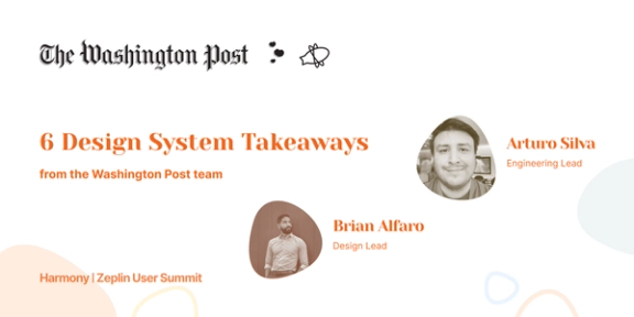
We had a chance to chat with Roman Blagovirnyy, one of the UX Design Leads at Paychex. His focus is on building out the Paychex design system, as well as defining processes and evaluating new tools.

Roman Blagovirnyy, UX Design Lead at Paychex
We focused on his journey of building out a design system and how Zeplin helped with this — take it away Roman! 🎤
How is the design and development team set up?
We have a design team consisting of 30 designers and 10 or so folks focused on content. We are typically set up by projects structured as a triangle between a product owner from the business, engineers, architects and testers from the development team, and, finally, a scrum master. The design team is a partner to the development team in this setup.
What does the overall design workflow look like?
First, the business stakeholders provide a short description of the business problem or need, along with some additional context. The UX team then comes up with the vision for the product features. Once we have taken that vision through several reviews and usability testing sessions and feel good about it, a charter for the dev team is created and implementation begins. However, design and testing do not stop at this point; we are constantly improving, refining, and adding on to that original vision.
What do you think is unique about your processes?
One of the key differences is our large development team. There are 70 teams and a typical designer supports three teams of 6 to 12 developers, a business analyst, product owner, and QA testers. In a setup like this, it’s very important for us to work efficiently. As our teams grew rapidly, the traditional methods of using PDFs or manually generating marked screenshots and documentation in a WiKi became clearly inefficient. It would have been impossible to support this model without tools like Zeplin. Zeplin helped focus our time on designing and delivering rather than on creating and maintaining documentation.
Let’s talk about your design system. What’s the current status of it?
We don’t have a full design system yet. I would describe what we had previously as a UI kit, but one that wasn’t created using a systematic approach based on clearly-defined design principles. We now have a small, dedicated team, including developers, that’s working towards creating a full-blown design system.
What does a “design system” mean for your team? What does it include?
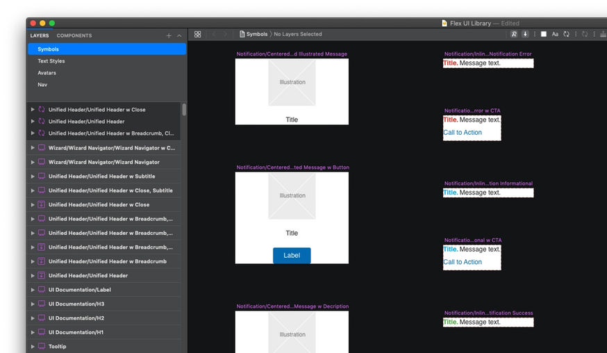
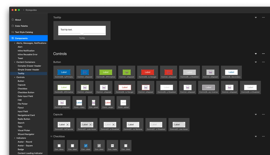
A design system is a way to implement and manage the design of our digital products at scale. At its core is a set of principles that reflect the product brand and generally describe the kind of experience and product we are creating. Based on those principles, we have styles, conventions, and rules that, in turn, inform the detailed specifications of UI components, interactive behaviors, information architecture, workflows, and various design patterns. The UI components, Sketch symbols that represent them, CSS styles, and supporting graphic assets are the product of that design thinking. These artifacts enable designers to design and developers to build the kinds of user experiences that the principles described.
The design system is a product itself, one that should easy to understand and use so that it can help both designers and developers make the right design and implementation decisions.
What tools do you use for this?
We rely on Sketch for the UI library, a Wiki to describe design conventions, standards, and guidance. Finally, we use Zeplin’s Global Styleguide to surface components and styles that are being used in individual screens.
What was the main reason you think you needed a design system?
Given our large suite of applications, our main goal was to improve UX consistency and quality, as well as to reinforce the product brand. We also wanted to increase efficiency for both designers and developers by giving them guidance on how to solve problems and making it easy for them to re-use assets, components, and code, and implement UI changes across products.
What are the first things that you did when you first started building it?
One of the important things we did is define very clear design principles up-front, based on our product brand so that we had a foundation to rely on when making decisions along the way.
What’s something you learned while you were building the design system?
My single biggest piece of advice is to start thinking about the design system as you build out individual screens. It’s much easier to define the principles early on than to try to fit in something after the fact. Starting with a smaller team also helps you get started faster. We have a decentralized structure where a small core set of team members build the design system, but then have individual contributors providing feedback and updates to the design system. Additionally, defining workflow and processes for building and maintaining the design system upfront is helpful to ensure it’s a living organism. Having leadership buy-in is also important to get the proper resources. We actually did a workshop for our executives to describe what a design system was and the value it brings to the organization.
It sounds like your developers were engaged early on while building the design system.
We use the atomic design principles when building our components. It’s very valuable to consult with developers early to structure components in a way that is modular, reusable, and easy to understand for both designers and developers. Designers sometimes worry that their creative work might be stymied, but a developer can be your best ally in finding alternative solutions within the technical and resource constraints you have.
How do you communicate the changes in your design system?
We have a defined process in which anybody can make a request to change the design system. We ensure that all requests are reviewed by a design lead, as well as a developer, to ensure it follows our fundamental design principles and meets technical requirements. Once the change is finalized, communication is made via various channels. We also leverage design and developer check-in meetings to make updates. This remains a challenge for us especially since we constantly hire new employees and contractors. We are solving this with better onboarding and by catching any “gotchas” earlier in the design review stage.
How does Zeplin help your design system efforts?
We are in the early stages and still actively updating the design system. However, we expect Global Styleguides to solve one of our biggest gaps, which is what the designers intended to convey in their designs and what the developer actually implements. Zeplin solves this by clearly showing the styles and components that should be used to implement UI elements on a particular screen.
What is the one best thing/feature of Zeplin?
We love Zeplin! While it’s hard to choose one, something simple like enabling copy and paste links to a screen was a game-changer. This alone helped us share across our teams more effectively since we don’t have to rely on static PNGs. We use it in design documentations, chat and Jira, which facilitates conversations by providing richer context. Zeplin makes it super simple to share and collaborate with the team. We’re also excited for the upcoming Jira Server integration.