
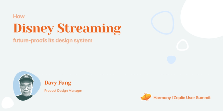
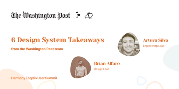
Disney Streaming is the team responsible for creating some of the world’s most popular streaming services. The Disney+ platform alone has nearly 130 million subscribers. We recently invited product design manager Davy Fung who leads design systems and delivery across 3 Disney Streaming products to share his experience building a design system consumed by nearly a thousand product designers and developers.
When the Disney+ platform was first launched in 2019, Davy’s design team delivered over 800 screens for development. Davy wanted to find a smarter way to deliver designs for future releases and to ensure posterity across all platform form factors and brands.
Speaking at Harmony, the Zeplin user summit, this year, Davy explained how Disney Streaming used design systems to improve their design delivery process and launch the new Star+ product in just 9 months.
Scaling your design system might seem scary. Here’s how Davy did it with the help of Zeplin.
Leveraged Styleguides for better alignment
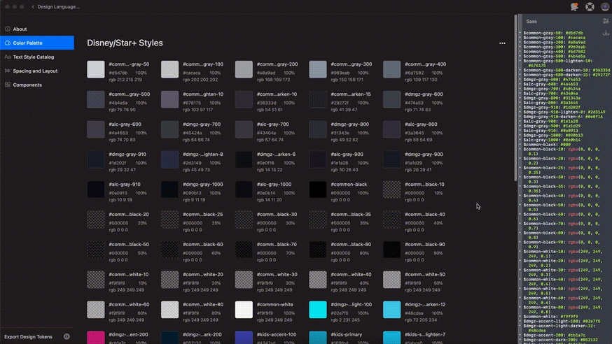
Davy needed a framework that would allow the company to launch apps quickly and get its teams to use the same design system. This meant creating a single source of truth for its design language and lexicon. Zeplin Global Styleguides helped Disney Streaming achieve that by allowing the company to bring all of its colors, styles, and components into a central hub.
They first worked on getting the taxonomy of the color systems right by defining the tiers of color: primary, secondary, feedback, neutrals, and accents. Then, they arranged and ordered the colors based on tiers and darkness(from lighter to darker) in the styleguide.
If a designer makes any change to the order of the color, it’s instantly reflected in the CSS code in Zeplin, thanks to the Sass extension. This proved to be an incredible tool for handing off designs to engineering.
Today, Zeplin Global Styleguides serves Disney Streaming as a central place for defining its design system colors, text styles, and components. “Zeplin is our design delivery and engineering source of truth,” says Davy. It helps the company ensure that the designs are consistent throughout its apps, resulting in less time spent on building reusable components that already exist.
A win for quality assurance
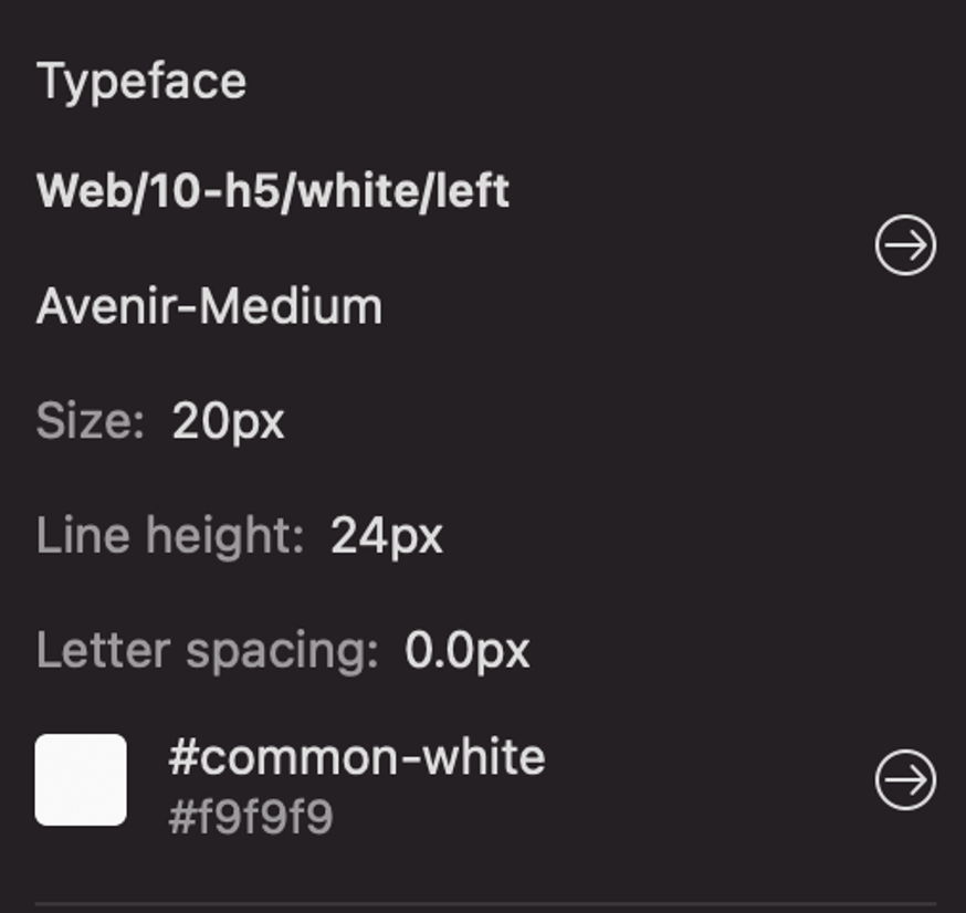
The engineering and design teams at Disney Streaming operate on one major rule: any color used in Disney+ and Star+ has to map back to colors that are approved in the style guide. The style metadata defined in Zeplin allows developers to check if the design maps to their style guide or not and spot any inconsistencies. This is a huge win from a QA perspective.
Developers can click to inspect any element and see the style metadata. For instance, they can immediately see that the following type element uses an h5 style and an approved white color:
Disney Streaming’s designers can now also show design elements in situ. They review these in situ designs to ensure that any tints, shades, or stops in the gradient of an element, such as a button, are mapped correctly.
Improved organization with Screen Variants
The developers at Disney Streaming previously worked with 800 screens and their variations. Those screens were disorganized, resulting in visual clutter and time wasted on switching them back and forth. Thanks to Screen Variants, Disney’s engineering team is now able to better organize its designs, remove clutter, and effortlessly toggle between screens.
Previously Disney’s design team would have to deliver 16 unique links to illustrate different variants across breakpoints(1440px, 1024px, 768px, and 480px). Screen Variants now enables them to cluster all under one link.
Disney Streaming found this clustering to be extremely valuable from an agile-delivery point of view, as it was more efficient and simplified the view for future use.
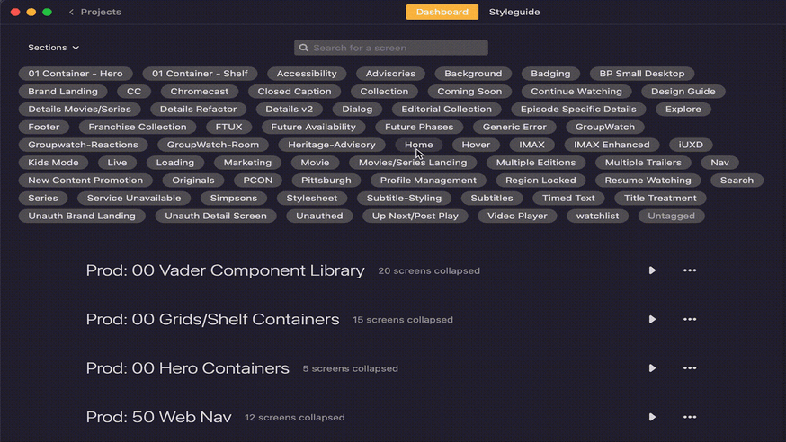
Used Sections and Tags to improve file hygiene
File hygiene plays a big role in Disney Streaming’s efforts to future-proof its design system. The company is able to better manage and organize its design files using the Sections and Tags features in Zeplin. Users can leverage these features to name and sort their screens/projects however they see fit.
Anyone from Disney Streaming can use Zeplin to see what they’ve previously done for any part of any app. The company even leverages this as an onboarding tool for new designers and developers alike. “We want to make sure that any person that comes in and utilizes our files and deliverables are able to navigate them in a very easy and rewarding way,” says Davy. For instance, anyone can easily see what the Kids version of Disney+ looks like on the Home screen with a few clicks.
Semantic naming of the features also helped improve file hygiene. Each feature name has a number attached to it in increments of 10 to create space for any iterations. Any subsequent releases to the Sign Up feature (numbered 10) will be versions 11, 12, and so on.
Disney Streaming was able to replicate this naming structure in its Sketch and Figma files and then ultimately in Zeplin. Its team members can now view any project on any platform and easily understand how the house is organized.
Disney Streaming’s design system is ready for the future!
Disney Streaming’s design team now uses fewer deliverables, organizes its files better for the next designer, and improves alignment with engineering.
This future-proofing not only allowed the company to launch Star+ in a short span of time but also equipped it to work more efficiently on future iterations and new apps.
If you’d like to learn how Zeplin can help future-proof your design delivery, contact sales today. Watch Davy’s full presentation and others from Harmony to learn how some of the world’s most beautiful products are built.