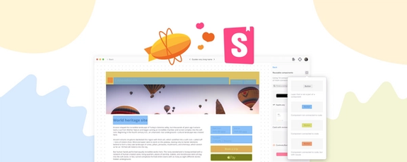
2024 was a year of big changes at Zeplin. Not only did we roll out some amazing features, we also launched the Summer Breeze update in June, after nearly a year of hard work and love: a complete design refresh that brought a smoother, more modern experience to Zeplin. And we didn’t stop there. We also revamped our pricing and packaging to better align with your needs. It’s been a year of big changes, all made with you in mind!
This year, we had 104 (!) releases in total. Today, we’ll go through the most exciting ones, starting from January. Let’s dive in:
1. Styleguides Sync: A faster way to curate and align Figma libraries with Zeplin
Whether your team is starting or scaling a design system, Zeplin Styleguides helps you organize and showcase your components, color and text styles in a centralized location.
Styleguides Sync is an automated way to build and maintain your styleguide in Zeplin. You can create a new centralized design system reference from a Figma library in minutes and easily keep it up-to-date as it evolves. 🪄

2. Styleguide Color Palette: Support for Figma color variables & sections
With this update, you can now import your color variables from Figma (including different modes) and organize them using sections.
3. Component Used In: Now across all styleguides
Component Used In feature helps you quickly discover where a component is used, across your projects. With this update, Zeplin shows where a component is used within styleguides as well, not just projects.

4. Summer Breeze: Design refresh for the entire app 🌿
This was a major update we worked really hard on, pouring our hearts into it. We completely revamped the Zeplin interface for a lighter, faster app experience. Before diving into the key changes, here’s a quote from one of the first testers:
Holy smokes, this is good! The updated design is excellent! Fits SO much more on the screen and makes it so much easier to find what I'm looking for. THANK YOU!
Now, let’s look at what’s changed:
- First up, we revamped the entire workspace where your projects are listed. We introduced a new left panel making the navigation easier across sections. We also updated project thumbnails for better organization.
- Our web app now also supports dark mode!
- We believe versioning is a key part of design delivery, and clearly communicating changes between iterations is something we care deeply about. With that in mind, we've significantly improved the versions feature with clearer version numbers, commit messages, and previews.
- In the assets panel, “Download all assets” is now the default option, rather than having to select each asset individually.
- Specs for Auto Layout (alignment, padding, gap and so on) are now listed in a much more readable way — similar to how browsers do it when you’re inspecting elements.
5. Vive l’Annotation!
OK, this one is super important: Remember the Annotations feature? The button for creating an annotation is no longer buried or overshadowed, it now stands proud, ready to revolutionize your workflow. Welcome, buddy!
6. Copy SVG content
SVG assets are now much more accessible: you can now see the contents of an SVG in the right panel and can quickly copy & paste it to your codebase.

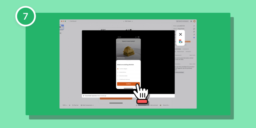
7. Figma prototypes in Zeplin
You can now view Figma prototypes directly in Zeplin. Simply drop the prototype link in a comment or annotation — Zeplin will fetch it and allow you and all your collaborators to interact with the prototype right within Zeplin.
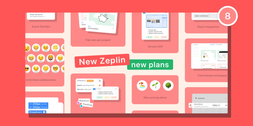
8. New pricing and plans
There’s been a lot of discussion in our space around pricing — high costs, feature paywalls, and complicated user permissions to name a few. To address these, we made a significant change at Zeplin. We believe the tools to create beautiful products should be accessible to everyone, from freelancers to large enterprises, without any end-of-month surprises.
- New Free plan: We’ve removed the user limits and added all of the core features you need for a flawless design delivery experience.
- New per-project Basic plan: Enjoy the freedom of unlimited seats for internal and external collaborators — including developers — for an unlimited number of screens, with one flat monthly rate.
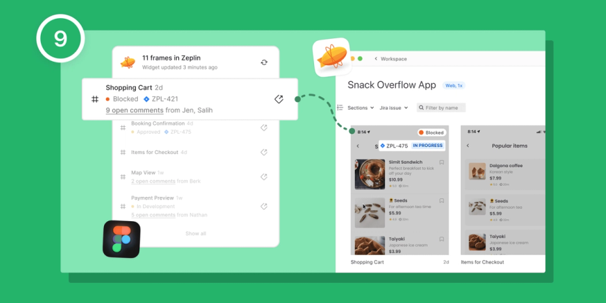
9. Zeplin Digest Figma Widget
We released a new Figma widget for quick intel on frames you’ve published to Zeplin. It summarizes key Zeplin details right inside the Figma canvas.
10. Project Dashboard Footer
Your top-used features in the project dashboard are now way more accessible:
- Create section
- Add tag
- Combine as variants
- Request approvals
11. Project Comments Panel
We’ve heard how tedious it can be to go through screens one by one, searching for comments and trying to stay on top of everything. You can now easily access all the comments across all the screens in the project.
Highlight related designs: With this new comments panel, as you’re hovering over different comments, the related screen will be highlighted on the left.
12. Unread Comments
Zeplin now keeps track of all the comments you’ve read — more importantly, it highlights the comments that you haven’t read yet.
When you combine unread comments with the new comments panel, it serves as your personal to-do list within Zeplin. ✅
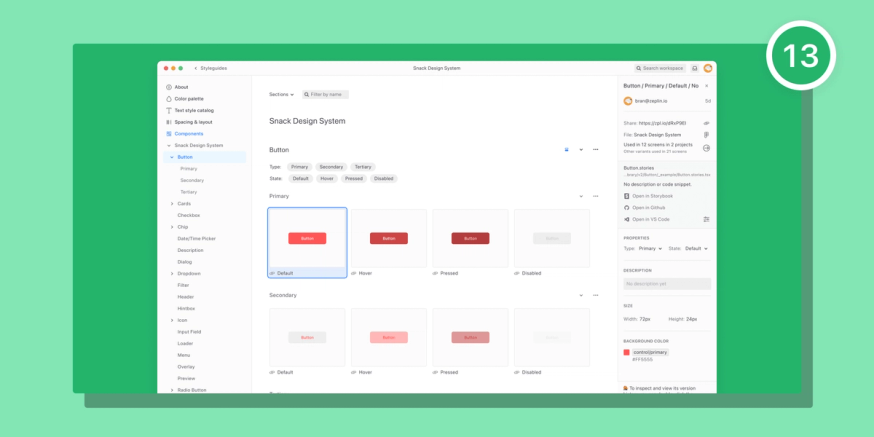
13. Styleguide Components: Redesign & performance improvements
We’ve updated how components in your Styleguide are laid out, helping you easily find the component you’re looking for.
We also know that performance is key, especially when you have hundreds and hundreds of components.So, we released an update to improve the scroll, multi-select and left panel interactions!
14. Approvals 2.0: We fixed Approvals
Last year, we released the Approvals feature to standardize design reviews, but we quickly realized it was too bare bones. After talking to many of you, we identified where we needed to make improvements — and here we are: Approvals 2.0!
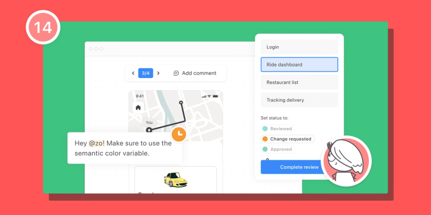
- Request approval for a group of screens: This was by far the most requested improvement! Instead of having to request approval for each screen one at a time, you can now select a group of screens and request approval for all of them together.
- A clean, focused approval view: We've added a new, dedicated approval view that shows only the screens up for review, so you can focus on what you need to review without distractions.
- A hub for all approval requests: We’ve added a new hub for approval requests on the project dashboard, with your involved approvals at the top.
Here’s to you, dear Zepliner. Thank you for being a part of this journey. Most importantly, thanks for making it easy to get up in the morning.
From our team to yours, happy 2025! 🥂
P.S. Not using Zeplin? Our CEO, Pelin, wrote a great post about why you should — give it a read.
P.P.S. If you’ve made it this far, here’s a little something: ping us at support@zeplin.io, and we’ll send the first 50 readers some new year-themed swag — the kind that’ll make your teammates jealous. 🎁


