Zeplin has a brand-new look. It’s our Summer Breeze release 🏖️ — a refreshed design for a lighter and faster app experience.
So…why a redesign? It's been five years since our last refresh, and a lot has changed. Everything has evolved in our space, including our teams and how we build products. Zeplin has evolved, too.
We've been known for specs and handoff for a long time. And while it's still a top reason you — our users — love Zeplin, it now represents only one part of the Zeplin workflow.
Zeplin is a connected space for the entire product team, bringing harmony to design delivery. You can document design decisions, organize your team’s work, track versions, manage reviews and stakeholder approvals, and much more.
With this redesign, every part of Zeplin's UI is more modern, and our powerful workflow features are more discoverable, accessible, and enjoyable for you. 🧡
Say hello to Zeplin's Summer Breeze release. 🎵 summer breeze… 🎵
All about Zeplin's Summer Breeze release
We're so excited for you to enjoy the new experience, but first, I should mention that you’ll still feel right at home. We made sure you can still easily navigate to your favorite features and continue shipping beautiful products without skipping a beat.
We actually tested this redesign with hundreds of users to make sure we got it right, and I’ll let one of our beta testers tell you how they felt:
Holy smokes, this is good! The updated design is excellent! Fits SO much more on the screen and makes it so much easier to find what I'm looking for. THANK YOU!
Introducing the Summer Breeze experience…
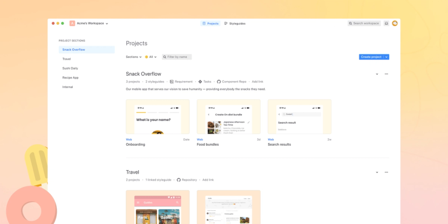
Find what you need faster in Workspace
Workspace is where you bring all your projects, styleguides, and team members together. It’s where everyone can learn what's going on across the organization — whether you need to scan all projects and statuses, run a search across all projects, or pin your favorite projects. This is the hub for all cross-project activity.
What’s improved:
- A handy new left panel for zipping through sections
- Updated project cards and thumbnail backgrounds for more visual organization across sections
What could be more exciting than a faster way to navigate your work across many projects? A new mode to view it in, of course!
Enjoy the new Dark Mode, now available everywhere. 🌒
Over 60% of our users use Dark mode for our macOS app. As our app users have been enjoying dark mode, we enhanced the experience and made it more accessible. And more importantly, we’re excited to announce it is now available on the web, too!
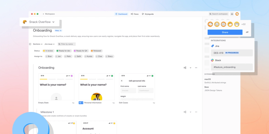
Improve collaboration in the Project Dashboard
Project Dashboard, like Workspace, is where you can combine information into a single space, except here, it’s for details unique to the project — like description, team members, screens, user flows, and styleguide. From the Dashboard, you can use Sections and Tags for organization, invite collaborators, integrate with your team’s tool stack (e.g., Jira, Slack, Storybook, etc.), add code extensions, and more.
So, what’s new?
- You’ll now see all of the main project information you wouldn’t want to miss on the top left — including its name, density, and description.
- A new dropdown for more direct navigation between different projects in the same section.
- We simplified the sharing experience, whether it's sharing a link with a team member or sending an invite to collaborate. There’s now a new and prominent copy project link action for when you just need a link!
- Integrations are now more discoverable in the right panel, and all channels are more visible to project members (even if the integration is not yet connected).
Locate Versions more easily
Zeplin captures individual screen versions, giving your team a clean record of important changes and Git-like version “commits” to each screen over time.
We’ve made some exciting improvements to Versions:
- You can now see which version you're looking at with a new version indicator
- Along with the version indicator, you also preview versions before selecting them
Get richer information in Screen Detail
Screen Detail is where inspect lives, plus much more. In Zeplin, developers go to Screen Detail to find specs, copy, code snippets, and valuable supporting information to efficiently translate your design vision and requirements. In Screen Detail, you can sync related Jira issues, surface reusable (design system) components, add Annotations, visually QA the design vs. build, request an Approval, and more.
Could there be more in Screen Detail? Yes.
- Approvals and Jira get more visible in the right panel
- SVG code is now accessible — devs can now see the content of an SVG before downloading it and can quickly copy-paste it
- In the Assets panel, “Download all assets” is now the default option, rather than having to select each individual asset
also...
Annotations declares its independence with its own entry point in the footer.
Pop Out also gets a spot in the footer, giving devs quick access to visually QA the design with the build.
Many of you have told us that component versioning and inspect is valuable to your workflow, so we enhanced our component versioning and detail page. Component version changes are now easier to spot and the entire component inspect experience is smoother and more intuitive.
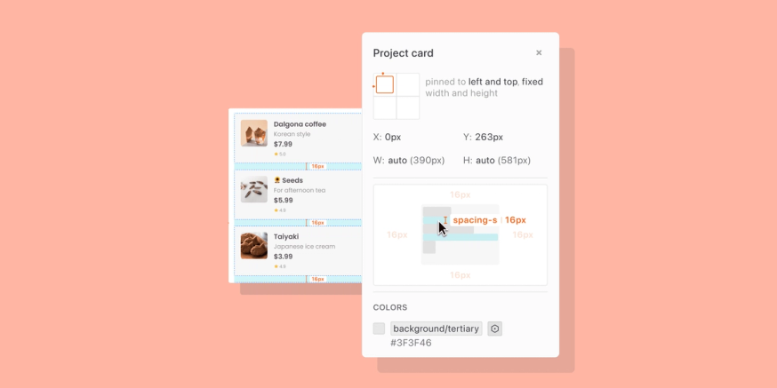
Has your team been using Auto Layout in Figma? You’ll love this: we now show spacing from Auto Layout in a much more readable way. Similar to how browser inspect works, simply hover to see those spacing values in the right panel.
You can now see Figma prototypes directly in Zeplin. Simply drop the prototype link in a comment or annotation — Zeplin will fetch it and allow you and all your collaborators to interact with the prototype right within Zeplin.
And even more fresh updates
- All of our visual foundations (typography, colors, etc.) got an update from the ground up for a more consistent experience across the app — including both light and dark modes, across web and desktop.
- An improved Flows toolbar that’s clearer and more accessible
- A tidier top navigation for intuitive navigation for all users invited to your workspace
What’s in it for you — and what’s ahead
This Summer Breeze release was all about you, our users. We modernized and reimagined our app experience from the ground up to improve your workflows and products. In case you need it, we put together some helpful FAQs.
This redesign also marks an inflection point for Zeplin as we continue to help teams of all sizes build beautiful products together. Along with our new look, we’ve refreshed our plans, too.
At Zeplin, we believe making beautiful products should be accessible to all — from the individual freelancers and small teams to the largest enterprises. We’ve reimagined our plans with full feature access – even in Free – and tailored their structure and price to fit how you work to make Zeplin even easier to use.
We’re so excited for you to enjoy the new Zeplin. Please send us feedback, or join an upcoming Zeplin deep-dive session to learn more and get a live tour and Q&A in a group setting.
Cheers!
🧡 Pelin