

Design system adoption and product team success go hand-in-hand — like witches and broomsticks, ghosts and goblins, Harry and Ron…you get the point. 🧙 That’s because adopting your design system (not just having one) means stronger design-to-dev alignment, faster release cycles, and, most importantly — higher-quality products.
We’ve been investing a lot in connecting design systems and dev workflows, and we’ve learned that design system adoption is only possible when devs have clarity around component usage and can easily access the latest documentation. So, just two weeks ago we launched Zeplin’s second product, Omlet: a component analytics product for measuring design system adoption in your codebase. 🍳
…and today, I’m excited to treat you to some new Zeplin updates to boost component visibility and adoption across your org. 🍬
Introducing version control — for components
Most design system components are constantly evolving, which makes tracking changes to individual components a tricky challenge. It also means it’s possible your devs are regularly building with outdated versions. 😱
For example, let’s say you’ve used a component across 100+ screens — how do you keep track of which screens? Or if your team updates thousands of components a month across projects for different dev teams — how do your designers ensure every developer understands those granular changes?
Keeping your team in-the-loop on component iterations usually means sending messages or spending meetings manually walking through updates.
Zeplin now offers the solution — Component Versions with Version History and Version Diff, now available on the Web app: app.zeplin.io. 🕸️
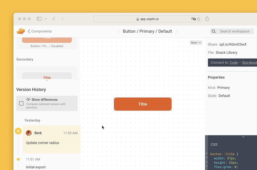
Just like how screen versions and Version Diff for screens in Zeplin make it easy for devs to follow precise changes in your UI designs, Component Versions offer the same clarity around your component iterations.
As long as your components are published to a Styleguide in Zeplin, your devs can instantly see any component’s before/after states and whether it’s an updated or outdated version — without manually comparing the differences.
Your first clue to component version updates is available in the inspect panel in the Reusable Components section. 🔍 Here, you’ll find a list of all components used in the screen, plus indicators to show which components were updated since the screen’s last export.
Also, Zeplin’s existing Used In feature helps you quickly discover every screen across your projects that your component changes might impact, which is super valuable for those highly-used components in your library.
New Component Details view
We’ve built a new Component Details page where you can run Version Diff for that component, plus see its full Version History, variants, properties, and links to Storybook, all in one view. 🪟
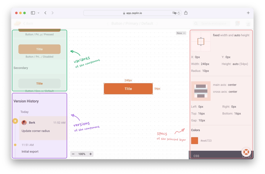
Get to this detailed view from any screen in Zeplin by clicking the "See versions" button on the component card or on the component tag that’ll appear when a component is selected. Try it yourself on the live app!
Hover to inspect components
While viewing a screen, you can now hover to see if a layer is a component, making it easier to visualize components and get exactly what you need, faster. This is currently available in the macOS app — with a fast follow on the Web app next month. 🏃
Revamped colors palette in Styleguides
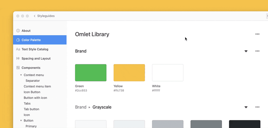
As your design system grows, organization and visibility gets hard. That’s why we built Styleguides to be a central catalog for all of your design system elements so devs can always reference and build with the right ones. We’ve recently made the Styleguides experience look and feel even smoother.
Zeplin now automatically creates collections of colors using your color naming conventions in Figma and Sketch. You can further organize them by renaming, deleting, or moving them. 🎨
Take another look at Styleguides — if you dare 🧟 — and see the benefit of organizing and documenting all of your design system colors, text styles, and elements in one place.
Figma Variables support — more coming soon
We’re working to add ways to view and manage your Figma variables in Zeplin. You can already see variables while inspecting layers in Zeplin, and we have plans to reflect those variables in your Styleguides automatically — stay tuned!
Reach out if you’re interested in helping us test this out: beta@zeplin.io
More treats this way:
- You can now generate SwiftUI code snippets from our Swift extension. Switch between SwiftUI and UIKit/AppKit frameworks easily to generate code for whichever framework you use for iOS and macOS projects.
- Our most popular release this fall, Approvals, now automatically creates Pending and Approved tags based on approval status.
Design system visibility and adoption continues to be a big focus for us at Zeplin, and we’ve got some more exciting updates on that front coming very soon. We’d love for you to try these latest features in your workspace and ping us if you have any feedback!
Until next time….boo to you, from our crew. 👻