You may have seen their socks at your local sports store or department store. Or maybe you’ve stumbled upon their e-commerce website. That’s right — we’re talking about Bombas. A comfort-focused apparel brand with a mission to help those in need. Believe it or not, the number one most requested clothing item at homeless shelters is socks. Underwear and t-shirts are second and third. So that’s exactly where Bombas wanted to step in and help. For every item purchased, Bombas donates a specially designed item to those at risk, in need, or experiencing homelessness through its network of over 3500 Giving Partners across the United States.

We got together with Steven Kilzer, Director of UX Design at Bombas, to chat about their design-to-development workflow. Plus how he and other teams at Bombas use Zeplin and Figma together for better organization and collaboration.
The UX design team at Bombas is largely responsible for the digital product design of their e-commerce website, working closely with developers, product teams, and merchandisers, to deliver a comfortable online shopping experience for their customers. They constantly juggle business needs and objectives with the needs of the merchandising teams.
From Figma to Zeplin
When Steven first joined the Bombas team, there was no design system infrastructure or handoff process in place. With lots of out-of-date design files in backlog, it was unclear whether a project was complete and ready to be handed off to the developers, and even harder to figure out which version of a project was the final version.
Developers, product teams, and merchandising teams had to enter a design tool they were unfamiliar with (in this case, Figma), causing a lot of questions and confusion, and overall slowing down projects significantly.
When Zeplin was introduced to the team, the designers took full advantage of delivering designs with Zeplin and now have an organized process in place for communicating design intent. Now, they can easily showcase what they’re trying to build, and see projects through to the finish line much more efficiently knowing that what’s in Zeplin is the “source of truth.”
“Everyone knows if it's in Zeplin, that’s the most up-to-date thing we are going to build.”
So how exactly did the Bombas team organize their design system so that all teams can work collaboratively and efficiently together? Let’s walk through some of the benefits they noticed right away, and what features got them there.
Zeplin’s simple UI improves efficiency and saves time
When you ask Steven for the most noticeable change since onboarding Zeplin, he’ll say the simplicity of Zeplin’s UI, and how it’s been easy for both technical and non-technical teams to navigate and work together. Steven and his team love that they can now direct someone to a specific screen with a single link, making it easier for non-designers to clearly see how a screen fits into the larger scope of the rest of a project.
It’s also helped improve the way their designers can iterate. Updating small fixes has become easier for their design team — they load the new iterations from Figma directly into Zeplin in the same spot as the previous version. This enables the designers to provide updates to other teams on any changes made, without needing to create a new file.
And it’s not only the designers that have benefitted from time savings. Their developers have too! Steven says with Zeplin their developers gain clarity on exactly what to build.
“It’s frustrating for everyone when you give the wrong instructions to developers and the wrong thing is built. Zeplin allows us to provide clear instructions so developers are building the correct thing.”
Sections and Tags to help with team alignment and screen organization
Because their design team spends most of their time in Figma, the Figma integration with Zeplin helps with cross-team collaboration and communicating the right things to the right people. Steven frequently uses the Figma integration to link to a Figma project directly in Zeplin, so that once feedback is submitted through Zeplin, he can clearly understand what needs to change. He then enters the design file directly and begins iterating on the next version. Then, he can upload it back into Zeplin with the click of a button.
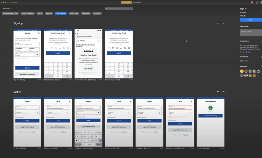
The use of Sections and Tags has made navigation and organization easier too — since they often juggle between desktop and mobile sizing, they use sections to group screens together so that other teams can view them easily. Tags are then used to help teams isolate what’s relevant to their specific needs.
Plus, a bonus for them is that with Zeplin they can now clearly see what other teams are working on. They’re no longer limited to the scope of their team's projects. Now the entire company has visibility and can clearly understand the intent and full scope of a design project.
Let's take a look at some of Steven’s favorite features, and the ways Bombas uses Zeplin in their projects.
Feature: Sections & Tags
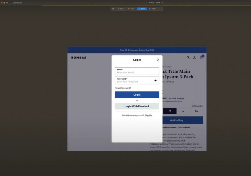
Feature: Screen Variants
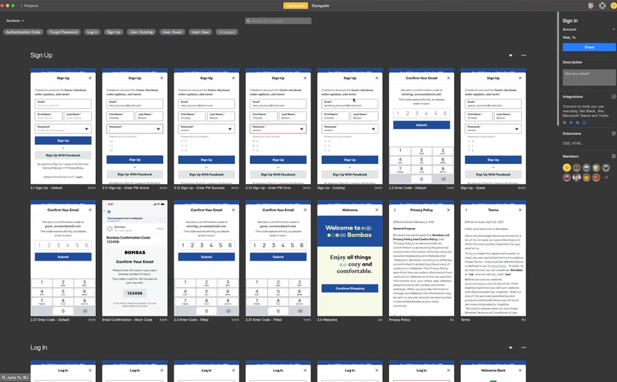
Feature: Publishing
What's next for Bombas?
Because the design team is growing, Steven and his team are still working through the foundational setup of their design process and pushing it to the next level.
One major step in this process will be connecting Zeplin to Storybook to help designers and developers work even more efficiently. This will help them tie the entire chain of their design system together: from Figma to Zeplin to code.
As Steven and the Bombas team continue to refine and develop their design process, one thing is certain. Zeplin has enabled them to spend less time explaining things and more time doing what they love — designing and building a delightful website for their customers, all while supporting those in need.
Learn how your team can use Zeplin to improve cross-team collaboration or contact us with questions.


