Introducing Styleguides Sync: A faster way to curate and align Figma libraries with Zeplin
Product News

There are so many benefits to having a design system, but as it grows it can get hard to organize all of the elements and communicate them clearly to devs. That’s a core reason we built Zeplin Styleguides — a unified design system reference for all.
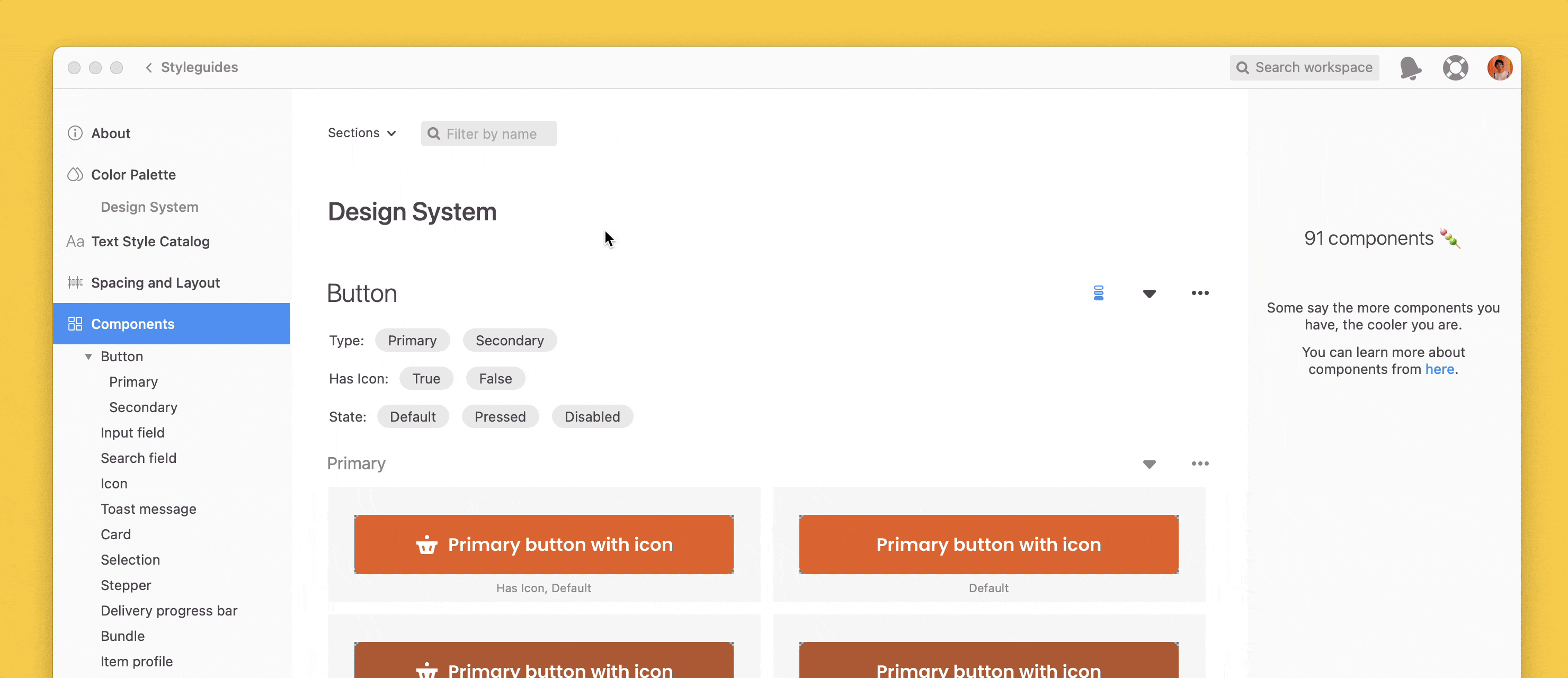
Whether your team is starting or scaling a design system, Zeplin Styleguides helps you organize your most up-to-date colors, text styles and components in a centralized location.
With Zeplin’s Styleguides, your team can:
Store finalized styles and components separately from work-in-progress to prevent confusion, and offer even more clarity with component versioning
Organize style guides in a single place of reference, for everyone (one link vs. multiple different links to libraries)
Easily surface design system information right on designs: whenever there is a reusable component or style when you inspect, you can jump directly to Styleguides
Link components in Zeplin to stories in Storybook with our Storybook integration. This offers quick access to Storybook code and documentation while inspecting in Zeplin, with automatic notifications when there are changes on either end.
Zeplin Styleguides today have all these advantages, but the challenge is they're hard to maintain. It takes time for designers to import newly updated styles and elements from a Figma library over to Styleguides, especially if your team makes a lot of regular design library updates.
That’s why we built Styleguides Sync, which I’m excited to tell you all about.
Now live: One click to create, one click to sync your Figma libraries to a Styleguide
Styleguides Sync in Zeplin is a faster, automated way to build and maintain Styleguides in Zeplin.
Create a new centralized design system reference from a Figma library in minutes and easily keep it up-to-date as it evolves. 🎨
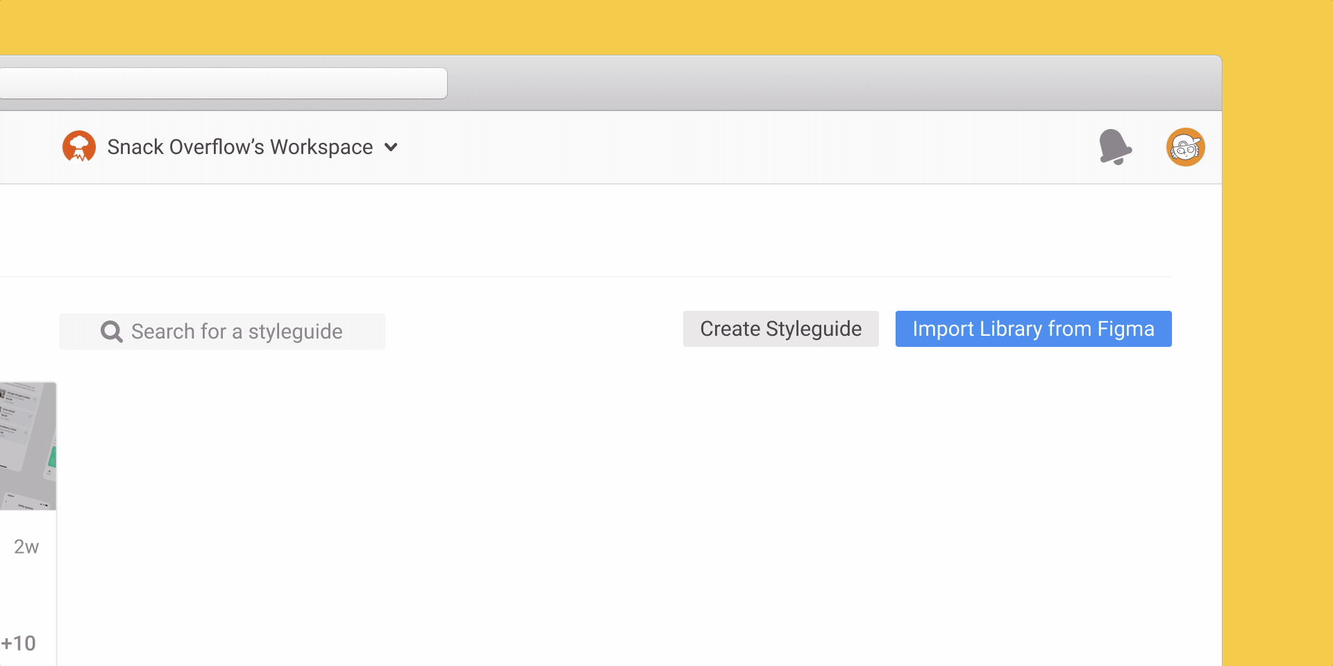
As you can see, generating a new Zeplin Styleguide from a Figma library is as simple as copying and pasting a link. That’s up to 2-3x faster than before for larger libraries.
For existing Styleguides, this new feature eliminates the need to export individual elements manually.
With just a click, Zeplin checks for all recent updates from the connected library — including new components and styles — and applies those changes for you. 🪄
See it in action
What do you think? Styleguides Sync works at the Global Styleguides level — look for it in your workspace or contact support@zeplin.io with any questions.
Even more Styleguide improvements:
Ability to export color variables. You can now export and display color variables from Figma in Styleguides.
Note: Variables can only be exported using our Figma plugin.
Improvements to color palette.
We’ve revamped the color palette in Styleguides with enhancements like:
The ability to reorder color sections
Listing colors sections in the left panel
Retaining the order of colors when exporting from Figma
Improvements to component inspect
You can now select to see dimension (width, height) and auto layout values
On the web app, you can now hover to see if a layer is a component or part of a component. The "Go to" arrow in the component tag will open the component detail page.
Component tags are green or red to show whether they are connected to code.
Improvements to “used in”/linked instances
You can now see when components from global styleguides – not just local – have been used in other screens, and view them.
When you select a Styleguide component, you’ll see an indication that it has a detailed view and versions, if any.
You’ll see a green indicator tag if there are updated/new components on a Styleguide since your last visit.
We hope you’re as excited as we are about Styleguides Sync and these Styleguide improvements. Start creating and managing Styleguides faster in Zeplin, and ping us with any questions or feedback. Cheers! 👋
Fin