
Welcome to the first edition of the Zeplin Highlights!
As the Zeplin crew, we're dedicated to helping teams deliver on the promise of design and we're excited to share several new features to make this easier. In this edition, publishing finalized designs gets even better, colors go to the next level and sharing externally becomes a snap.
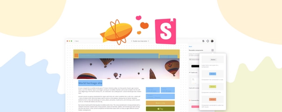
Semantic Colors in Zeplin
Users already rely on Zeplin to manage all of the different colors that are used within a design but we knew there was more we could do. In speaking with users, we learned that a common use case involved using the same color but in different contexts. For example, you may be using the color pink as a background color as well as the color for a border. While the color pink is the same, the context in which it is used is different —this makes pink a semantic color.
What are semantic colors?
Semantic colors are colors that communicate a purpose in their own context. By establishing a color system for your UI elements you can convey messages simply through color usage. For example, you can use a green border and background color to highlight important elements, while using red to convey possible hurdles for user experience or accessibility.
This allows you to use different colors within your design system to convey a semantic meaning, improving your workflows and user experience down the line.
Keep in mind however, that different text colors and accent color variants might be seen differently by users with a dark theme compared to users in light mode. Adjust your base palette, so usage for your semantic primary colors also translates to users in dark mode.
How to use semantic colors
Now that Zeplin supports semantic colors, you’ll be able to align existing and new colors along with the context in which they are to be used. So, not only will you have pink, but you’ll have #Background Pink and #Border Pink, both the same color but now with additional context baked right in. Semantic colors provide valuable context to everyone on the team so they know exactly what to build from the published design, helping ensure pixel perfect quality.
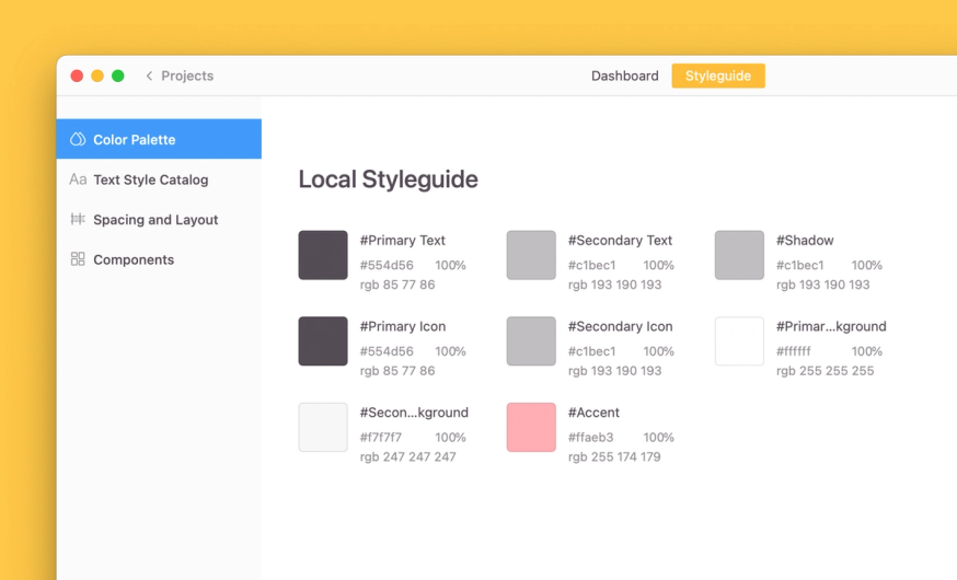
If you already have colors in your local styleguide, they will be updated automatically the next time you export a design to the project which is linked to it. Color names will also be updated to match the names defined in your design tool — no naming convention applied.
Publish in Order
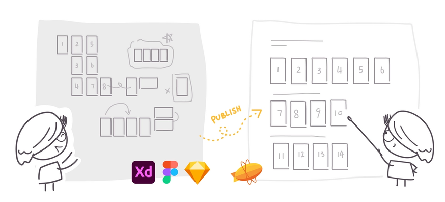
As a designer, is there a specific order you like to lay out your artboards, frames, symbols and components within your design tool? We hear this every day from Zeplin users out there. Until now, when publishing your finalized designs to Zeplin, you’d need to re-create this order for the rest of the team, which was time consuming.
Today, we’re happy to announce that Zeplin will publish in the order that you had originally set within your designs. This means that you no longer need to re-create this order in Zeplin, saving you time and effort. Zeplin will analyze the order that you have set in your design tool and maintain that order during the publish process. This becomes even more useful when you have dozens, or hundreds, of artboards and elements within your design. Now, Zeplin will publish them in your original order, so your design intention is carried through for the entire team.
Let’s Make a Copy
One of the most popular requests we get from digital agencies is to provide the ability to create copies of design projects. Since digital agencies work with external clients, they needed a way to share a “clean” design, without showing all the comments that live within the design project in Zeplin.
This made a ton of sense to us so we went ahead and built a new feature allowing teams to create a copy of an existing project that can be used to share with a separate set of users. Now, digital agencies can freely share a clean copy, without worrying about oversharing the team’s comments.
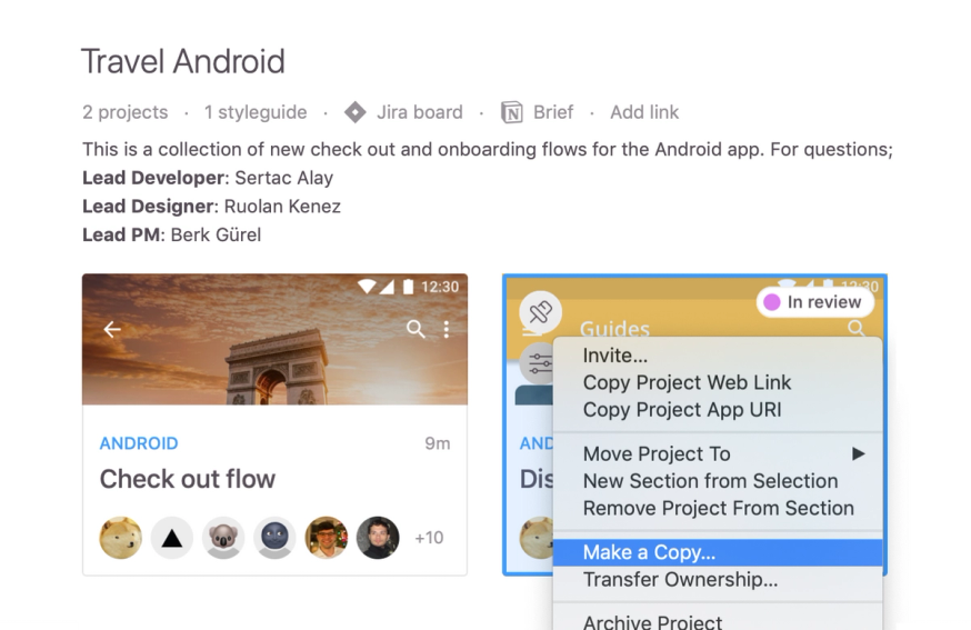
Bonus: You can make a copy of styleguides too!
You can also use the new copy feature as a way to iterate on an existing design, rather than building a completely new design. In some cases, users have told us that they prefer to iterate on designs in this way, essentially working from a copy since they maintain documentation that they would otherwise lose with a new file. This is a great use case for this new feature too.
Whether you’re sharing designs with an external team, like digital agencies, or want to iterate from a copy, we know you’ll love the new copy feature. We think it will save you time and improve collaboration with the team.
So that’s three new features to help you deliver on the promise of design, we hope you love using them and share with the world!
If you have any questions or feedback, please drop us a line!