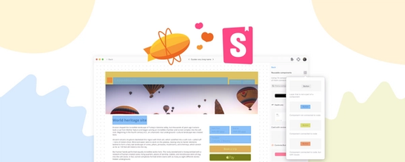

Our users love Zeplin’s Styleguides for bringing clarity and structure to design systems. But teams, especially those managing complex design systems, were running into challenges — organizing components was messy, navigation was clunky, and documentation was lacking.
After talking to lots of teams, we realized the problem wasn’t just usability. The structure we built Styleguides on couldn’t support what they needed, like better documentation and public sharing. So, we listened, dug into the pain points, and started to restructure Styleguides.
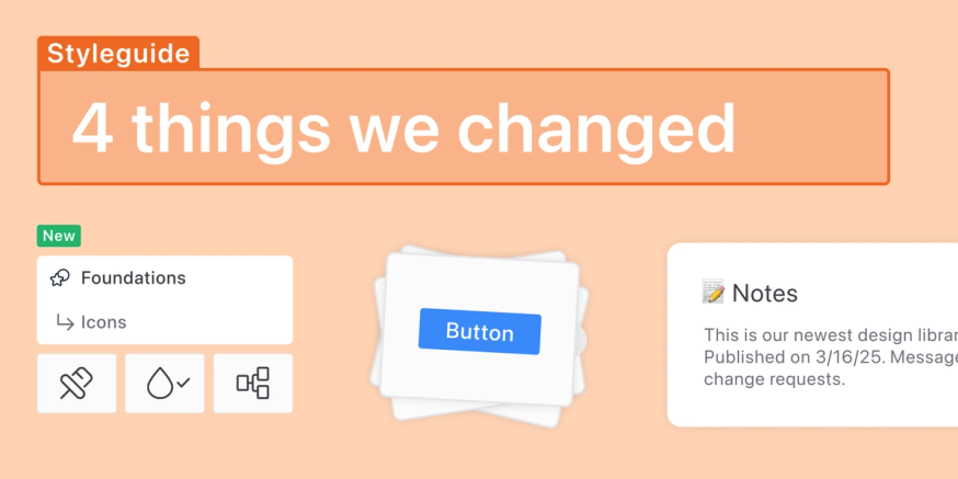
Today, we’re rolling out major updates to Styleguides — bringing better organization, faster performance, and structure. These improvements make Styleguides easier to use today while setting the stage for even more powerful features like documentation and public sharing.
What’s new?
Dedicated pages for components
Previously, all components in a styleguide were listed in one page. For organization, you could create sections but it was pretty limiting and as you add more and more components, it would get pretty overwhelming pretty quickly.
Now, all your component sections have their dedicated pages:
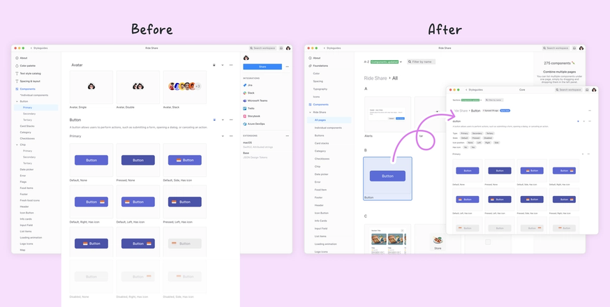
In addition, you can also create pages! Let’s say if you have multiple button-like components (“Button”, “Icon Button”, “Split Button” and so on), you can create a page called “Buttons” and move them all there.
Here’s how it all comes together:
Note that any components that are not in a section or a page, they will be collected in a page we call “Individual Components”. If you want to, you can select any components in there and create a new page from them.
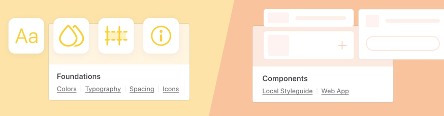
Icons page
Since icons are also represented as components in design tools, they would get lost is a pretty long list of other components. After talking to you all and reviewing lots of public design systems, we realized they’re usually given more priority. So that’s exactly what we did: Icons now have a dedicated page — easier to browse, manage, and maintain.
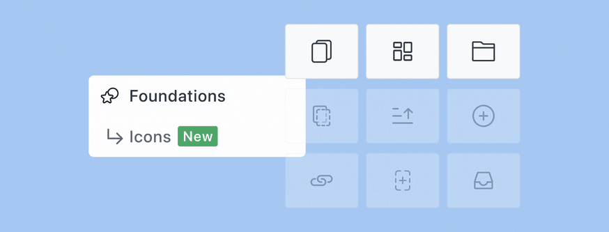
To move your icon components over to the new Icons page, head over to a component page and simply select “Move page to Icons” from its menu.
Foundations and an improved About Page
New Foundations section
For better organization, colors, spacing, typography, and now Icons (!), are now grouped under a single section we call Foundations.
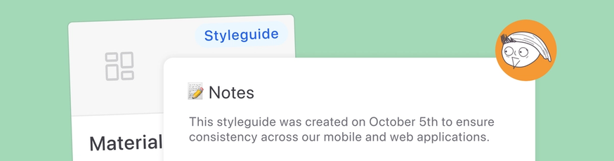
Notes
Within the About page, you can now add markdown notes for your design library, making it easier to communicate guidelines. This is our first step towards more sophisticated documentation features that will follow!
Bonus: Better structure, better performance
By restructuring Styleguides, we’re also made them way faster. Since all components aren’t crammed onto a single page anymore, performance is drastically improved — especially for teams managing hundreds of components. 🐇
How do I get started?
I already have a styleguide
If you are an existing styleguide user, your component sections will now be listed in distinct pages and the pages will be sorted automatically alphabetically — you’ve been asking for this for a while now!
There are a couple steps you can take to organize it further:
- Move your icon components to the Icons page
- Create pages for similar components (like your buttons and your inputs) where they’ll be listed together
I want to create my first styleguide
If you’re a Figma user, you can use sync your Figma library with a Zeplin styleguide in one click — Zeplin will automatically import your entire component library.
You can also watch a quick demo from our lovely Berk on all the changes we introduced today:
If you’re a Sketch or Adobe XD user, similar to export artboards, you can export symbols/components to your styleguide. Once they’re exported they’ll be listed under the“Individual Components” page. Then you can go in and start creating pages and sections to organize them.
What’s next?
We’re very excited about Styleguides and want to keep making it better — this was our first release in a series of Styleguides improvements. With this new structure in place, we can finally build on top of it — so expect updates around better documentation, public sharing, and more.
For now, jump into Zeplin and check out the new Styleguides! Let us know what you think — we’re all ears. 👂
As always, if you have any issues or feedback you can find us at Discord or you can email us at support@zeplin.io.
Cheers!