Last year, we launched Approvals — a way to standardize design approvals. After launch, we quickly realized it was too bare-bones. It lacked a lot of the pieces you’d need to make it truly useful in your day-to-day work. But it wasn’t all bad: it pointed us to the right teams who needed this type of functionality. So we listened, talked to a bunch of you, understood where we needed to make improvements, and here we are: Approvals 2.0.
But before we jump in, a quick reminder — why did we build Approvals in the first place? Getting sign-off on designs is complex and drawn-out. This is true for any design team, but it’s especially rough for agencies and freelancers working with clients. Approvals in Zeplin is all about standardizing this process, reducing back-and-forth and getting everyone aligned. But back to today — so, what’s different in Approvals 2.0?
What’s changed?
Request approval for a group of screens
The biggest change? Instead of having to request approval for each screen one at a time, you can now select a group of screens and request approval for all of them together. This was hands down the most requested feature we heard from you. It just makes sense: designers often have a set of screens that need to be approved as a package, not as individual pieces. Now, you can do exactly that.
To get started, select a group of screens in your project and hit “Request approval” below.
A clean, focused approval view
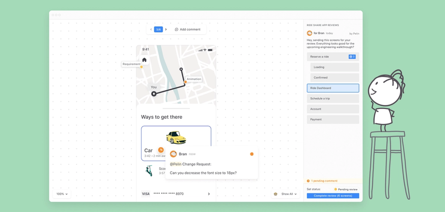
Another big addition is the new dedicated approval view. This view is all about keeping things simple: it shows only the screens that are part of the approval, so you can focus on what you need to review without distractions.
You can add comments as you go through each screen, but those comments stay hidden until you finish your review. As you finish your review, you also get to pick from three options: Reviewed, Requesting Changes, or Approved. Sound familiar? Yep, it’s a lot like GitHub’s pull request reviews, and we think it’s a great way to communicate clear, actionable feedback.
Built for folks not familiar with Zeplin
We kept the approval view simple on purpose. That’s because people reviewing designs might not be designers or developers. In fact, it might be their first time using Zeplin. So we want to make sure they don’t get lost in the details.
ProTip™️ — If you need to inspect designs while you’re in the approval view, you can still do that. Select a layer and you’ll notice a prompt to enable inspect mode.
A hub for all approval requests
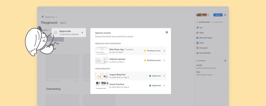
We’ve also added a new hub for all approval requests in a project, right on top of the project dashboard — you’ll see all the approvals there, with the ones you’re involved in right at the top.
Other bits and bobs
First up, you made it all the way down here. You get a cookie. 🍪 Aside from Approvals, here’s everything else we’ve worked on recently:
- Styleguide just went through a design refresh! Here’s what it looks like:
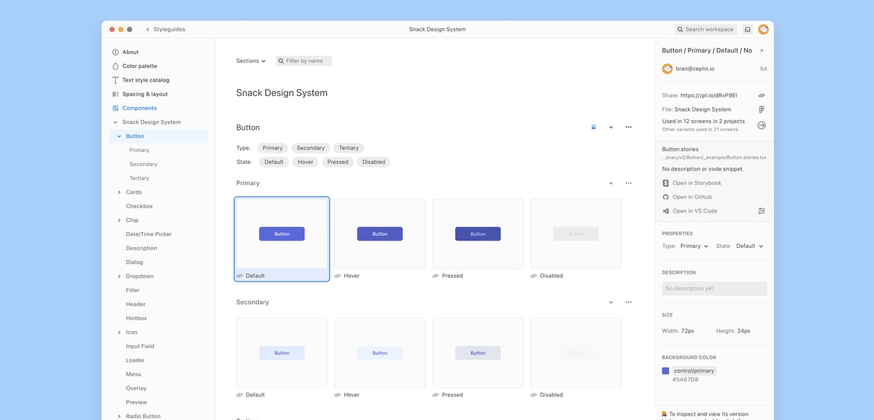
- We’ve also made some significant performance improvements in the Styleguide. If you have hundreds and hundreds of components, navigating through them should now be much faster.
- In case you missed it, we rolled out a couple new features last month: Project comments panel and a new Figma widget. Check out our full update from Halloween with a spooky twist.
- Our focus for the next couple of months will be to improve Zeplin’s performance overall. If you are having performance issues, reach out and let us know at support@zeplin.io. That would be super helpful. 🐌
We’re super excited about Approvals 2.0, and we hope you are too. We’ve taken a lot of your feedback to get here, but we’re always looking for more. Give it a try, let us know what you think, and help us keep making this feature better. As always, you can ping us anytime at support@zeplin.io — cheers!


