

O la la — bloom season is here!
A few months ago, we started discussing whether our next move should be a big one, maybe an AI-powered feature. But then we looked at the backlog, listened to your feedback, and realized: it's time to focus on the things you use every day.
This release is all about everyday improvements: a set of updates to features you already rely on, inspired directly by you. Some of these have been requested frequently, some have been requested persistently (we hear you!), and some are just those nitpicky fixes that make the app feel like home. Whether it's a major new view or a tiny tweak to the plugin, we designed these to make your daily life in Zeplin a little smoother.
Let's dive in.
The big one: Project Activity 🎾
“I want to understand what's going on in the project at a glance.”
“What happened when I was away?”
“Did they update those screens?”
We've been hearing these for a while. And sure, it was kinda possible through notifications. But up until now, keeping track of project progress meant hunting through notifications or clicking into individual screens to check version histories. It worked, but it wasn't exactly a "bird's-eye view."
Today we're excited to announce Project Activity: a dedicated place to see the pulse of a project at a glance.
Project Activity gives you a clear, chronological view of what's happening in your project — the story of your project's evolution, all in one place. It's all the context you need, right where you need it.
For now, we're tracking a few key actions: new screens, screen updates, status changes, and mentions. We wanted to keep it simple and make sure the information is actually useful before adding more.
One thing we love about this update: setting and changing statuses on the dashboard gets way easier. Right next to each screen, you'll see a dropdown to set or change its status:
This is our first step — let us know if the information is helpful, and if there's other stuff you'd want us to add.
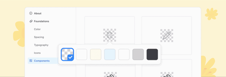
Component background color
This one caused some frustration. Previously, if a component had a transparent background, Zeplin would check the icon color and, based on its HSL value, assign a checkered background. The idea was to help, but it ended up confusing devs more than anything.
So we stepped back and decided to put that choice in your hands: you can now set the component background color yourself. By default, components come with our grid background, but you can change it for your entire Styleguide, for specific pages, or even for a specific section.
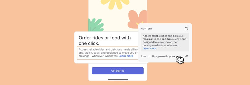
Figma hyperlinks
This one's pretty straightforward — turns out we've been ignoring the hyperlinks you add in Figma. Not cool. Zeplin now shows whether a layer has a link, and you can access it from the right panel under the "Content" section.
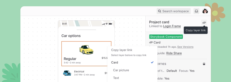
Layer deep links
At Zeplin, we've always been proud to make as many things linkable as possible: individual screens, components, annotations, a specific comment reply… But one thing that took us a while was layer detail links.
You can now copy a link to a specific layer for hyper-specific feedback. Just select a layer and hit the new copy link button in the right panel. You can also right-click any layer and hold the option key to grab the link from there.
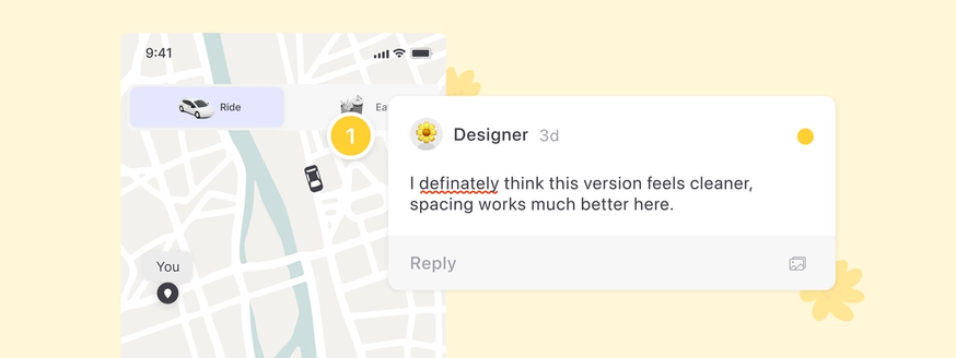
Spellcheck for annotations and comments
It's still hard to remember all the n's, c's, and s's in "unnecessary." And when you're in a rush, typos happen. From now on, Zeplin will catch your typos before you send them to your teammates. We're on your side.
Section names in the Figma plugin project list
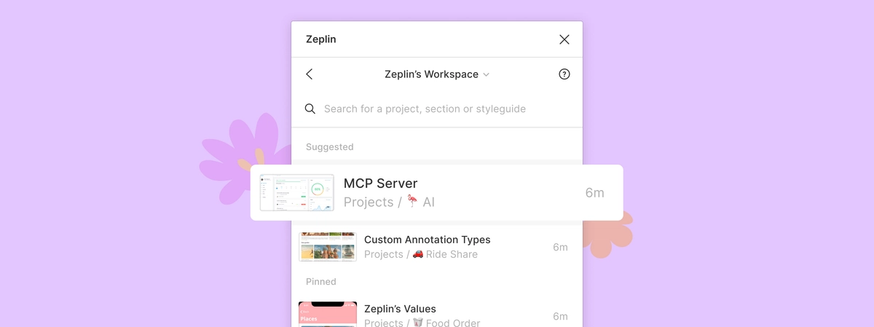
When multiple teams work on the same app but different parts, project names can start looking pretty similar. We've been hearing feedback about this, so we now show section names alongside the project name in the Figma plugin — making it easier to pick the right project when you're exporting.
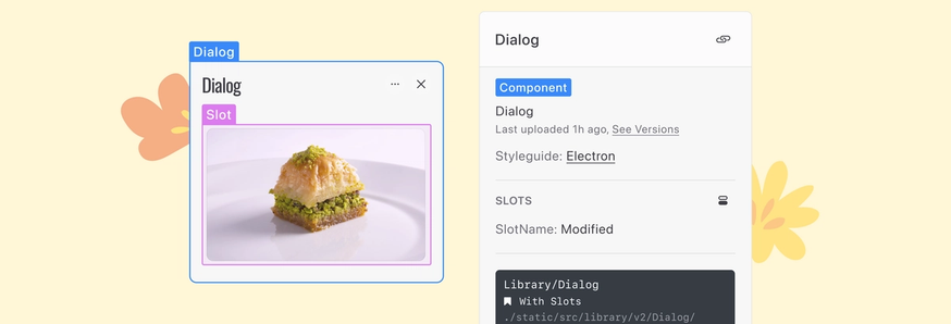
Almost here: More Figma Slots improvements
We've been supporting Figma's Slots feature since day one, and devs shouldn't have any issues if you started using slots in your components.
But we've got more coming in a couple of weeks: we plan to surface the slot layer better as you’re inspecting components.
And more!
- Screen names now have more room on the Dashboard. When in doubt, hover over to see the full name.
- Fixed an issue where annotations were stuck on loading.
- Fixed an issue where the Flow tab got stuck if a member left the project.
What's next?
In the upcoming updates, we plan to focus on our AI features and Flows. We'd love to hear your suggestions — ping us at support@zeplin.io, we're all ears.


