
During the product design and development process, when is a screen more than a screen? Well, when it comes in multiple variations, of course!
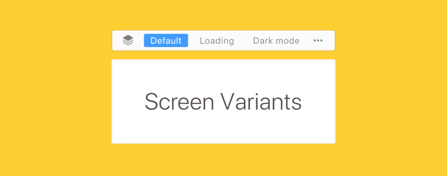
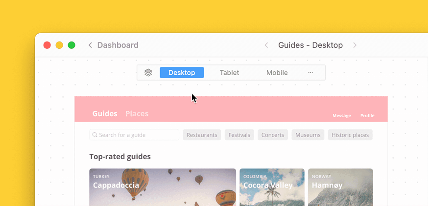
These variants can include things like light and dark mode, screen breakpoints and even error states. While these may all seem like separate and different screens, they are, in fact, variations of the same screen. This can all get confusing fast, which is exactly why we built the new Screen Variants feature for Zeplin.
Today, designers will try to lay out their designs in such a way that variants are highlighted (i.e., vertical layout below default screen), use text layers to provide instructions for the team or even book more meetings to clarify. For developers, understanding where variants exist is one challenge to overcome but then working with variants is another — it requires so much back-and-forth switching between screens. There had to be a better way.
It’s time to DSV — Define Screen Variants
In addition to Sections and Tags, users can now keep their workspace organized and reduce visual clutter by defining screens that are variants of a default screen. With Screen Variants, users can group variations of the same screen in Zeplin so that their relationship is easily recognized.
You can define Screen Variants in Zeplin by simply dragging and dropping variant screens onto the default screen. Zeplin will automagically convert them into a Screen Variant — it’s that easy. You can also define Screen Variants from within your favorite design tool (whether that’s Figma, Sketch or Adobe XD) by adding “-v” as you name your screens. When published to Zeplin, they’ll come in as a completed Screen Variant. 😎
Learn how to define Screen Variants step-by-step in this support article.
Make it easy for the entire team, including developers
After defining Screen Variants, the entire team, including developers, UX copywriters, product marketers and more will see an organized set of screens where variants are grouped together, making it much easier to collaborate on designs.
We’re also excited by the impact Screen Variants will have for developers specifically — in fact, they were the first to ask us to build this feature! We received a lot of feedback from developers asking for a way to identify and work with related screens. With Screen Variants, developers will now gain visibility to when variants of a screen exist and also have the ability to cycle through various states easily, all without having to switch between screens.
By making the relationship between various screens more organized and visible, Screen Variants cuts down on unnecessary back-and-forth when it comes to understanding the layout of the design and how all the screens fit together. Fewer conference calls to explain the design and more collaboration on the design.
“This will help a lot with stakeholder collaboration,” Matthew Ellam, Product Designer at TSB Bank. “Now teams can focus on the content instead of navigating lots of screens.”
We believe it will be wonderful for designers to no longer spend time redlining screens to describe their state or manually create documentation about variants within the design file.
“As a designer, I find this feature quite amazing. We have huge projects with many screens so organization becomes critical. Screen Variants will help us establish much needed structure for the team,” Nuria Bringue-Bergua, Mobile UX Designer at Electrolux, also said.
Now, developers can save time with this simplified and streamlined way to work with variants. Even teammates in QA and PM can quickly confirm that the designer has accounted for all necessary variants (like “empty,” “error” and “regular” states). We hope you love using Screen Variants as much as we loved building them for you!
Check out this short explainer video on how to get started using Screen Variants.