Welcome, foolish mortals, to our newest update in Zeplin. Kindly leave all your earthly troubles behind, and join us in celebrating the rebirth of comments… 🪦
Comments have been around since the day Zeplin was born. Over the years, we’ve made tweaks and improvements, but today marks our biggest update yet.
First up, you’ll be introduced to the Project Comments Panel, a centralized space where all comments across all screens are collected. Next up is Unread Comments — Zeplin now highlights comments you haven’t read yet, making it clear where your eyes are needed the most. 👁️
If you stick around till the end, we might also have one more thing. Now, as they say, “look alive”, and we’ll continue our little demonstration.
Project Comments Panel
We’ve heard how awkward it can be to go through screens one by one, hunting for comments, trying to make sure you’re on top of everything. Well, fear not.
In the project dashboard, within the right panel, you’ll notice a new “Comments” tab — a new home for comments.
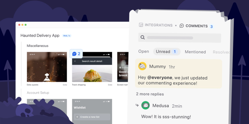
The new panel is where you can access all the comments across all the screens in the project. It’s not just a list of comments though. That would be pretty overwhelming — as we’ve heard from folks managing comments in design tools.
Project comments panel has got clever tricks to help you find exactly what you’re looking for:
Filter and search for comments
As we talked to many of you, we learned about lots of different reasons for searching comments. So, the new comments panel has a bunch of filters optimized for common use cases:
- Comments you made — Did anyone respond to my comments yet?
- Comments you’re mentioned in — Did anyone ping me directly?
- Comments you haven’t read yet — Did I miss any comments?
- All open(or resolved) comments — Let me make sure no one’s blocked.
- Comments based on color — Did copywriters leave any comments?
On top of these filters, if you already have a specific comment in mind that you want to jump back into, you can simply search for a word or phrase you recall from that comment.
Highlight related designs
A comment usually doesn’t make sense by itself. You’d need to see the design it is added to, to have more context. That said, you don’t want to navigate in and out of screens endlessly as you review comments across many screens. So, we’ve built a way to give you just enough context.
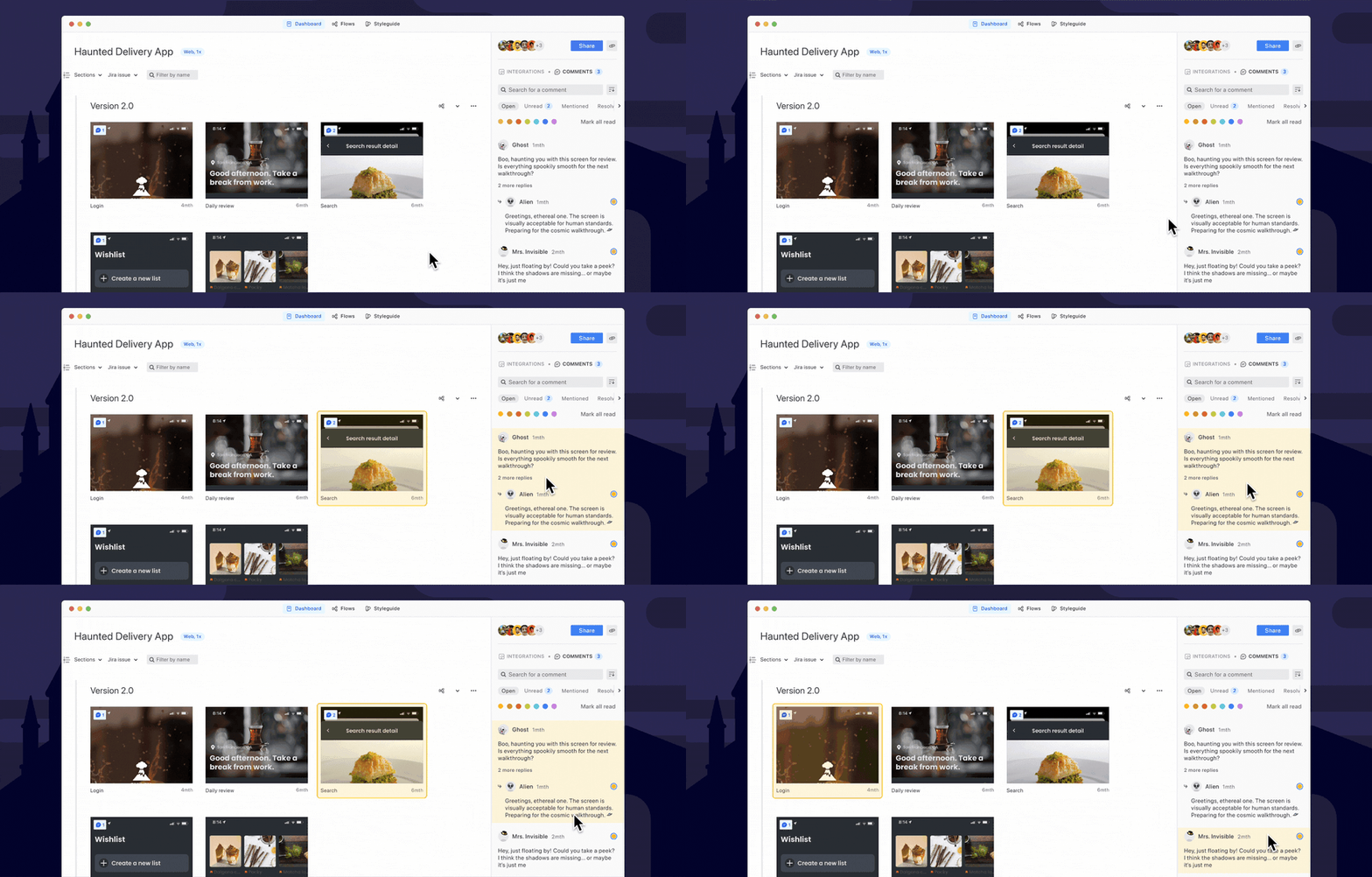
With the new comments panel, as you’re hovering over different comments, the related screen will be highlighted on the left. If you need to take any action, double-click into the comment and respond. If not, quickly move on to the next.
Spot screens with comments
Aside from the comments panel, there’s also a new way to quickly spot screens that have comments — an indicator right on top of the screen’s thumbnail:
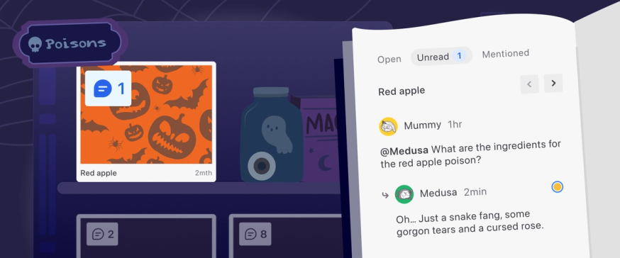
Clicking the indicator pulls up the comments panel and only lists comments for that screen. What’s even neater is that you can move between screens with comments using the arrow keys, if you hold down the Option ⌥ key on macOS, or the Alt key on Windows.
Unread Comments
When you have dozens of comments in a screen — and more(!) are added over time — it gets really tricky to figure out which comments are new and which you’ve already read.
Zeplin now keeps track of all the comments you’ve read and highlights the ones that you haven’t seen yet.

This also applies for the new comment indicators in the project dashboard. The screens with comments you haven’t read yet are highlighted in blue.

Mark as unread — your to-do list in Zeplin
When you combine unread comments with the new comments panel, it serves as your personal to-do list within Zeplin. If there’s a comment you need to revisit later or an action item that requires follow-up, simply right-click the comment and mark it as unread. This way, you can easily keep track of changes you need to make.
…one more thing: New Figma widget
Well, well… It seems you’ve made it this far. You were promised one more thing and you shall receive it.
Introducing Zeplin Digest, our new Figma widget for quick intel on frames you’ve published to Zeplin. It summarizes key Zeplin details right inside the Figma canvas.
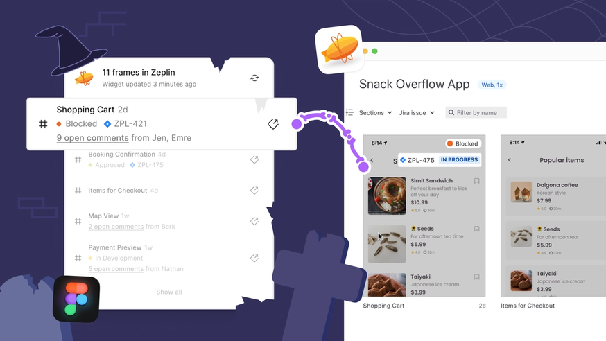
To get started, head to your favorite Figma file, click the “Actions” button below (⌘K or Ctrl+K), type in “Zeplin Digest” and search for it under widgets. Alternatively, you can also install it from the community page:
Once you log in, Zeplin Digest will list all the frames in the page that you’ve published to Zeplin.
ProTip™️ — If you move the widget inside a Figma section, it only displays information about the frames within that section. So, you can add multiple instances of the widget, one in each section, to get the most out of it.
Here's what you get within Zeplin Digest:
- Quick links to open the designs in Zeplin 🏎️
- See when a screen was last published to Zeplin — to make sure your devs are working off the latest designs
- See if anyone commented on a screen
- Any attached Jira tickets, along with Jira status
Well, unwary adventurers, we hope this was a satisfactory demonstration of Zeplin’s new capabilities. As always, we’re eager to hear your feedback. Feel free to ping us at support@zeplin.io, we’re all ears. 👂
…and if you’re new to Zeplin, sign your registration form here. We’ve been dying to have you.

