

Well, hello! This is my first Zeplin blog, so thank you for taking time to read it. I’m Burcu, one of the Product Managers here at Zeplin. In my last 6 years as a PM, I’ve watched the industry come a long way, moving from a focus on specs, pixels, and redlines to component-driven workflows. 🍡
The history of components is fascinating to me. Did you know that software developers were thinking about “componentization” as a way to organize and reuse code way back in the 60s? Since the design community followed suit in the 2000s, more product teams use — or want to use — components than ever before.
As a PM, I’ve watched this trend translate into positive outcomes for the entire team. With components as our common language, we reuse more design and code, ship more performant UX across touchpoints, and can quickly scale with less strain on the team.
Now, all of this sounds wonderful on paper. 🤖 After speaking with several teams this spring, my crewmates and I observed a common theme: Many teams don’t have the time or capacity to do both: maintain design libraries AND ensure component adoption. Because of this, developers are left in the dark: They can’t see all components used in the design or easily access instructions for component behavior at handoff.
Components hide-and-seek
As we dug into this, we realized this was also true for Zeplin users. While teams love Zeplin for a structured handoff process and top quality specs and code, not all were using Styleguides, our offering for component management.
When we built Styleguides in 2017, we imagined a linear process: The designer sets up Global Styleguides for the team, Zeplin cross-checks Styleguides to extract component information, and the developer sees all this information during screen inspection. But without first setting up Styleguides, developers won’t be able to see any components.
Among those developers who do have some level of component visibility, we noticed another pattern: When they start to work on a new feature, the first thing they do is check for components. Any components on this screen? Has it been used in other places before/has it been built already? How should this component behave? Am I missing something?
Now, some great tools for component documentation already exist. However, designers still had workarounds to add notes on component behavior, like writing instructions in text layers in the design tool or storing notes in separate documents/Jira for devs to get to. We also saw teams struggling with Figma comments. All this meant that everyone needed to jump on a call to go over everything again because those workarounds… didn’t work.
So we asked ourselves: Could we make it so easy to see components in Zeplin, like turning on a switch? 🕵️♀️
Components in Zeplin: Maximum Visibility, Zero Guesswork
We rolled up our sleeves and went to work. Lots of brainstorming (and blood, sweat, and happy tears 🐸) later, we’re excited to announce three new updates for component-driven teams. We’re proud to say Zeplin is the first product to offer these, and can’t wait to see how you’ll use them.
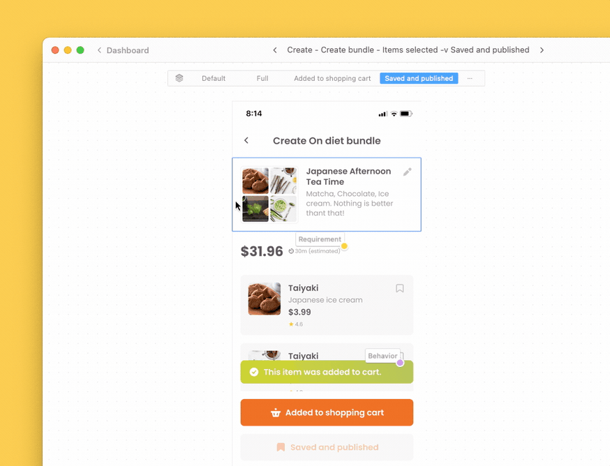
1. Instantly Visible Components: With one click, you can now see all components on a screen — even if they haven’t been added to Styleguides. That’s 100% component visibility at all times. No more guessing games, pinging designers for help, or setting reminders to remind developers to... you get it. Use the “Show All Components” dropdown to get started.
2. “Used In” Details: See a list of other screens the component is also used in— within a project and across projects. No more randomly clicking around to find other places of reuse! Zeplin will also show when component variants or similar components (shown when no designated variants) are detected in other screens.
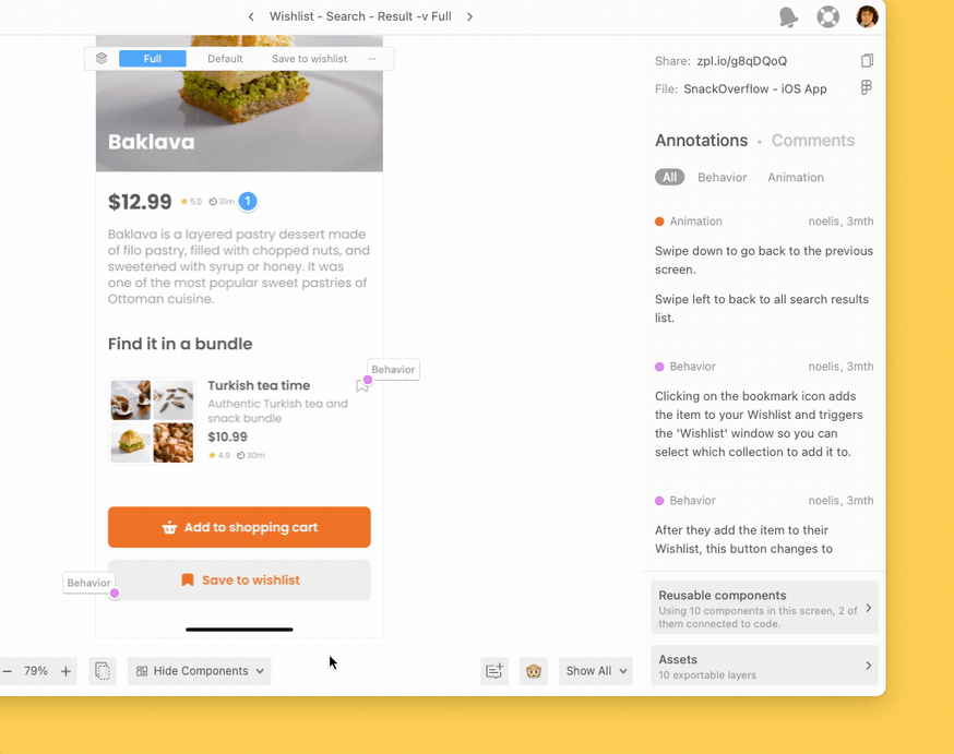
3. Linked Annotations: Designers can now pin Annotations to a component. The Annotations remain “linked” to the component wherever it is used in a project, and remain attached whenever a screen is updated. (That’s right, no more lost comments floating out in space!) Your instructions stick around long after you’ve moved on to the next project, giving developers 24x7 access to design intent right on the design.
You can continue async conversations with Comments and Filtered Notifications.
Now that anyone can see all components from the design tool, you might ask why use Styleguides in the first place. It’s a good question!
We recommend using Styleguides to connect design to code, and to let your teams know when new components are added. You’re no longer maintaining isolated libraries in the design tool or code repo, you’re giving each other more information and more insight. It’s like a design system, only leaner!
Global Styleguides: A lean, mean design system machine
This is how a power team can use Styleguides:
- Designers publish components from the UI library in Figma, Sketch, or XD to a Global Styleguide. This is where they maintain all components across projects.
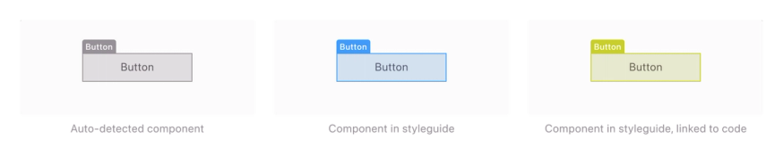
- Developers instantly see all components — whether detected from the design tool or in Styleguides. They can use Zeplin’s color-coded highlights to tell apart core components from custom ones, and plan for build.
Green highlight means this core component was intentionally added to the Styleguide and connected to code. Code snippets will be visible during component inspection in Zeplin.
Blue highlight means this core component was added to the Styleguide but not yet connected to code.
Dark Gray is the default highlight color for components auto-detected from the design tool.
Pro tip: Once you connect your Storybook instance to Zeplin, you can match design components to their code counterparts with simple text and visual search. Once you’re set up, anyone on the team can use the color-coded highlights to know when a new component’s been added.
Designers, it’s time to show off your components — so everyone benefits! And devs: 100% visibility into component use means you’re always on the same page as the designer. So you can reuse code, save time, and ship higher quality work.
To see these features in action, join our Recent Releases webinar. Prefer to read? Check out our release notes.