Joining us today are Juhani Lehtimäki, Pierluigi Rufo and Ilian Konchev from SnappMobile. They’re experts in the mobile app development space and you may recognize Juhani as the author of Smashing Android UI. They’re the team that built Zeplin Mobile using the Zeplin API!
If you haven’t tried Zeplin Mobile yet, join the open beta here.

Today, we’ll chat about the SnappMobile team’s product development philosophy and workflow, which led them to build the mobile app.
Tell us a little bit about yourself!
SnappMobile is a mobile-centric design/development agency based in Europe with people distributed across 15 sites from many different countries ranging from Germany, Italy, UK, Kenya, Bulgaria and much more. We’re a small company of experts and mobile enthusiasts working on iOS, Android and Flutter.

How do you use Zeplin in your workflow?
We’ve started using Zeplin almost from day 1 when it launched, and we are huge fans of it since it closely aligns with our development philosophy and workflow.
"For us, Zeplin is not just a handover tool, but a communication tool.
"
We believe that the quality of the end product directly depends on the number of iterations we do during development. To maximize iterations you must remove friction wherever possible. For us, Zeplin is not just a handover tool (we don’t do handover, but continuous improvement), but a communication tool. Zeplin provides context to our design-related discussions. Being able to point to a specific component or part of the screen and having a discussion in that context is extremely powerful. With this powerful communication tool, we remove all the friction and overhead from design discussions.
Related to the first point, we also have a mantra that an amazing design doesn’t matter if it cannot be implemented. Similarly, the technical architecture and implementation doesn’t matter if the design isn’t there. Because of this, we have spent a lot of effort in bringing design and development into one single team. We don’t have a separate design team and a development team — just one product development team! Even as one team, communication is essential since our team members are distributed in different cities and countries. Communicating design ideas is not straightforward and Zeplin helps a lot with that.
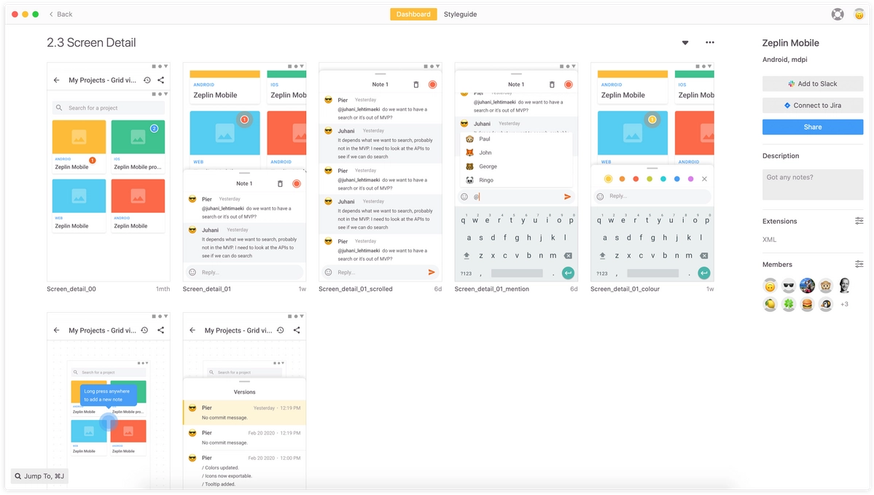
I would go so far as to say that without Zeplin we could not achieve the high quality of our product we do now.
Working remote is becoming increasingly a popular topic. Any tips for folks who are considering this?
Make sure the tools and processes are in place! For instance if you are doing meetings online, have everyone show their faces using video and try to avoid situations where part of the group is in a meeting room. Small things like adding your profile picture on Slack or other applications also go a long way. Real-time collaboration apps like Google Docs and Figma also helps us a lot since we reduce the back and forth that would happen.
What inspired you to build the mobile app for Zeplin?
A mobile client for Zeplin is something we’ve wanted to do for a very long time and we’ve heard others asking for it as well. The inspiration came when we got email notifications from a Zeplin comment, we tried to open them in mobile but we couldn’t reply back or view the designs.
As mentioned above, Zeplin is our communication tool when it comes to designs. In the modern world we can perform many of our tasks on the go but design communication wasn’t one of those that really worked from mobile. As our company is highly distributed, people work in different times zones, and have lunch breaks at different times etc, it’s not always possible to be in the front of you computer to answer design-related topics. Like we mentioned, for us quality is about removing friction in our own communication. Making it easier for both designers and developers to be reachable will remove one more roadblock to achieve super-fast iterations, so the need was very clear to us.
When the API became available it seemed like a too good of an opportunity not to jump in and build it. We solved an everyday issue we had and hopefully others will benefit from it as well!
What does Zeplin for Mobile include?
"We’re not trying to replicate the full Zeplin desktop experience on mobile, but instead focusing on the communication aspect and solving that well.
"
We designed it in a way that it’s almost like a messaging application where it’s very easy to view the screen and comments. The use case was very focused on allowing designers, developers and product managers to easily view designs and respond to comments on the fly. We intentionally didn’t include technical specs since you have access to Zeplin on your desktop where you would do more intensive work. We’re not trying to replicate the full Zeplin desktop experience on mobile, but instead focusing on the communication aspect and solving that well.
The app will show you an overview of your projects and detailed info about the screens inside the projects, including the screen annotations and the screen versions. The app allows you to comment on the existing notes, create new notes and share the screens with the rest of the team.
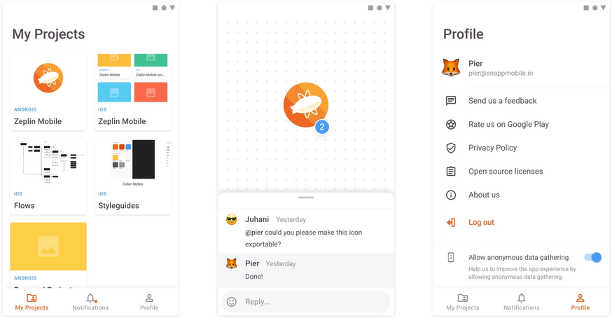
For the developers reading this, we tried to use the latest and the greatest from what both mobile platforms have to offer. We use quite a lot of Combine on iOS, we use diffable collection view data sources, some custom layouting and we found the end result being quite enjoyable from both the users’ and the programmers’ perspective.
What are you looking forward to? What’s next?
We are looking to push this out publicly very soon! We have a lot of ideas but our immediate goal is to deliver a very polished experience. We also want to enable deep linking so that when you click on links from Zeplin in your phone in Slack, email or another tool, you’ll be taken directly to the mobile app. We will also enable user tagging in the comments. As soon as the Zeplin webhooks are out, we will also implement notifications.
While designing, we considered what’s unique to a mobile app that you might not be able to do in a desktop app. If possible, we’d love to support native push notifications so you will be able to preview screens and reply to comments right from the notification to make the communication experience even faster.
This is a very long term vision, but as a mobile centric team we also thought that being able to view prototypes in Zeplin would be great to have. Imagine holding your real device trying out a full screen prototype in Zeplin.
How was your experience working with the Zeplin API?
Zeplin’s API was quite stable from day one. I think that’s worth pointing out because it means there’s been some serious thought and work put into the design and implementation. We were also surprised by how friendly and welcoming the Zeplin team is. They responded promptly and accurately on our questions and were also open to listen to some of our proposals. They’ve set up a developer community on Slack so we were able to collaborate very closely with the Zeplin team — props to the Zeplin API team!
What’s the feedback been like so far?
"It’s only been less than 2 weeks and we’ve already had 1,000 users try it out.
"
Given that we have only launched beta access to our apps, we were overwhelmed by the amount of people that are interested in trying it! It’s only been less than 2 weeks and we’ve already had 1,000 users try it out.
We are also quite surprised by how friendly and positive our conversation with our testers is. We see requests for features like having a full screen view mode for designs which seems again that there’s need for seeing prototypes on a device. Swiping between designs was also another request.
There’s lots of potential ahead, and we’re very excited!
Zeplin API lets you build a wide set of solutions ranging from internal scripts/applets to full-blown apps. Getting started is easy, explore the documentation now!
We can’t wait to see what you all will make, ping us at dx@zeplin.io with any questions or suggestions.


