Today, we’re very excited to announce Spacing, a new way to share your spacing system in context of your designs — along with support for rem unit.
While inspecting designs, Zeplin now displays overlays for spacing tokens and translates measurements to rem, allowing your product team to communicate effortlessly and deliver beautiful products.
Why spacing?
It all started with folks asking if they can see their spacing tokens right in Zeplin — just like how they see the named colors, text styles and components. It’s a key piece of the design system. When we dug deeper, we realized that teams have a well defined spacing system but on a day to day basis, struggle to communicate spacing in their designs to their developer friends.
As a developer, you might receive a design that doesn’t fully match with your spacing tokens, so you take your best guess only to find out that it needs to be updated. Maybe you were extra careful and asked what the spacing value should be, but in either case it caused additional back and forth.
A lot of designers also add overlays to their designs to reduce ambiguity — this is what our designers do at Zeplin as well! But again, it’s time consuming.
With Spacing, we focused on communicating your spacing system to the rest of your team without all the fuss.
Getting started
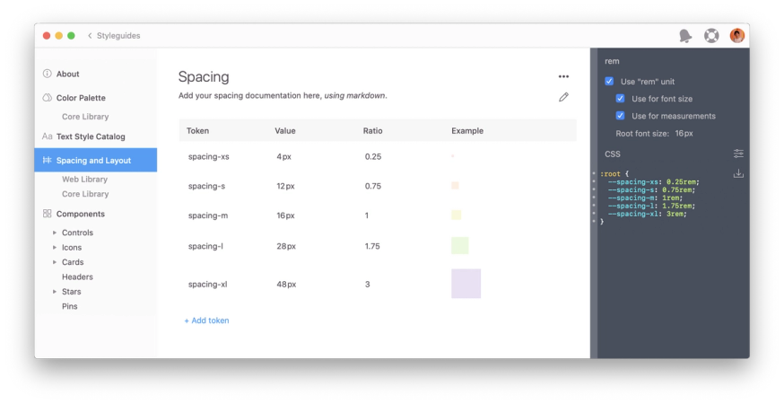
To get started, head to the new “Spacing & Layout” page of your styleguide in Zeplin. Hit “Add Token” to create your set of spacing tokens. Zeplin will suggest names as you create tokens but feel free to rename them to match your design system.

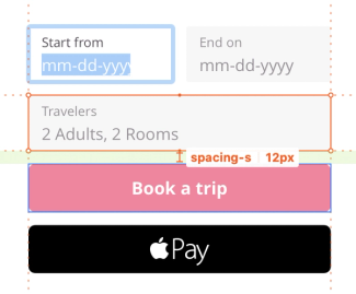
Once you create your spacing tokens, you’re pretty much done. You can now see these spacing tokens in your designs, like so:

You’ll also notice that Zeplin also displays translucent overlays so that you can easily differentiate where spacing tokens are used. You have the option to change the overlay color to provide the best contrast for your designs (or just pick your favorite color).
Enabling rem unit
Since day one, we’ve heard from a LOT of developers that they’d like to see values in rem. It’s taken us a while, but it’s here!
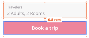
If you go back to the “Spacing & Layout” page of your styleguide and click “enable rem”, you can now see measurements and font sizes in rem.

You can enable rem for either measurements, font sizes or both — based on your workflow. If you have different use cases you’d like us to cover, let us know at support@zeplin.io, we’d love to learn more!
☝️ It’s possible to use rem units separately or together with spacing tokens.
More tips and tricks
If you define measurements based on a single base value, Spacing supports that too. Define only a single spacing token in your styleguide and Zeplin will show measurements in multiples of this base value. For example, if your base value is 8px, and you call it “x”, instead of seeing 16px while inspecting designs, you’ll see “2x”.
For developers, once you define spacing tokens in a styleguide, you can also get platform specific code snippets through Zeplin extensions: Style sheet variables (CSS, Sass et al.), Swift constants, XML variables. You can also create your own extension to generate custom code snippets.
Spacing tokens are also accessible through the Zeplin API, where you can build custom workflows like pulling them into your codebase automatically.
What’s next?
During our conversations with folks, we’ve learned about more advanced scenarios such as having a different set of spacing tokens where one set is used for layouts between components and another for spacing between content inside a component. Our hope is to support more use cases like this one down the line by looking at a spacing in relation to its surrounding layers. If you have any other feedback on Spacing, let us know at support@zeplin.io!
🐦 Share Spacing with your teammates.
That’s it for today. We can’t wait for you to try Spacing out (pun intended) and let us know what you think.
Stay safe, stay healthy!


