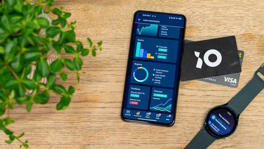
We’re lucky to live in a time where our everyday banking needs don’t require a physical trip to the bank. Things like tracking our spending, paying a bill, transferring funds, managing investments, or seeing if that last paycheck cleared, can all be done directly from a mobile banking app right on our phones, anytime and anywhere.
This is quite an achievement when you think of mobile banking apps from a product perspective. Banks manage a massive amount of sensitive and complex financial data across thousands or even millions of users, and those users — people like you and me — tend to log into mobile banking apps frequently, either out of habit or necessity. The majority of consumers (61 percent) use digital banking services at least once a week!
We wanted to dig deeper into what’s required to successfully build a mobile banking app and consistently deliver a positive experience for its users, so we connected with Mobile Solutions Architect at iO, Rogier Saarloos, to get his insights.
iO is the maker of the BankingRight, a mobile banking front-end framework. Comprised of a number of customizable UI components, BankingRight has enabled companies like TD Bank, Knab, Aruba Bank and Optimix to create crowd-pleasing banking apps and wealth management websites rapidly, which means Rogier and his team’s advice is a real goldmine for any team looking to build positive digital banking experiences for Fintech.

Read on for Rogier’s thoughts and direct answers to these questions:
- What makes developing a mobile banking app unique?
- What are some must-have features of a mobile banking app?
- Top advice for designers and developers creating a mobile banking app
- How Zeplin helps iO quickly build and deploy high-performing mobile banking apps
What makes developing a mobile banking app unique?
Banking as an industry sounds very traditional, but the opposite is true for digital banking. If you’re a banking institution today, you know that your customers want access to a sleek app that’s enjoyable, fast, and secure. And when you put those customer needs together with what banking apps are functionally designed to accomplish, you get three characteristics that make the process of developing these apps unique from other types of apps.
1. Usage rate is extremely high
When you give banking customers the option to check their account balance anytime they want, they will do that. Several times a day, even. Multiply that by multiple thousands of users and you have the pressure of daily active users that cause technical challenges that simply don’t exist on apps with less rigorous usage.
2. Banking customers have strong expectations
Due to the frequency of use and the availability of so many competing mobile banking options, customers demand for a high level of in-app user experience. At the very least, a banking app needs to be fast-loading and simple to use. Beyond that, product teams who support these apps must be wary of any moment there is any type of friction, because users will feel it immediately and will typically be very vocal about it.
"When you have a lot of interactions with customers in a day, you need to have a highly performing app. That's partly technical, but also how you structure things visually and UX-wise. What customers are looking for needs to be there incredibly quickly because the moment the UX is not good enough, users will start complaining."
3. The standard feature set is large
There are five categories of features you’ll typically find in mobile banking apps: payments, expense management, savings and investments, customer support, and security. Users want all of them and if a competitor has it, your banking app must have it too. Because ultimately, the current generation of banking customers will choose their bank based on your app’s feature set and they expect a lot of them as a baseline.

What are some must-have features of a mobile banking app?
When it comes to personal finance and Fintech digital experience, users naturally care a lot about security. However, “there’s a common misconception where people assume that the banking app on their phone is less secure than on their PC because of the nature of it being mobile. They think, hey I can put this in my pocket and take it on the go, which makes it insecure — right?. But in reality, your banking app runs on a device in a tight ecosystem, especially when you're using an iOS device, which makes it much more secure than your website.”
So beyond that, the must-have features when building a mobile banking app are those that focus on ease of use for the everyday user. Here are some examples:
Onboarding
In the past, becoming a customer at a bank was a multi-day process because it was manual, the information you needed wasn’t connected in any way, and several people had to get involved. But now, onboarding for a digital banking experience is a self-guided process that can take 10 minutes or even less. This is where the UX of a banking app comes into play because users build that trust and loyalty with you through that initial experience.
Personal financial management
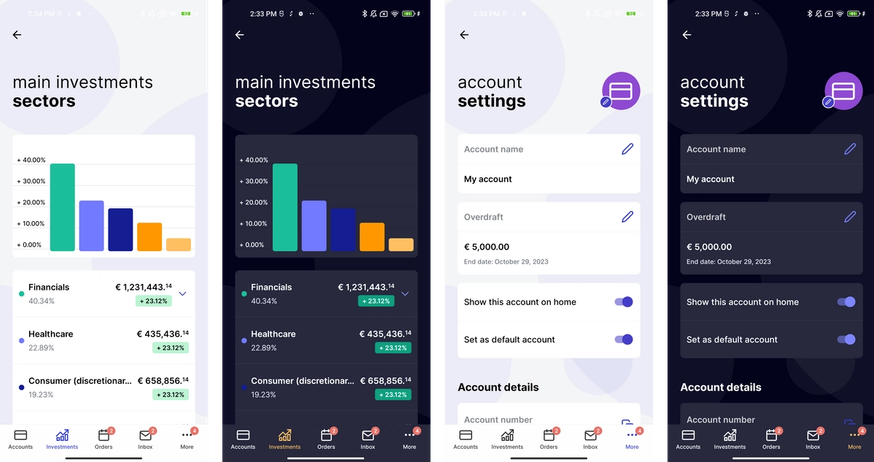
A huge draw for banking apps is that they give users visibility into their expenses and income. More specifically, a display of all of their spending buckets categorized and visualized in various ways so they can see their spending activity over a period of time.
And then on top of giving users access to this information, banking apps can help users proactively make better decisions by enabling spending limits. For example, banking apps can not only guide users as they ask themselves “What am I spending my money on?”, but also “How can I make sure I don’t spend too much on groceries for the next few months?”.
Notifications
Similar to how personal spending management features help customers make better decisions, notifications in a banking app also nudge customers in small but useful ways so that they can manage their finances better. For example, when an account balance reaches 0 or when money has been deposited, notifications let customers stay on top of these changes and take action accordingly.
"How can I make more money for my customer and how can I keep my customer financially healthy? Because in the end, as a bank you save much more money from a financially healthy customer than somebody that goes into massive debt and can’t repay it."
Split-the-bill functionality
So let's say you went to a dinner party with friends and wanted to split the bill. This split-the-bill functionality on your banking app would be able to send a message to everybody in your group with a link for them to easily pay the exact amount they owe. This is a popular banking app feature that appeals to customers on a couple of levels.
It alleviates the real-life hurdle of trying to split the tab at a group dinner, and it helps you quickly and safely share your bank payment details with your friends so you can get paid back faster. This is a perfect example of a feature that’s unique to digital banking, and that makes a big impact on how you build a strong mobile banking app experience.
Payment options and integration
Lots of people shop online or like to pay for things on-the-go without having to take out their credit card, so having multiple payment options and ApplePay and GPay integration are also things banking customers want to see in a banking app.
Top advice for designers and developers creating a mobile banking app
Tip #1 Set up a good design system
Given the size and complexity of any mobile banking app and the likelihood that a lot of stakeholders will be involved who may change your build requirements mid-process, a good design system is your saving grace. This is certainly true for our work at iO as we build brand new apps for new customers regularly. They all want a high performing app and strong UX designs, but also want to see results quickly.
"We can deploy a version of the app for a new customer that we can iterate on together in as little as two weeks. Compare that to if we did not have a foundation of a design system, it would take months to maybe a year to get there. That first period that would take maybe like a year is basically reduced to a week's sprint."
Tip #2 Don’t try to reinvent the wheel
For banking apps and their core functionality, it's important to stick with what works versus trying to reinvent how an app looks like.
For example, one banking app’s account overview and my app’s account overview might look nearly identical and maybe that’s boring. But what’s also true is that they both contain the basic information the user wants to see immediately at a glance. In other words, it’s not about having fancy graphs or visuals, but a clear and concise display of the information the user wants to see — that’s what matters for this use case.
"Don't try to reinvent the wheel with fancy new UX patterns. A banking app is just not really the place to do that. I understand that many of the visual designers in us want to be the one who comes up with a new pattern...but in practice, parts of your banking app will have to be boring."

How Zeplin helps iO quickly build and deploy high-performing mobile banking apps
Zeplin helps standardize their design system
We rely heavily on our design system foundations that we’ve built over the years. Zeplin ensures all of that information becomes part of the development process so that both designers and developers are on the same page and benefit from it before, during, and after the design handoff process.
"You can’t say that you have a good design system if it doesn’t translate into the app that your developers build. Zeplin helps expose components and design system information right alongside screens during development so we can bring our developers and designers’ two worlds together."
Zeplin is a place to quickly present designs
A significant part of our workflow is presenting designs to our customers to exchange feedback and Zeplin has become an essential tool for that purpose. Once we’ve prepared our designs in Figma, we export everything we need into a Zeplin project and invite the customer to it, which saves so much time and logistical headache.
Zeplin reduces communication overhead across the team
Zeplin helps us communicate very specific information so no one on the team has to rehash the same details over and over again. For example, we know that we’re going to maintain the same finite margin on every screen — those small details can live in Zeplin rather than on emails, comments, and Slack threads.
"Using Zeplin in our production pipeline saves us an immense amount of time, and also takes away tons of back and forth between developers and designers we would otherwise have."
Learn how Zeplin can help your product team build and deploy the best digital experiences, or contact us.


