
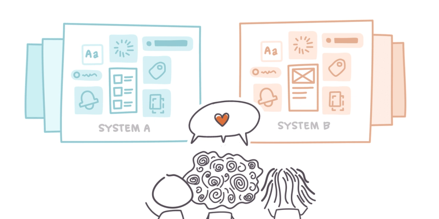
As a platform dedicated to better product collaboration, we're pretty passionate about how teams develop and maintain their single source of truth for all of their design and development projects. And the holy grail of all sources is, of course, the design system.
Lots of companies publish their brand books, but a design system is a lot more than just a set of guidelines. It stores the actual components that your team will use over and over across all of your products, pages, and platforms. It's what keeps you from having to spend hours sorting through 20 different components, all labeled "primary button," with no information about where they came from or which one to use.
There's an art to packing component libraries, patterns, design tokens, and style guides into a system that's still simple enough for designers, devs, and non-technical product team members to navigate with ease. And as avid appreciators of that art, we have opinions — lots of 'em.
I talked to the Zeplin design and product crews about their favorite design systems and what makes them stand out. Here are nine of our favorite examples.
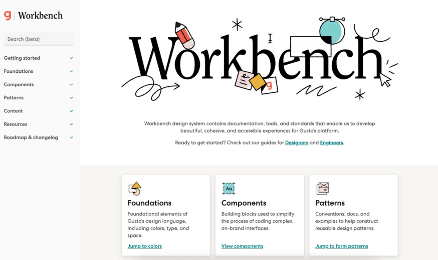
Workbench by Gusto
The larger your team is, the more complex your design system needs to be; and the more complex your design system is, the harder it is to structure it in an organized, easy-to-navigate way.
That's why we always appreciate bigger brands that find ways to organize their massive design systems in a way that feels intuitive to the average reader. This is especially relevant when your team includes lots of non-technical people like copywriters, researchers, project managers, and brand designers.
While streamlining your design system is important, you also don't want to over-simplify your design system to the point where developers have to wade through the basics to find the technical details they need. Gusto's design system, Workbench, balances these two priorities well by pairing implementation details with live components, which makes for easy adoption and easy understanding.
Visual explanations, code snippets, and comprehensive implementation notes make Workshop a one-stop shop for designers and developers. The unique way that Gusto presents its design system elements ensures that anyone can understand components and the best ways to use them to their full potential.
Repository: GitHub
JS Library/Framework: React
UI Kits: Figma
Distribution: npm
Design tokens: Yes
Semantic colors: No
Accessibility guidelines: Yes
Garden by Zendesk
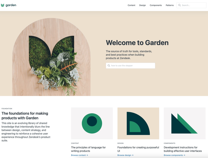
Zendesk's design system, Garden, stands out because it incorporates guidelines for an oft-neglected member of the product team: the product copywriter. Whether you have a dedicated copywriter or your designers double as product wordsmiths, content guidelines are extremely helpful in maintaining a consistent tone across your products.
Garden offers the full suite of standard design system resources plus an entire section on "the principles of language for writing products." It includes the brand's linguistic values, voice and tone guidelines, and even a list of specific words that Zendesk does and doesn't use.
Zendesk's design system is also connected to Code Sandbox, which allows developers to view, interact with, and test edits to any of Garden's components without pulling them into their own project first. It's another powerful way to keep your design system as lightweight and nimble as possible for everyone using it.
Repository: GitHub
JS Library/Framework: React
UI Kits: None
Distribution: npm
Semantic colors: No
Accessibility guidelines: No
WPDS by The Washington Post
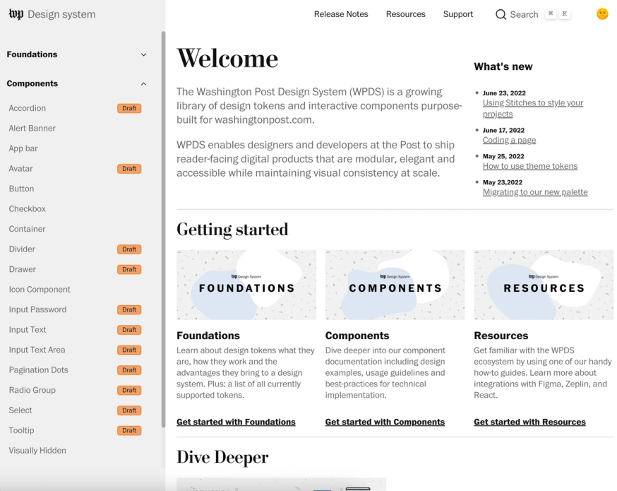
As we've mentioned, something we really appreciate in a design system is a clear and guided introduction for new users. The design system is sort of like a product team's house, and little things like an introductory overview of the system's contents or a written getting-started guide go a long way to make sure that non-technical members of the team feel at home in the design system.
The Washington Post's design system goes above and beyond the call of duty when it comes to providing resources for new users to get up to speed using its contents. Its "Dive Deeper" section offers full video workshops—one for designers and one for developers—dedicated exclusively to explaining how the design system works. (It also offers an onboarding guide for using WPDS with Zeplin, including how to enable Connected Components so that engineers can easily access components in their codebase right on the designs.
We also love that the WPDS places a "Draft" label on components that are still in progress. So much of designer-developer collaboration hinges on clear communication around versioning, and flagging incomplete components up front prevents a lot of confusion later on.
Repository: GitHub
JS Library/Framework: React, Stitches
UI Kits: React, Figma, Storybook
Distribution: npm
Design tokens: Yes
Semantic colors: Yes
Material 3 by Google
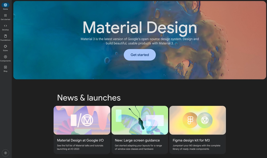
Material 3—the system's most recent iteration—is one of the most comprehensive and thoroughly documented design systems out there. And while most design systems lay out guidelines for creating branded products, Google's design system is written so that it serves as both Google-branded product guidelines and general best practices for designing products and experiences for Android and the web. The system is designed to help unify the user experience across different platforms, devices, and input methods. Apple has a similar design system for iOS, called "Human Interface Guidelines."
Not all design systems contain this level of detail, which is one of many things that makes Material 3 stand out, with highly tokenized guidelines for things like interaction states, motion, and accessibility patterns. Material 3 also comes with Figma kits, tutorials, and even its own blog!
Repository: GitHub
JS Library/Framework: React
UI Kits: Figma
Distribution: npm
Design tokens: Yes
Semantic colors: Yes
Accessibility guidelines: Yes
Polaris by Shopify
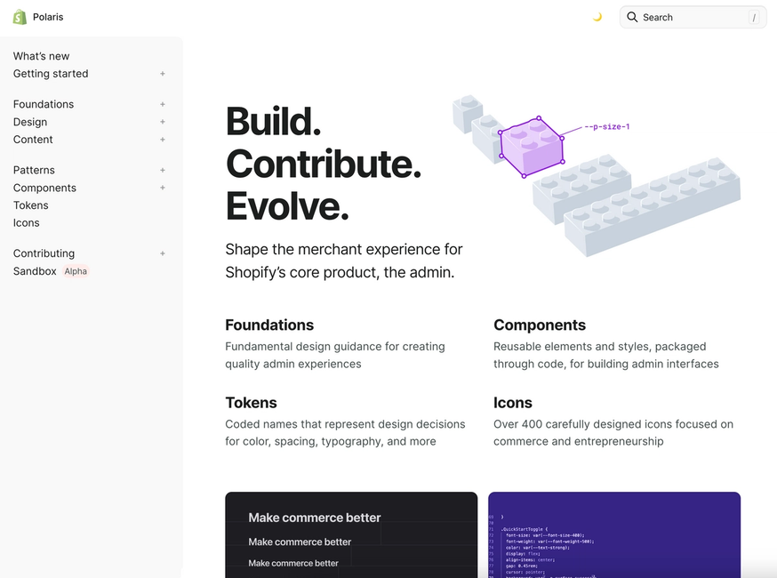
Shopify is unique because its product is designed to act like a chameleon, adopting the look and feel of each of the small businesses that use it. So the company's design system, Polaris, isn't just intended for use on Shopify-branded products — it's a consumer-facing system that includes patterns for commonly-used functions like filters, breadcrumbs, and navigation menus that merchants can then customize and use to design their own unique storefront. The system empowers small business owners to create Shopify-quality designs for their independent businesses.
The Shopify team built Polaris based on their experiences with their own platform, so all of the components and patterns in the system have been created and curated by experts. So users can utilize the design system with the confidence that all of its components are optimized for use with the platform.
Another powerful feature is the VS Code extension that generates an autocomplete menu of Polaris design tokens whenever it can tell you're adding a style variable to your code. It's a massive time- and energy-saver, and is another powerful tool to help make sure everyone across even the largest product teams is working with the same reusable components.
Repository: GitHub
JS Library/Framework: React
UI Kits: Sketch
Distribution: npm
Design tokens: Yes
Semantic colors: Yes
Accessibility guidelines: Yes
CI Portal by Audi
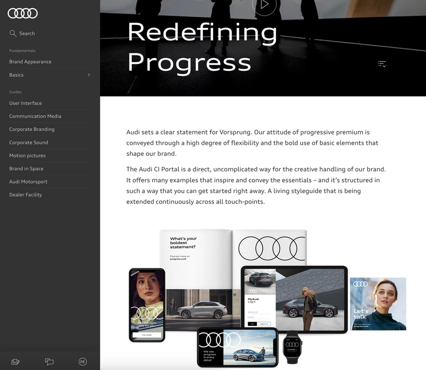
Audi used Storybook to build its component library, so all of CI Portal's components are already documented as stories. So rather than coding everything by hand, developers can update component controls and select the necessary component variations, and the design system itself will auto-generate the corresponding code to be copied into their project. Talk about a time-saver!
Audi's design system also includes a few unique categories. Because the company relies so heavily on videography across its digital and web products, its design system includes specific guidelines for video and even for sound. They even have design guidelines for their in-person experiences which, though not as relevant to product design, is still pretty cool.
Repository: GitHub
JS Library/Framework: Vanilla
Distribution: npm, Bower
Design tokens: No
Semantic colors: No
Accessibility guidelines: No
Cedar by REI
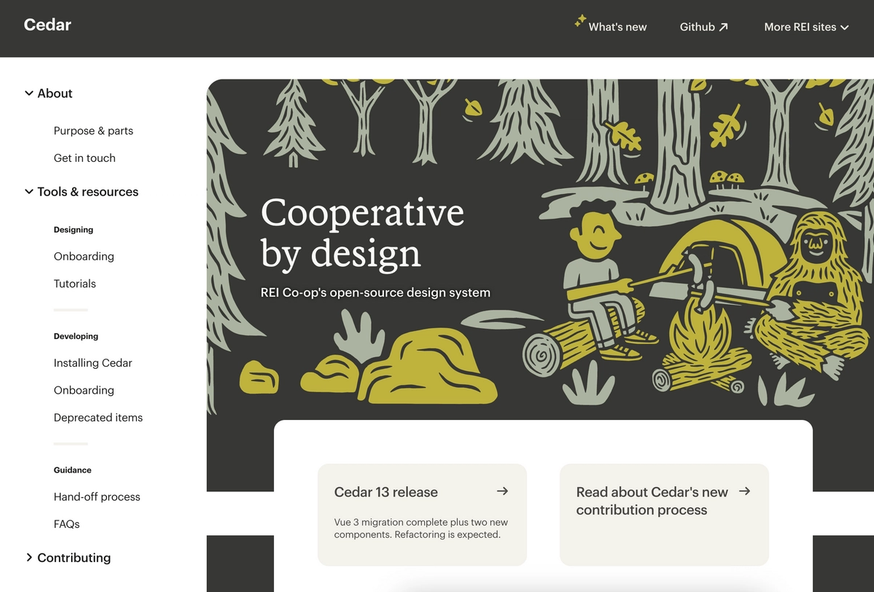
If there's one way to guarantee that the Zeplin crew will love your design system, it's by including a page dedicated to handoff processes and guidelines. This is something you don't often see included in design systems, but it's an extremely valuable resource when it comes to saving time and preventing communication mix-ups and mistakes during the handoff phase. REI's handoff guidelines include highly specific recommendations down to the number and pixel size of your artboards, which undoubtedly saves developers a lot of time.
Repository: GitHub
JS Library/Framework: Vue
UI Kits: None
Distribution: npm, Yarn
Design tokens: No
Semantic colors: No
Mailchimp Pattern Library
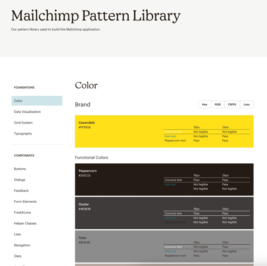
Though Mailchimp started out as an email platform, it has since grown into a full-fledged small business marketing tool. As its product offerings have grown more diverse, the company has adapted its brand and design guidelines to give the Mailchimp brand a cohesive look and feel without limiting its designers' creativity.
Mailchimp has three main creative content and design guides. The broadest of these documents is a unique, opinionated style guide that outlines the company's overall creative philosophy. The company's content style guide provides more detailed editorial and copy rules that govern the Mailchimp writing style in just about every context, from web and product copy all the way to legal content and trademarks. And lastly, the pattern library stores interactive design system components and thorough guidelines on how to employ them across Mailchimp products.
Mailchimp's content and style guidelines are so comprehensive that many designers, content creators, and editors use it to govern their own company's content. In fact, when we first created the Zeplin brand years ago, we were highly inspired by Mailchimp's creative approach!
Repository: GitHub
Design tokens: No
Semantic colors: No
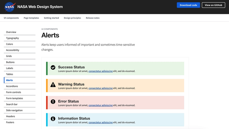
NASA Web Design System
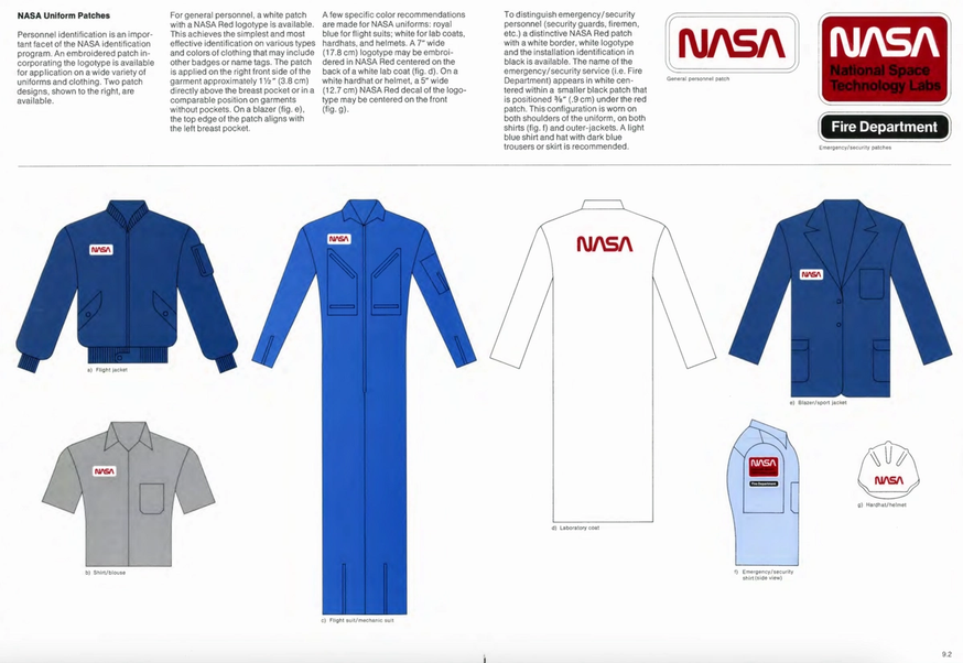
Digital product design systems are most commonly found at modern, tech-forward companies, many of which have only been around for a decade or two. So NASA's Web Design System provides a cool, unique opportunity to see how an organization's digital design system evolved from a legacy brand book (the National Aeronautics and Space Administration Graphic Standards Manual, to be precise) that was created in 1975.
The NASA Web Design System contains interactive components, code snippets, and implementation guides. It also offers two complete templates for landing pages and documentation pages, with instructions on where and when each page type should be used.
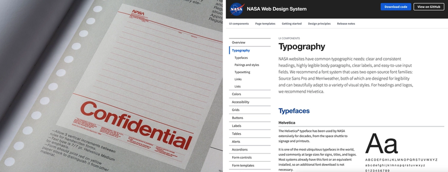
By contrast, the 1975 guide includes specs for designs on cars, space shuttles, federal building signage, and even NASA jumpsuits. But it also includes elements that have stayed the same — like the Helvetica typeface, which has been NASA's primary font system for nearly 50 years. Very few design systems can be traced back to a time before the invention of the internet, and it's fascinating to see what design elements have changed and which have stayed the same.
Repository: GitHub
Distribution: npm
Design tokens: No
Semantic colors: No
Accessibility guidelines: Yes
There are a few clear themes that appear across all of these examples and demonstrate exactly what makes a design system shine.
It might seem simplistic, but design systems that organize their contents in a clear, intuitive hierarchy and follow the classic "a place for everything, and everything in its place" rule will always stand out in a crowd. Tools and integrations that cut out unnecessary or easily automatable work for developers save time and energy and help teams avoid preventable mistakes.
And design systems that give consideration to the needs of the whole product team, making them friendly to non-technical people and providing necessary information for stakeholders like UX copywriters and researchers, really embody the full spirit of the "single source of truth" approach to product development.
Zeplin helps teams at Disney, The Washington Post, STARZ, Bombas, Veeva Systems, and more with their design system documentation and team-wide adoption — contact us to learn more.