
Though Dark Mode has been around for a pretty long time, it wasn't until Twitter rolled out a light-on-dark version of their app for Android in 2016 that the demand for Dark Mode skyrocketed. When Apple added macOS support for Dark Mode in 2019, it was clear that dark UIs were here to stay. Now, Dark Mode compatibility is practically a universal requirement — which means it's a required design skill, too.
Creating an entire UI that's almost the complete opposite (but not really) of what you initially designed is an intimidating challenge. We faced the same challenge a few years ago when we decided to add support for Dark Mode to our macOS app (and, more recently, our Figma plugin).
There are many ways to design a Dark Mode UI, and no one way is "right." Here's how we did it — and what we think will work best for you, too.
Use semantic colors for your existing palette
Most brands have one set color palette that they use across products, logos, and all of their other brand materials. Those colors are stored in the brand's design system and style guide to be used in design files and across the developers' codebase.
Before you dive into selecting Dark Mode variants for your brand colors, you need a new palette that categorizes your colors “semantically”. Semantic names give product teams information about what purpose the color serves, rather than just providing a name for the color itself.
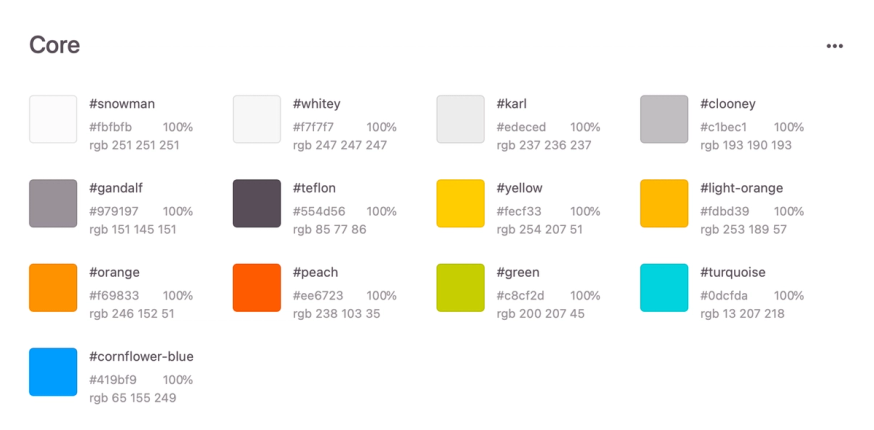
For example, here are Zeplin's core brand colors. We've given each color a name that references the color itself, like "light orange" or "clooney" (which, of course, refers to George Clooney's hair color). These colors don't have semantic names, meaning their names don't tell us how each color is used.
Now take a look at the color palette for Zeplin's macOS Library:
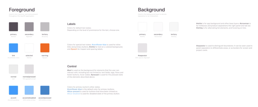
Because this palette is for a specific app, its colors have semantic names that tell us how that color is used throughout the product. The colors are broken into different categories, like labels and backgrounds, and then identified as primary, secondary, tertiary, or accent colors. There are also colors for different component states, like "disabled" or "pressed." So the color we identified as "clooney" in the core palette now has a name that tells us that it's used as a tertiary label color throughout the app.
You'll notice that some colors appear multiple times in the semantic palette. That's totally normal, because the same color could be used in more than one context in your product. In our case, we decided to use white (which we call "snowman") for both our primary background and selected labels, so "snowman" appears twice in the semantic palette.
Why not just create one semantic color label called "primary background and selected labels"? Simple: we may not always want to use the same color for both purposes. Since we defined them separately, we can update one without changing the other.
Create Dark Mode variants for your semantic colors
Now that you have semantic labels for all of the colors in your palette, all you have to do is create dark variants for each semantic color, and voila — you're ready to support Dark Mode.
Now for the fun part! There are a few different ways to select your Dark Mode color variants. Here's how we recommend going about it:
If you're designing for iOS/macOS
If the product you're working on is an iOS or macOS app, I'd highly recommend using Apple's suggested system colors. There are a few reasons for this:
- Since these color values come directly from Apple, you already know they conform to contrast, vibrancy, and accessibility standards.
- Apple's colors can be implemented using an API that allows colors to adjust dynamically depending on the user's color scheme, wallpaper, and system settings.
- Because Apple's system colors are used so widely, people are familiar with them, which can make it easier for users to adopt and navigate your product. It also synchronizes product experiences across platforms.
If you're designing for the web
If there’s no Dark Mode solution built into the system, it's up to you to define your own dark variants. For Web, a good way to get started is to visit other websites, see what they've done, and use the Inspect panel to find the CSS variables for each of the site's semantic colors.
You can also take a look at different brands' design systems and pull ideas from your favorite ones. Google's open-source design system, Material 3, is used widely by product designers as a baseline for their own design systems. It also has a specific set of recommended guidelines for creating a dark theme.
Keep accessibility in mind
No matter what platform you're designing for, keep in mind that accessibility can be a little tricker in a dark UI than in a light one. If you decide to select your dark mode colors by hand, you'll have to double-check them against web accessibility guidelines to be sure your design passes muster.
Test your palette
As you're picking dark variant colors, pick out a few screens to test them out on. Because you set up your semantic palette, you don't need to redesign all of your screens individually. Once you have your Dark Mode palette assembled, you can just apply it across your entire product — and you won't need to design separate dark and light versions of new screens going forward, either.
Dark Mode tips, tricks, and best practices
These are a set of best practices that we (and many of our users) have learned work best when creating a dark UI. It's like Picasso said: learn the rules like a pro, so you can break them like an artist. These "rules" aren't absolute musts, but they're important to understand so that you can make informed design choices about whether or not to follow them.
Contrast is key
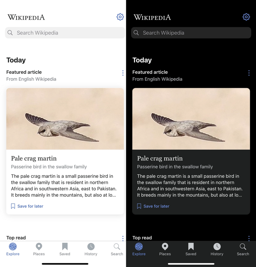
The purpose of Dark Mode is to make screens easier to read. A direct color inversion often has the opposite effect, since colors that contrast nicely in a light setting don't necessarily have complements that pair the same way.
To ensure readability, Dark Mode designs need to meet minimum contrast standards set by the Web Content Accessibility Guidelines (WCAG). The WCAG uses contrast ratio (the ratio of two colors' relative luminance) as a metric to set these standards. You can find the contrast ratio of two colors using a contrast checker like this.
Keep colors muted and minimal
As you go through and convert each of your UI colors, keep in mind that not every color in your light UI needs to be included in the Dark Mode design. Not only does Dark Mode employ different, more muted colors than light UIs, but it often uses fewer colors as well.
Stick to desaturated colors across the board. If you need a color to stand out a bit more, go for a lighter (but still desaturated) shade instead of upping the saturation.
You can keep your brand colors, even if they're bright
Conventional wisdom says that bright, highly saturated colors don't belong in a dark UI design. When you're working with a brand whose signature colors are bright and highly saturated, that's a problem.
Thankfully, you don't need to ban bright colors entirely; you just need to use them sparingly. Choose just one bright brand color and use it as an accent color in your Dark Mode palette. Limit color accents to smaller components, so the majority of the page is occupied by low-light colors.
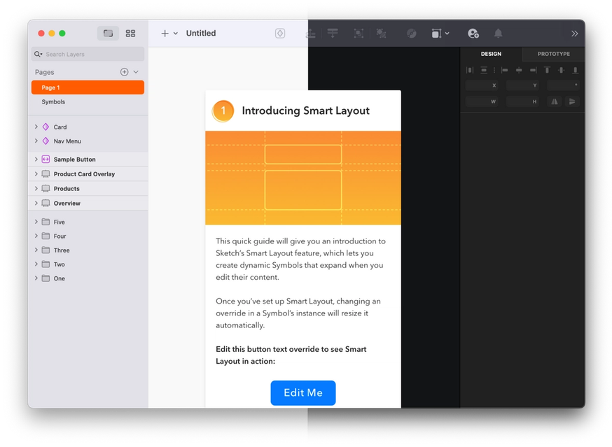
Take a look at how Zeplin incorporates brand colors in Dark Mode:
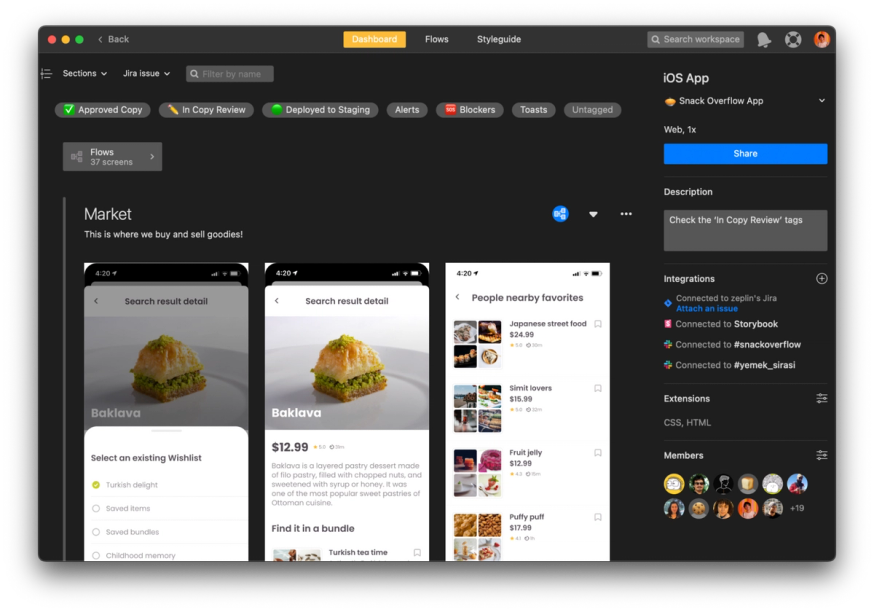
Our brand orange is incorporated as an accent color in the Dark Mode palette and is used throughout the app for small components like key headers and minor iconography.
Use semi-transparent overlays to imply a light source
In a standard UI design, colors don't change depending on the elevation of the component or element. In Dark Mode, there's an "implied light source" that gives components lighter or darker colors depending on how high they're elevated. In other words, the components behave as though they were illuminated by a flashlight held in front of the screen. The closer they get to the light source, the more washed out they'll be.
To achieve this effect, place a semi-transparent white overlay over your elevated components and adjust the opacity to indicate height. The higher the elevation, the more opaque the overlay will be.

Keep shadows dark
Elevated components also have shadows beneath them to indicate height. When working in Dark Mode, don't flip your shadows to light colors to make them visible between dark components and a dark background.
The brain understands that dark shadows indicate elevation because that's how shadows appear in the natural world. Because there's no environment in which shadows are ever lighter than the object casting them, a light-colored shadow will just confuse the eye.
This is another reason to use a dark gray for your background instead of pure black — it allows you to continue to use black component shadows, since black can still be seen against dark gray.
More than anything, the key to implementing a Dark Mode UI is a well-organized palette of semantically named colors. Using semantic palettes saves you from having to recreate designs and makes it easier for developers to swap color tokens between variants. It also saves you from having to create more than one version of new screens in the future. Like all product teams, you're aiming for efficiency, and semantic palettes are a powerful tool for saving designers and developers time without impacting quality. Dark Mode design is complex, but it can also be a lot of fun once you have your color system in place!