
Designers and developers work hand in hand to create beautiful products. We build these products together, with UI components in code and UI libraries in design — our design system. In design, these UI libraries might be composed of symbols or components from Sketch, Figma or Adobe XD. In code, these components might be built in React, React Native or Preact. So, how do we recognize our React components in designs and our UI library?
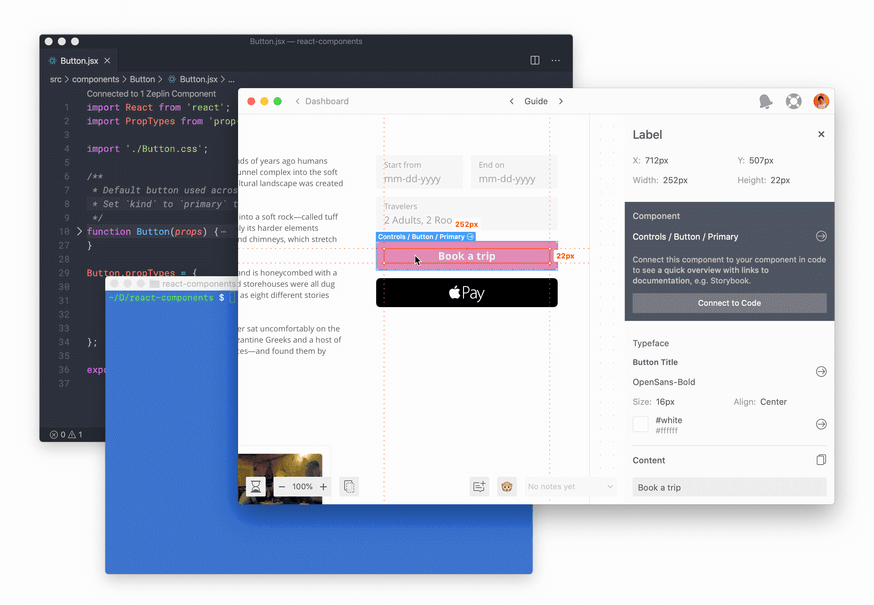
With Connected Components you can view React components from your codebase right on the designs and automatically link Storybook stories, marrying components in code and design.
In this post, we’ll overview connecting React components to components in Zeplin and adding our Storybook stories.
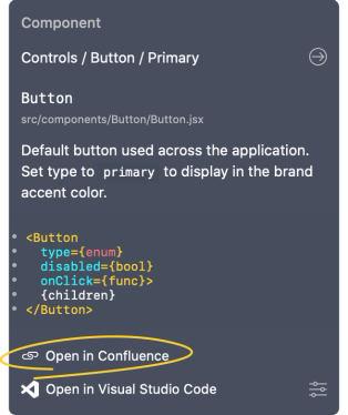
Bring development context to designs. Surface React components on designs, promote reuse and let your team access a summary of your component, including documentation, a bite-sized code snippet and links to Storybook, GitHub and so on.
Keep the team up to date on your design system. Recognizing an evolving design system takes time, help your team discover and learn about your components as they’re viewing designs.
Onboard new engineers to your UI components. Your design system is constantly changing, so are UI components in code. Onboard new engineers to your codebase and access to up-to-date documentation as you work on designs.
Connecting to React components
Getting started is simple. You can map components in your codebase to the components in Zeplin using a JSON configuration file.
It’s possible to create the config file in any text editor, but if you’re using Visual Studio Code you can install Zeplin’s Visual Studio Code extension. The extension simplifies the configuration file setup by automatically pulling information from Zeplin.
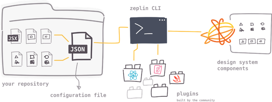
Once the configuration file is set up, Zeplin’s CLI tool lets us publish the connected components to Zeplin. This CLI tool is built on top of plugins for various platforms and the first plugins we built were for React and Storybook. Plugins analyze your UI components and publish a summary to be displayed in Zeplin.
☝️ It’s possible to use Zeplin’s CLI in your CI pipeline to always keep components up to date.
Voilà! Your components are connected. Now whenever a design has a connected component, we can view the React code snippet to initialize it and its documentation.
If you want to learn more and start connecting your React components, check out our getting started guide on GitHub:
Connecting to Storybook
Storybook is the world’s most popular UI component workshop. In Storybook you can organize, document and interact with your components without dependencies. We’ve been working with the bright team at Storybook and are excited to announce automatic linking of your Storybook stories and Zeplin components!
Now you can access your component library from Storybook, allowing you to browse, test and interact with your stories. If you want to learn more and start connecting some Storybook stories, head over to our guide for adding Storybook links.
Adding custom links
In addition to Storybook and React, many of our teams have internal wikis, e.g. Confluence, where they document their components. In Zeplin, you can now add any custom link to a component, making sure documentation is surfaced on designs.
If you would like to learn more, check out our adding custom links documentation.
We are incredibly jazzed to release Connected Components. Using Global Styleguides your team can add React code, Storybook stories and custom links to components across all your Zeplin projects and screens. We’re excited to see what you will do with it!
If you have any questions or feedback on Connected Components, reach out to us at support@zeplin.io.
Chow! 🐕