

Today, we’re one giant leap closer to bridging the gap between design and code. We’re excited to roll out two new features that surface components within designs: Highlight Components and our newly improved integration for Storybook.
Both features are powerful solutions for developers, so if you want to save time, reuse as much code as possible and better estimate your workload, grab a seat! 🤓
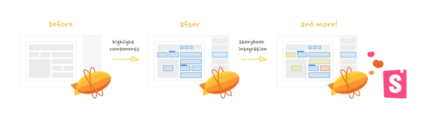
See components in the design with “Highlight Components” 🪐
With Styleguides and Connected Components, Zeplin already provides the unique ability for designers and developers to see reusable design components by clicking on each layer to cross-reference a project’s codebase with the design system. Recently, developers told us they want to be able to identify reusable design components at a glance, because a bird’s eye view would allow them to more easily estimate workload. You asked, we listened!
With today’s release of Highlight Components, view all design components and any linked information from the codebase in a new “Reusable Components” panel. Simply toggle Show All to highlight components on your project screen and see which ones have been linked to code.
If your design components are linked to code, now we’re cooking with gas! 🔥 Immediately view useful information like: code snippets from your repo, component states, link status, and link to edit it in your codebase.
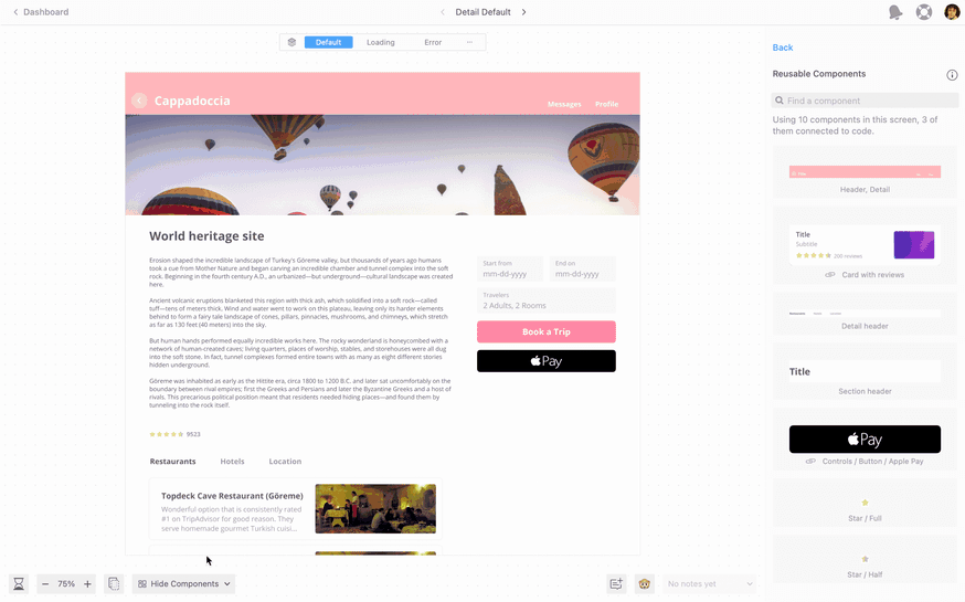
We are especially excited about the link status view because it solves a common developer pain point: keeping track of constantly evolving designs. Simply toggle link status to “Not Yet Connected” to easily see if any new components were recently added to the Styleguides by your designers and still require connecting to your codebase. Speaking of connecting design to code…
Zeplin’s Storybook integration: new and improved
Storybook is the go-to repository for component-driven development teams and given the popularity of our recently released Storybook add-on, we wanted to make working with Zeplin + Storybook even smoother.
Previously, developers needed to use the Zeplin command line interface (CLI) to install the Storybook plugin. With this release, we’ve made it easy to link and sync design components to code by simply entering your Storybook URL right within Zeplin to get started. So easy, that anyone can use it. ⚡
But that’s not even the best news…
With our newly-improved integration, Zeplin searches the Styleguide connected to Storybook and auto-suggests matches between components in Zeplin and stories in Storybook. Not just developers but also non-technical users can either approve Zeplin’s suggestions or search for other components to connect to by simply visually comparing the two. Yep, that’s right — no need to use CLI for this either!
With the Error link Status, you can see linking errors between Styleguides and codebase, which gives developers the chance to proactively fix it. Plus, Zeplin will auto-update the story list when a new component is changed, added, or deleted in Storybook.
With Zeplin’s new integration, I now have this great overview of all connected components in my design, see the component name, play around with it, and get CSS values, which I love. I use this concept of a “full circle” a lot in my work — it's a state where Storybook integrates the design and the design integrates Storybook. In this two-way integration with Zeplin, both the non-technical and technical user can take advantage of each other’s work. I believe this is an important step towards the “full circle”, and I’m looking forward to using this integration more.
Plan for work ahead, reuse as much as possible
Our hope is that with Highlight Components and the improved Storybook integration, your engineering team will:
• Save time: Quickly see all reusable components on any screen — or across all projects if you’re using Global Styleguides. Spot when the designer adds a new component to Styleguides, so you can plan ahead for its build. With the Storybook integration, easily search for the right match in code for new components.
• Reuse code: See CSS snippets and other custom code from your codebase right within Zeplin. If linked, make changes any time with the Edit link. Maximize use of pre-written code and avoid rebuild of already existing components.
• Better estimate workload: Identify reusable elements early on to better estimate work left. Give engineering leads and product managers this visibility so they can help developers accurately scope work.
We believe both these updates will help the entire product team access and make use of information from the design system AND codebase in one place: Zeplin. And in the case of Storybook, the new integration allows non-technical users to jump right in to do their part in maintaining a singular design system.
If you haven’t already, set up your Styleguide in Zeplin to experience Highlight Components (you’ll need Styleguides to use these features).
Our improved Storybook integration can be set up by anyone on a team that uses Storybook. Just plug in your instance URL to get started.